Category: General
Altenew: Magic Marker Techniques
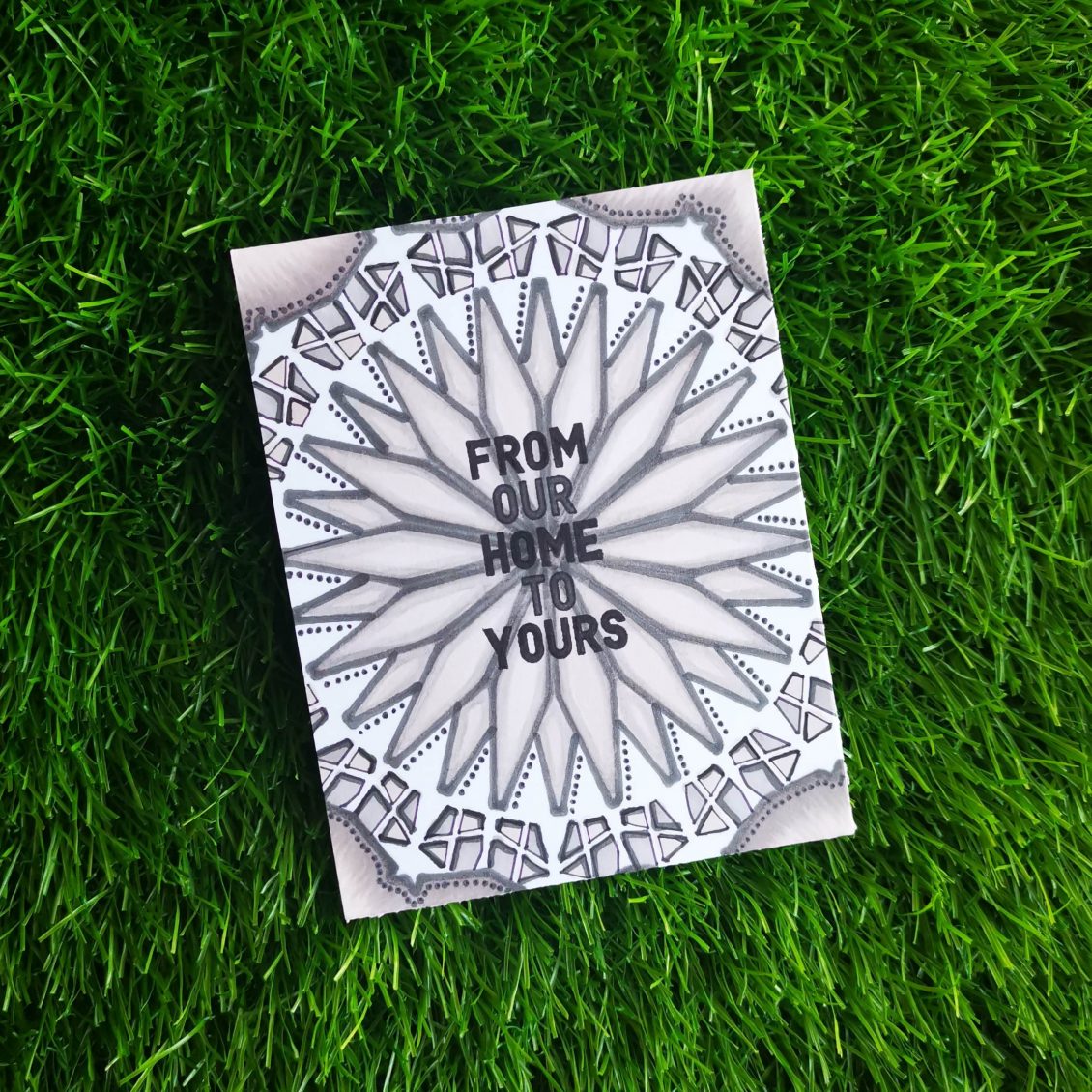
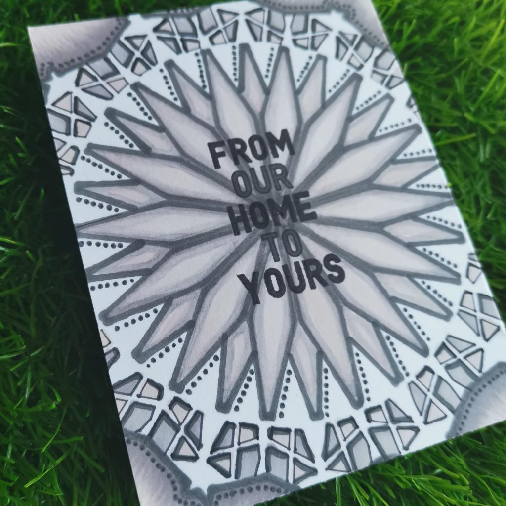
The next AECP class I tackled was “Magical Marker Techniques”, by Sara Naumann. I enjoyed the fact that Sara uses her markers for more than just coloring in stamped images, in fact, I liked that a lot. I would recommend this class to anyone who is looking for ideas on how to stretch their supplies . I used my artistic markers just for coloring, but through this class, I did explored a new way of using it.
INSTRUCTIONS
- Create a “4 1⁄4 x 5 1⁄2 ” card base from Classic Crest Solar White Cardstock.
- Place linear Stencil over card base and position it to the center of the card.
- Tack it down with masking tape.
- Remove the stencil and retrace the diamonds so they’re heavily outlined, then color in the diamond shapes
- Draw the outline using darker shade of artistic marker and fill them with lighter shades.
- Slightly rotate the stencil and move over to the second layer.
- Fill in the smaller parts according to your creativity and color choice
- Add small dots using the fine tip of the artistic marker
- You’ll have a cool dimensional effect by darkening the outline of the small parts of the stencil.
- Stamp a sentiment from the Holiday Tag sentiment.
- Fill in the sentiment with artistic marker
TIPS
- Tack the stencil down with masking tape on either sides, so that it would keep the stencil flat.
- Choose a color theme to bring up a mandala effect.
- Draw the outline using fine tip of the marker
- Slightly rotate the stencil and move over to the next layers.
- Take advantage of the fine tip of the marker to add dots and dimensions to the card
SUPPLIES
- Jet Black Crisp Dye Ink
- Morning Frost Artistic Marker
- Evening Gray Artistic Marker
- Industrial Diamond Artistic Marker
- Linear Stencil
- Holiday Tag Sentiments
For my card, I followed the techniques from lesson 6 of this course – using Markers with Stencils. I really encourage you taking this class taught by Sara Naumann, it will help you a lot more to understand color and color usage on projects. Hope you liked my card.
Have a wonderful day and I hope to see you all soon with another project from AECP. Until then happy stamping and thanks for stopping by!
-shahi
3D Paper Cut Light Box
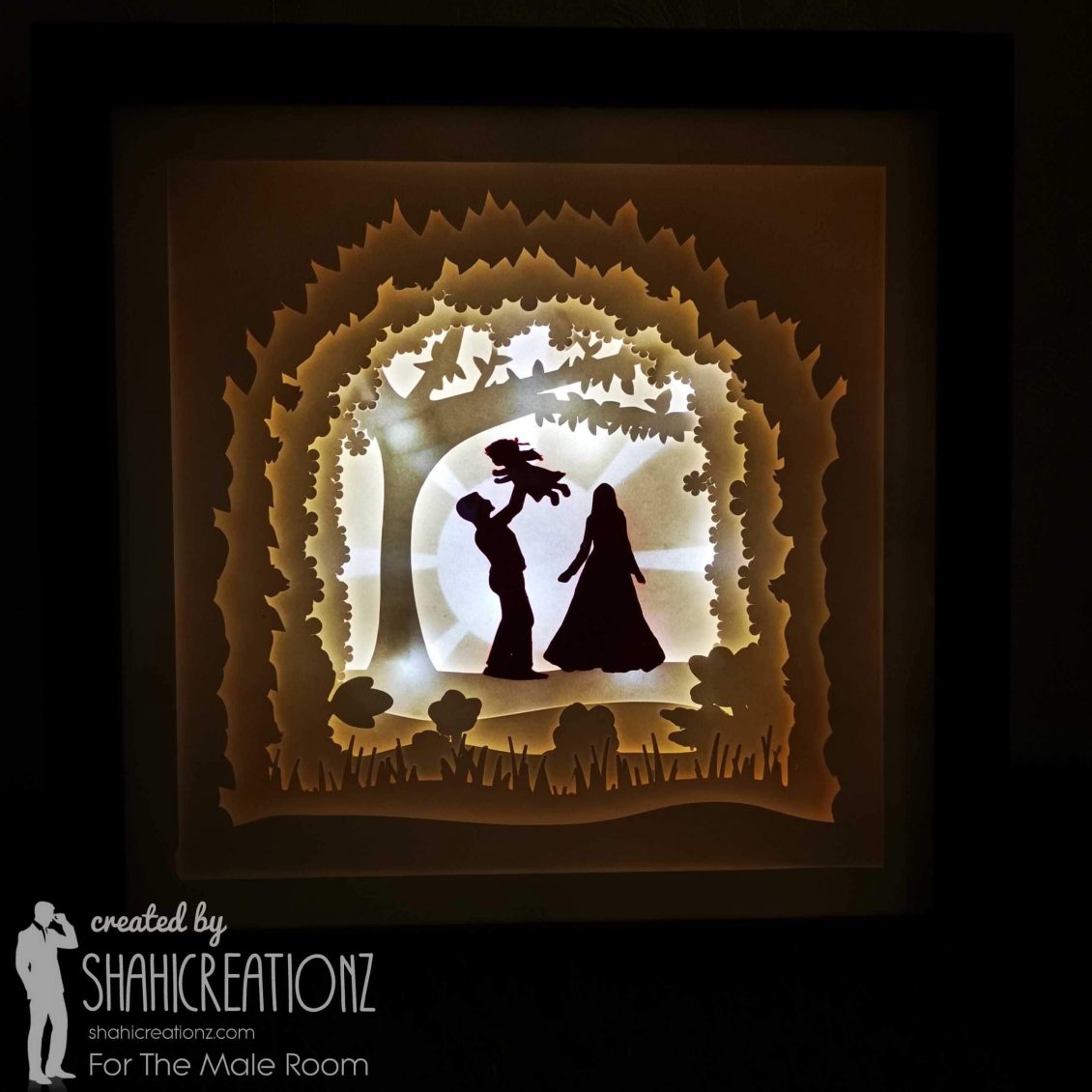
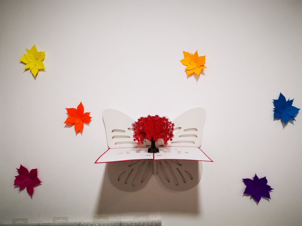
A new month and therefore a new task to begin with. For The Male room challenge, this month we have an interesting task ahead of us., But this month we’re shaking things up a bit and asking you to forget about cards and show us your creativity in a different way. So scrapbook layouts, tags, art journal pages, 3D, ATCs will be the order of the day. Inspired by the artist, Jennifer Maker and her beautiful artwork I decided to create a 3D paper cut light box this month.
A lightbox can be used as a wonderful home décor, or a unique birthday or wedding gift. You can mount it on a wall, or place it on a desk and enjoy its charming beauty. Basically, this light box consists of paper cut outs layered on each other in a box with a glass panel. LED lights are placed behind all the layers, which makes each layer glow, giving this 3D look.
After referring to Jenifer Maker’s videos , I created my custom design for this light box on Cricut space. And cut them I using 130 grams white card stock, because it’s stiff enough to stand up and thin enough to let the light pass through. The layers are reassembled with foam spacers in between each one. This gives the image the appearance of depth and creates a 3D effect. It was placed inside a shadow box frame sized 9*9 .
If you put your custom shadow box design in a display frame, you can add LED lights to the back to light it up and see all of those layers and shadows so much better! I prefer to use LED light strips, but some people just use fairy lights. Either way, they go behind your layers of cardstock. I usually put my LED light strips around the edge of the frame for a nice even glow. You’ll want to position the lights so your cord can hang out one corner — if necessary, cut a small notch in the corner of the frame for the cord. Now just replace the back of your display frame, plug in your light, and enjoy the magic!
Hope you liked my 3D Paper Cut Light Box. Now have a look at the challenge blog here for all the challenge details and to see the cards from the rest of the Design Team. https://themaleroomchallengeblog.blogspot.com/2021/03/challenge-148-not-card.html.
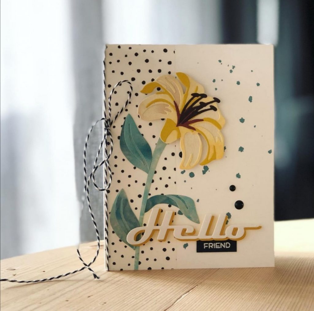
Altenew: In The Mood For Color
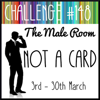
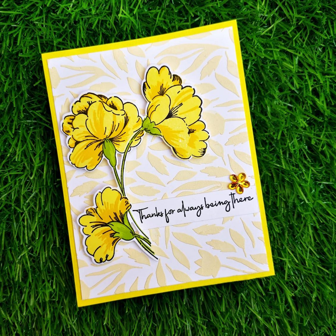
Hi, Thanks for stopping by… It’s so great to see you here! I was very excited to have graduated from Level 1 of the AECP program! That last project was HUGE and took me forever to get completed. After a long gap, I’m now onto my next level of the program. The first class I choose in level 2 is “In The Mood For Color” . In this class Stephnie Klauck shares the impact of colors on ones mood. Here I have focused on the color Yellow . It is the most luminous of all the colors of the spectrum. It’s the color that captures our attention more than any other color. It’s the color of happiness, and optimism, of enlightenment and creativity, sunshine and spring.
INSTRUCTIONS
- Create a 4 ” x 5 1⁄4 ” card base from Classic Crest Solar White Cardstock.
- Place Spring Garden Stencil over card base and mask outlines with masking tape.
- Take some embossing paste on the watercolor palette and add few drops of Buttercream Alcohol Ink and blend it well
- Apply the paste on the cardstock over the stencil.
- Wait until the paste dries
- Stamp the biggest stamp from Sweet Flowers Stamp Set using Obsidian Pigment Ink on a Classic Crest Solar White Cardstock
- Then, stamp in the layers of the flowers with Fresh Lemon and Maple Yellow.
- Then, stamp the floral stem details using Bamboo and Parrot
- Finally, die cut and adhere the florals onto your card base using double sided foam tape.
- Stamp a sentiment from Friends Forever Stamp Set onto a white cardstock strip using Obsidian Pigment Ink
- Stick it near to the floral die cut
- Add your favorite embellishment to enhance the look of the card.
- Finally, add this panel to your yellow card base
TIPS
- Choose the right colors , it allows you to let the sentiment say what you’re feeling, and help the person you’re giving the card to, feel what your feeling.
- Use a stamping tool to stamp your florals. It makes stamping large solid images so much easier since you can double and triple stamp. the included bar magnet can be used to quickly and easily position your cardstock, and the included grid paper makes it easy for you to lay out and align your card’s design.
- Before stamping, use an Anti-Static Pouch tool to remove static from your paper so the powder doesn’t stick where you don’t want it.
- When doing stamp layering, start with the lightest ink color first and then build up to the darkest.
- Add your favorite embellishment to enhance the look of the card.
SUPPLIES
- Obsidian Pigment Ink
- Fresh Lemon Crisp Dye Ink
- Maple Yellow Crisp Dye Ink
- Bamboo Crisp Dye Ink
- Parrot Crisp Dye Ink
- Friends Forever Stamp Set
- Sweet Flowers Stamp & Die Bundle
- Spring Garden Stencil
- Embossing Paste
- Buttercream Alcohol Ink (Artistic marker refill)
- Watercolor palette
I really encourage you taking this class taught by Therese, it will help you a lot more to understand color and color usage on projects. Have a wonderful day and I hope to see you all soon with another project from AECP. Until then happy stamping and thanks for stopping by!
-shahi

CASE your fellow AECP Crafter
Hello and welcome to Case your fellow Crafter Blog Hop!
You must be here from Sandhya Iyer ‘s blog
We fellow crafters at AECP are here with our first AECP Participant/Educator Hop! We thought it would be really fun to do a CASE your fellow crafter hop, which is an awesome way to get to know each other! All the credit goes to Natasha. she is the one who helped us the most in making this happen today.
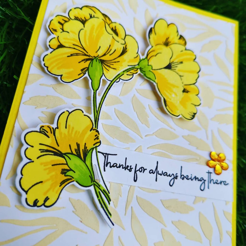
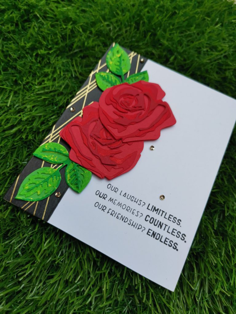
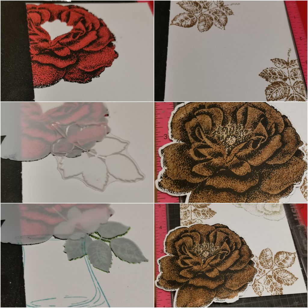
Today I’m going to CASE Berit Kyllo-Steinmoen . She is such a talented artist. A fellow AECP participant who has got real talent of playing with colors. The card I chose to CASE is
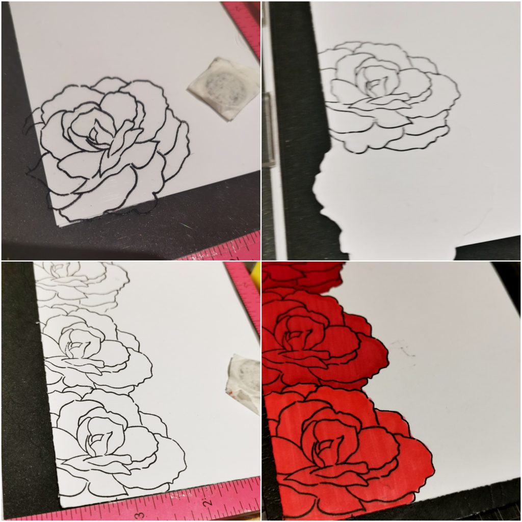
As I was scrolling through her IG ,I noticed that this was her first trial on layering dies. That when I realized that I haven’t given it a try yet. Switching from layered stamping to layered dies was something really new to me. But I’m totally loving it. So here is my version of her card.
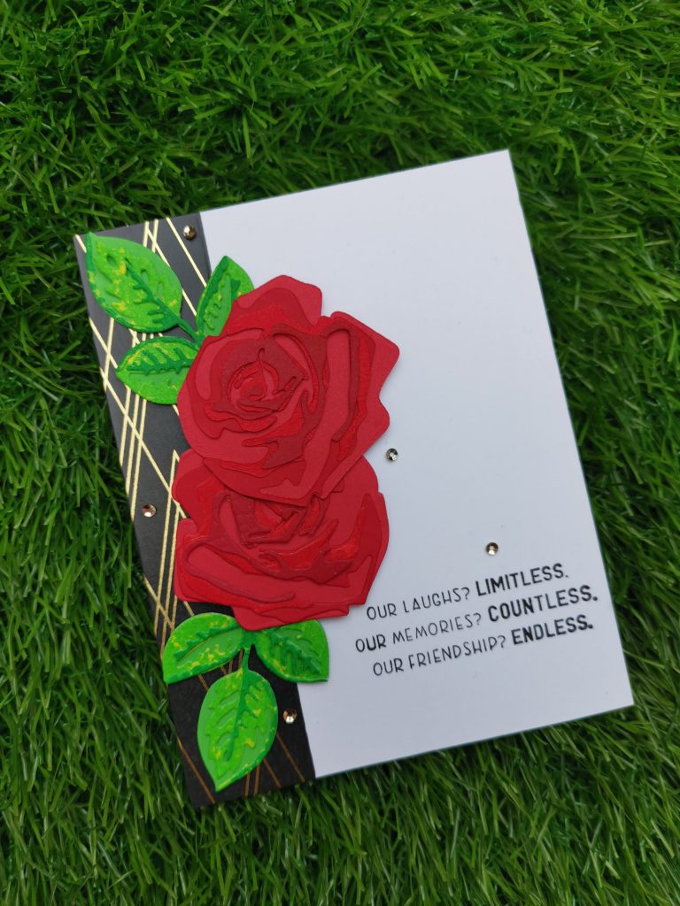
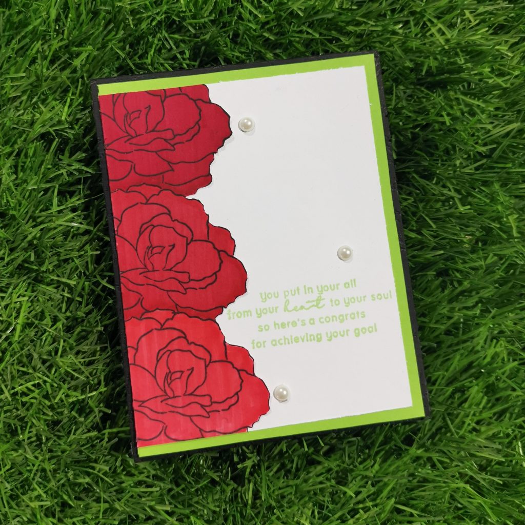
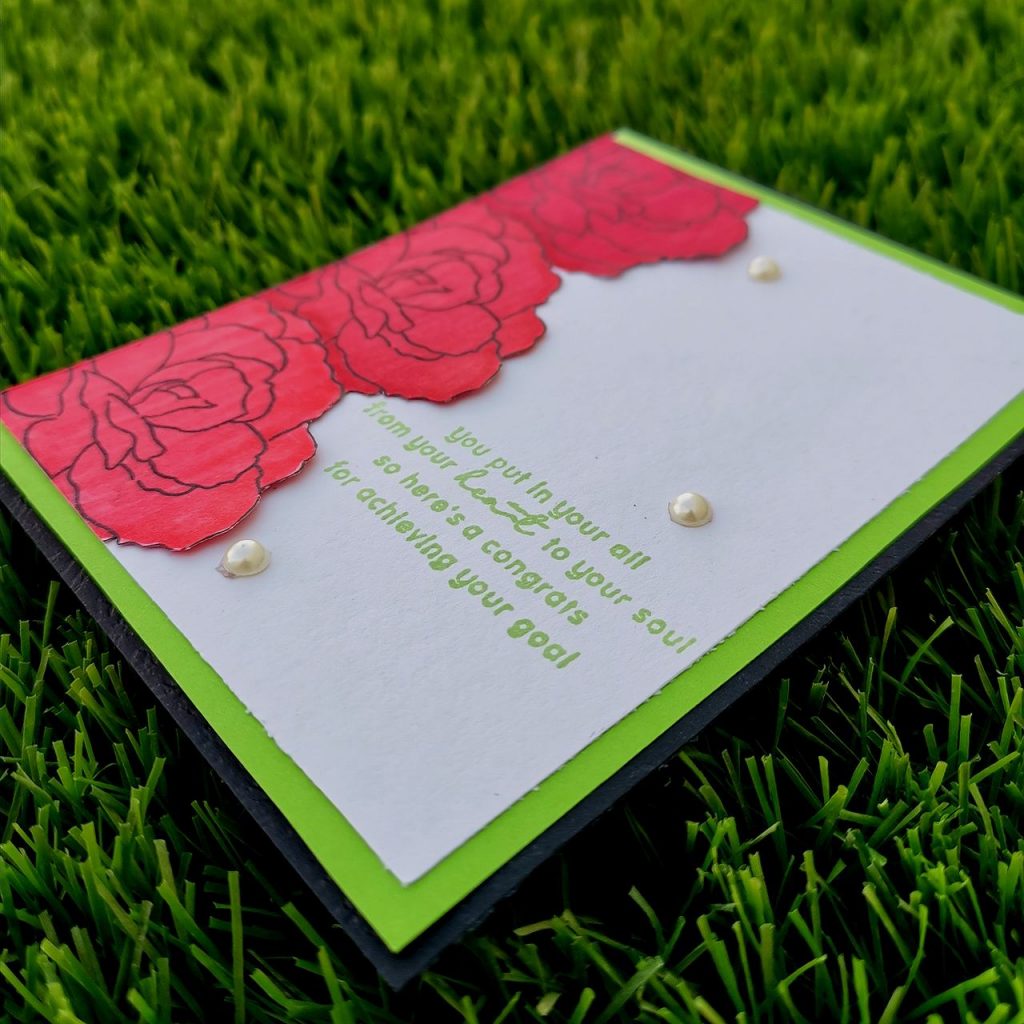
Coming to the details, CASE means Copy And Share Everything. but it can be interpreted in many ways. Basically, we would each choose one of the AECP/Educator creations someone has shared that inspires us. Then we would create something ourselves; it could be a recreation of the exact card, we could take certain parts of the design and make it our own. It could be that a specific technique or color choice inspires you. The possibilities are endless! Today I have focused on the techniques and the layout used by her. She has given a vertical border at the left side of the card with the layering flower covering part of it. The sentiment is placed on the right bottom of the card. As add-ons she has also used some sequences near the sentiment.
To begin with I trimmed a 5 1/4 * 4 1/2 Neenah classic crest cardstock. Then stuck altenew’s deco lines washi tape on the left side. Then I die cut Craft a Flower Rose layering die set from Altenew. I used 4 different gradients of red for the flower and green for the leaf. To give a unique look I splashed some yellow paint on the green leaves. The sentiment I used was from friends forever stamp set from Altenew. To have a extra look .I used some Antique gold sequins from Altenew. Here are some detail look to my card. Hope you liked it.
Thank You!
I really appreciate you stopping by. If you like what you’ve seen from me, please comment your feedbacks and do give me a follow over on my Instagram (@shahicreationz) and/or subscribing to my vlog and YouTube if you haven’t already.
Your Next Stop is Nandini Karmarkar ‘s Blog!

Setting up my passion
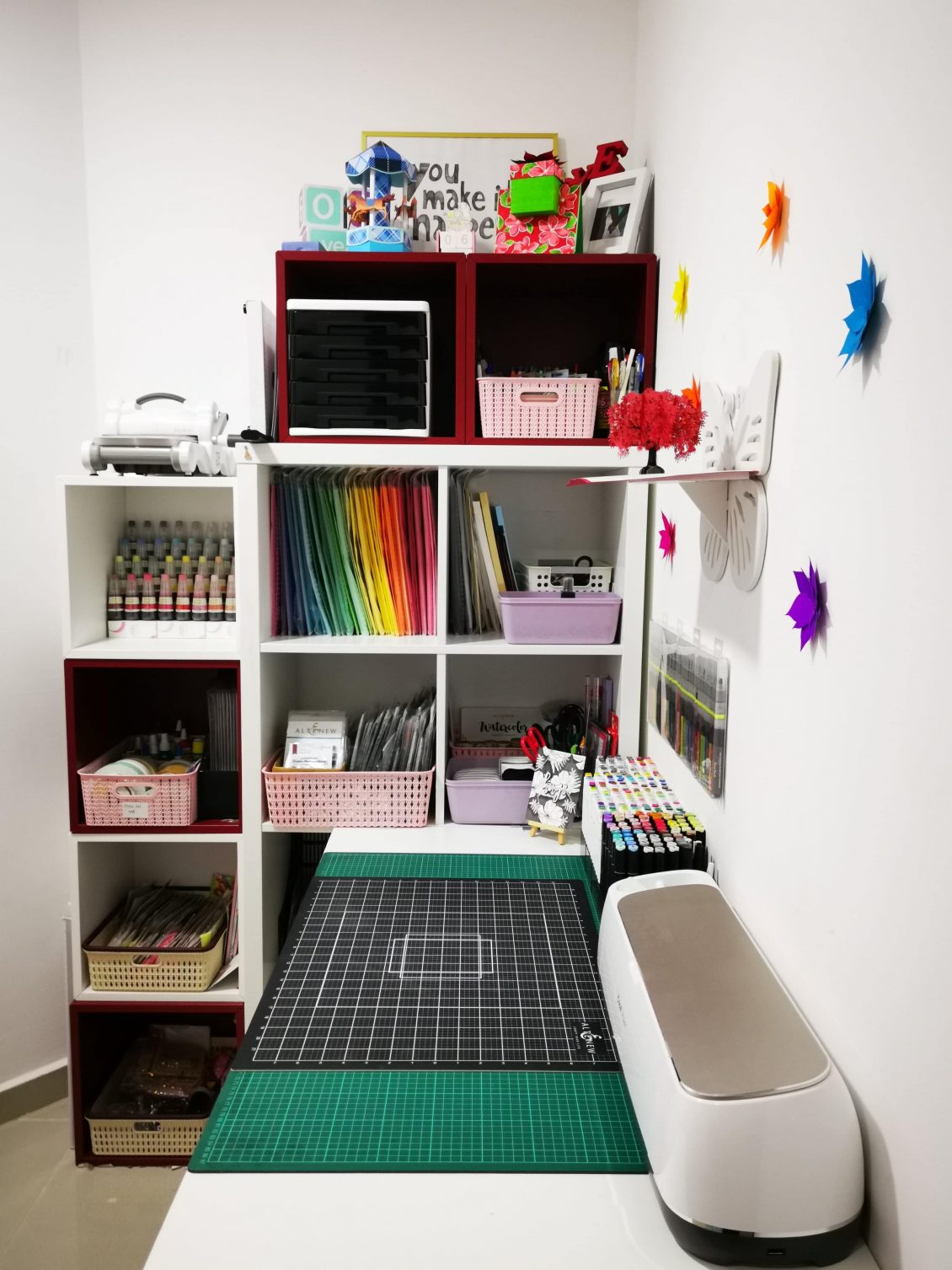
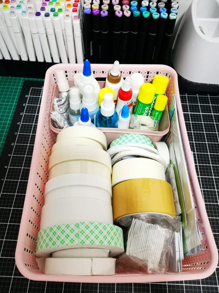
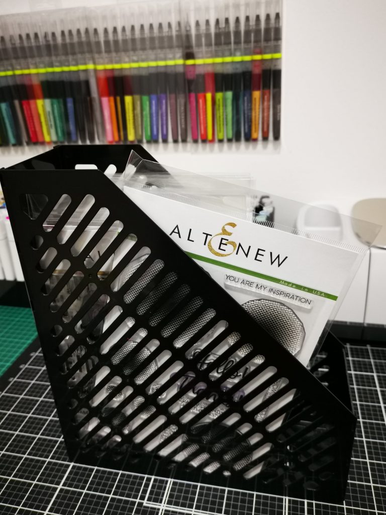
Setting up a space where I can call it a craft room was always a dream for me. I’m someone who thinks that, “For a craft room to look good, it should be organized well” . Organizing your craft room is essential to your creativity and sanity. A craft room can truly get messy once you’re in the works of creating something truly beautiful or practical.That’s why keeping it organized is very important. There is nothing better than feeling inspired in a place where you feel safe.And the organization can give you a sense of safety!
Today I’d love to share some of my craft room organization ideas that will keep you organized and hopefully inspired. First one is pretty simple but absolutely essential to keeping your room organized. Get tall shelves, the taller the better. The more shelving you have, the more space there is for all the supplies. The more supplies, the bigger the inspiration to get things done every day.
The truth is, you can get your craft room organized with a very small budget. All you need to do is go to the Dollar Store, get whatever seems proper for storage, and arrange something of your own.
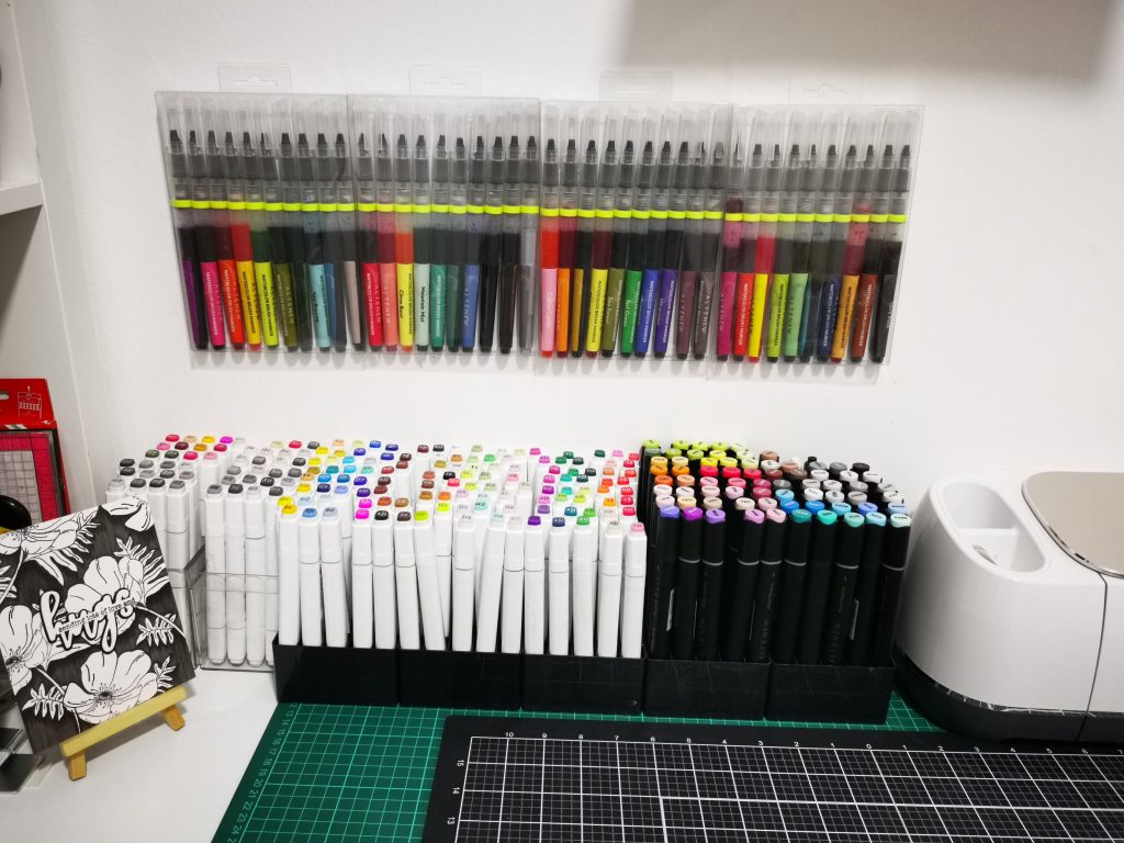
If you love to display your supplies on the table, get a display rack stand. These are great for threads, nail polish, paint, glitter, etc. Every inch of your space is precious. So, you might want to use the space on your table to keep some of the supplies. Obviously, make sure it doesn’t get too messy. You know how easy it is sometimes to just throw everything on your desk! If you just want to display your inks You may arrange them on a pen holder and then assemble them according to your taste. I would always want my artistic markers in hand. So I have arranged them in front on the top of the table. Lately I’m obsessed about water color brush markers. So I have arranged them on the wall.
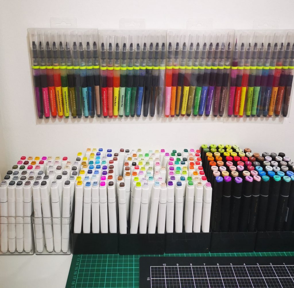
You can choose various methods for hanging them vertically. 1) using a pegboard 2) hang them on a clip or nail or a holder 3) stick it on the wall using a magic tape. I am someone who keep changing my stuffs according to the project I’m working on. So I never wanted to create a mess on my wall. So I always rely on magic tape. It comes out very easily. It’s really easy to reuse or stick it back on place. You’ll have everything in one place and you’ll finally start using some of the vertical space. All of it will come in super handy especially if your craft room is very small.
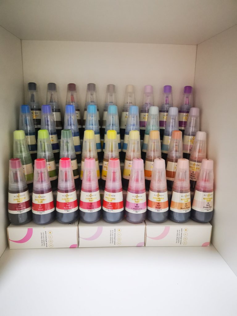
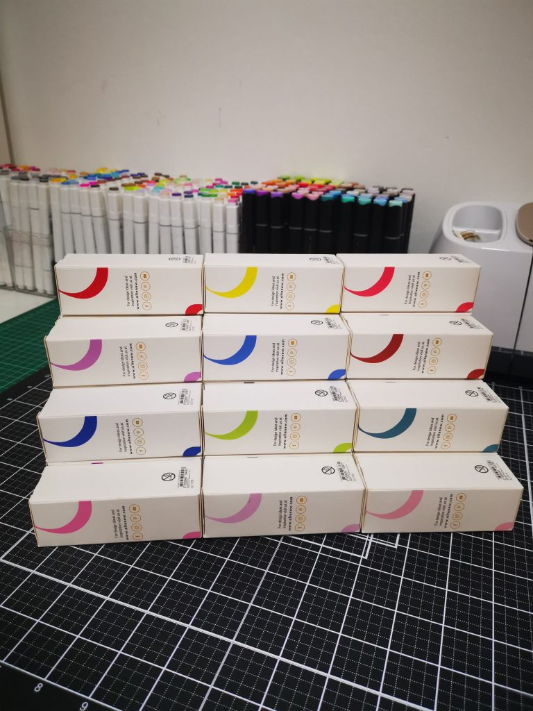
Coming to watercolor brush markers refills. It’s something that you should definitely catch hold of. But organizing them was kind of tricky for me. I wanted to see all the colours in a single sight. It helpes me to choose the right one. That’s why I choose to create my own stand for that. Altenew is always best for its products. Buy it once, you can never stop buying things from them. It’s not just their products, their packaging is also always on my favorite list. So I decided to create a stand for my refills, using their own boxes. And it definitely came out great. Do give a try for yourself.
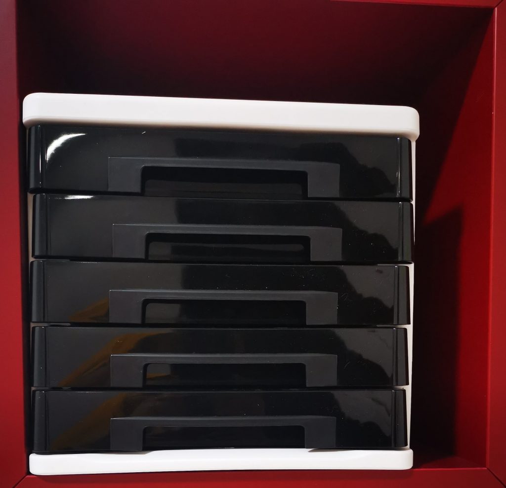
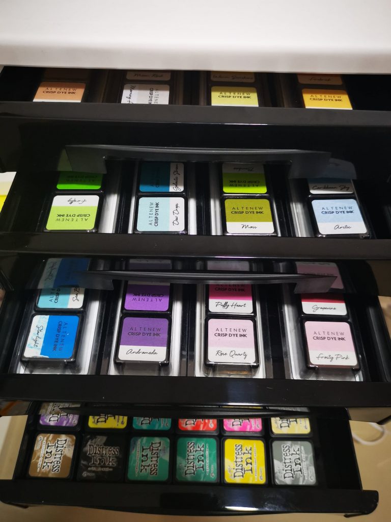
Next having a craft cabinet with smaller sized drawers can get very handy. If you have a bunch of buttons, needles, small decorations lying around, it might be a good idea to organize them. But I have used to set up my mini ink pads. I have a collection of mini distress ink and Altenew crisp die ink. I have loosely arranged my distress ink pads on one shelf. While altenew has a collection of various bundles. I have set them as it is. It helps me to choose color especially while using layering stamps. This plastic container is just for that.
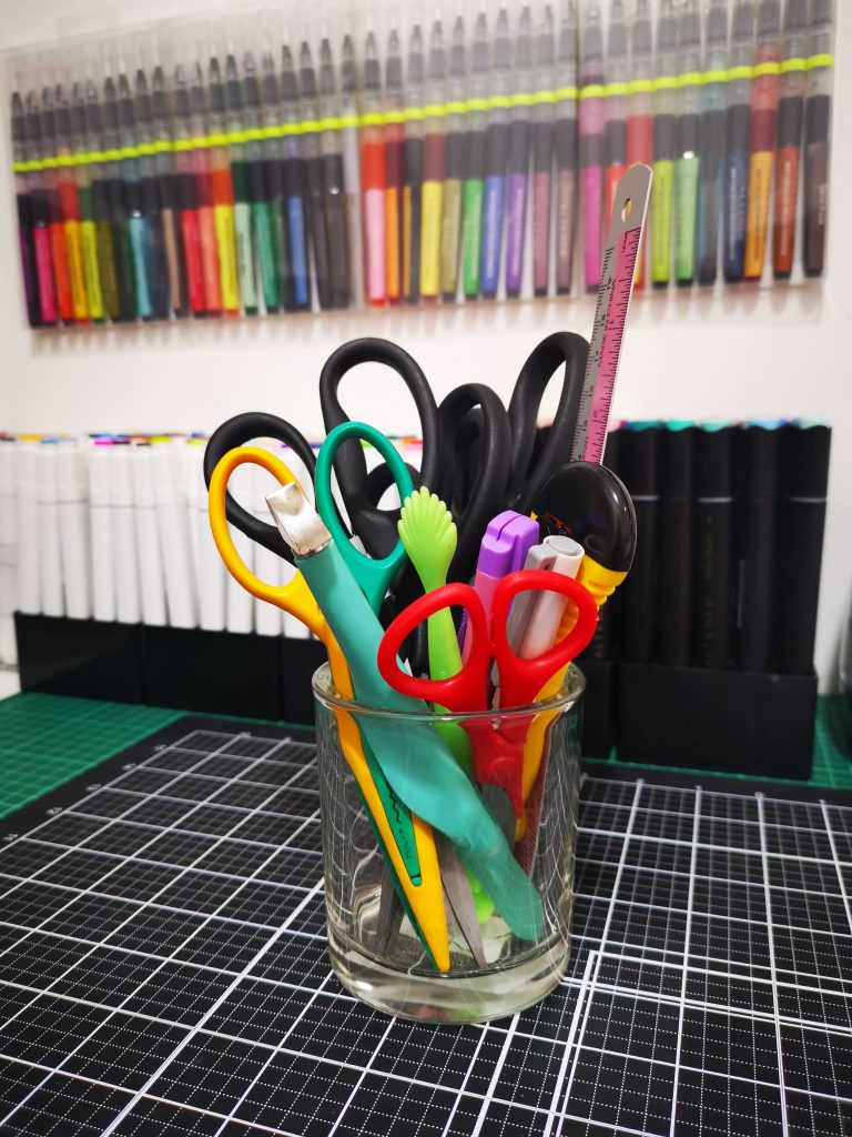
Pencil holders are great for not just pencils. Use them to store brushes, markers, sticks, or anything else that would get lost otherwise. I have used it to hold my scissors and blade. Get creative, introduce a few colorful objects here and there, and make the whole room livelier. Small details like that do matter.
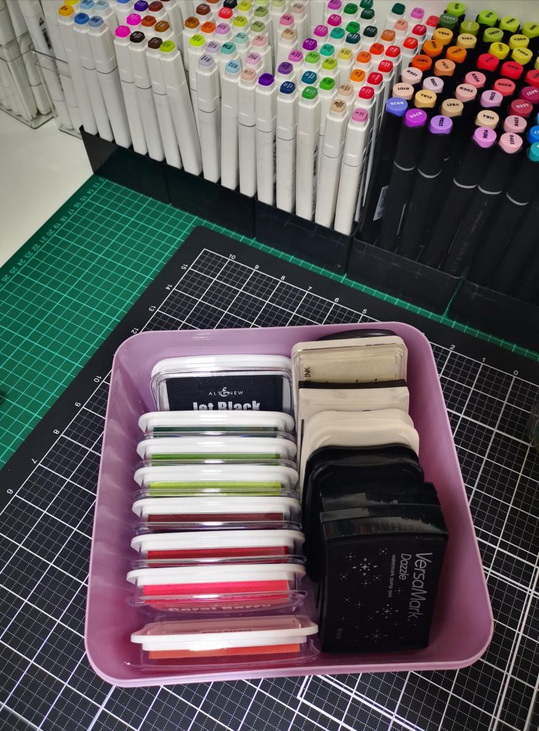
The truth is, you can get your craft room organized with a very small budget. All you need to do is go to the Dollar Store, get whatever seems proper for storage, and arrange something of your own. This little organizer is a perfect example of a cheap way to get things organized. Keep it on your table or on shelves.
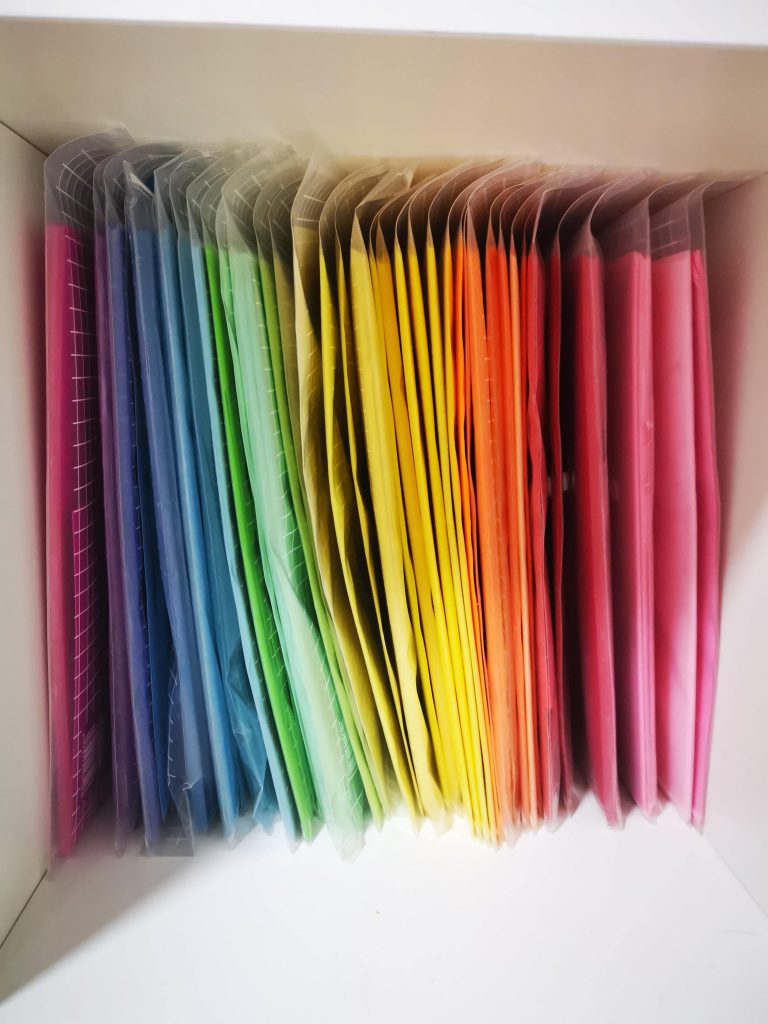
Organizing papers is a hectic task for many. I choose to keep them in clear bag. Sorting them in color helps us to choose the correct one needed for our project. For a crafter there is no piece called waste piece. So I sort the extra cut pieces and place them in the same clear bag . So that they can be used for future use
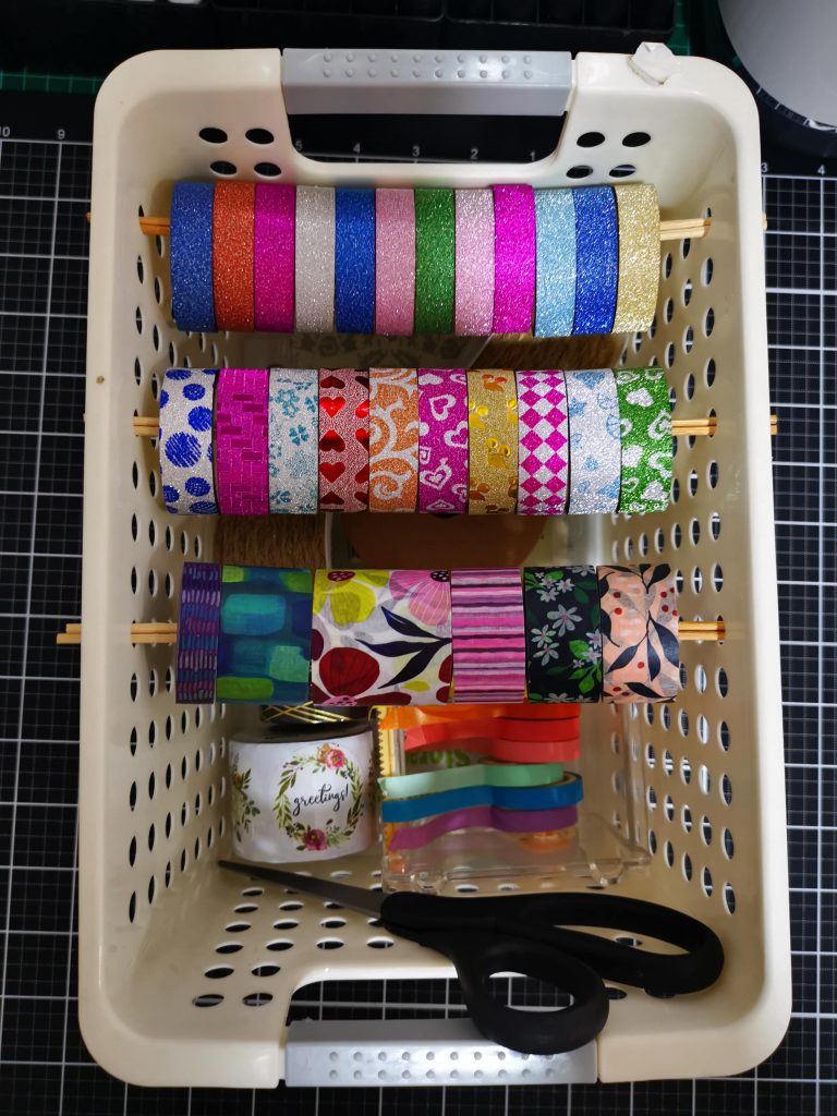
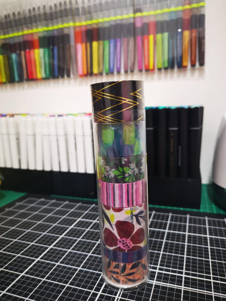
Coming to washi tapes, Organizing them can be done in various ways. I choose to hold them in 2 ways. 1) storing in it’s own containers. Altenew has some awesome containers for its washi tape bundles. try them. 2) Grab a container with holes on the sides from a dollar store. I have inserted them on a stick and placed it in-between the holes. I have also placed a washi tape organizer inside the same basket. along with a pair of scissors.
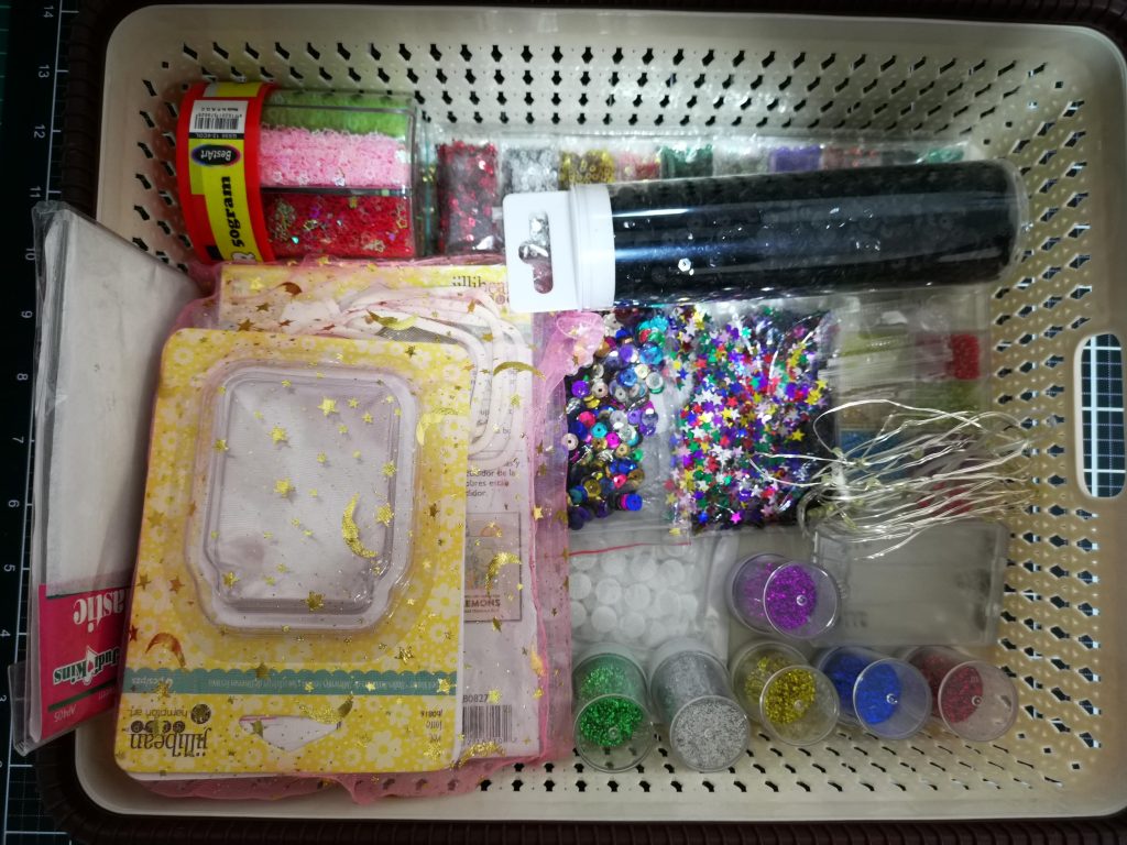
Another way of classifying your items is to grab a basket and sorting them according your criteria. I have kept all my interactive card accessories in one basket. while watercolor items are being kept in other. Thus it make things more easy and helpful for us while making a card.
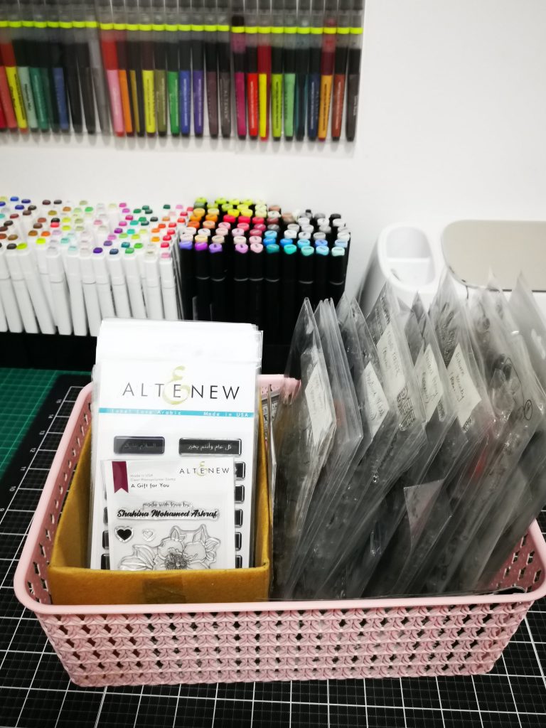
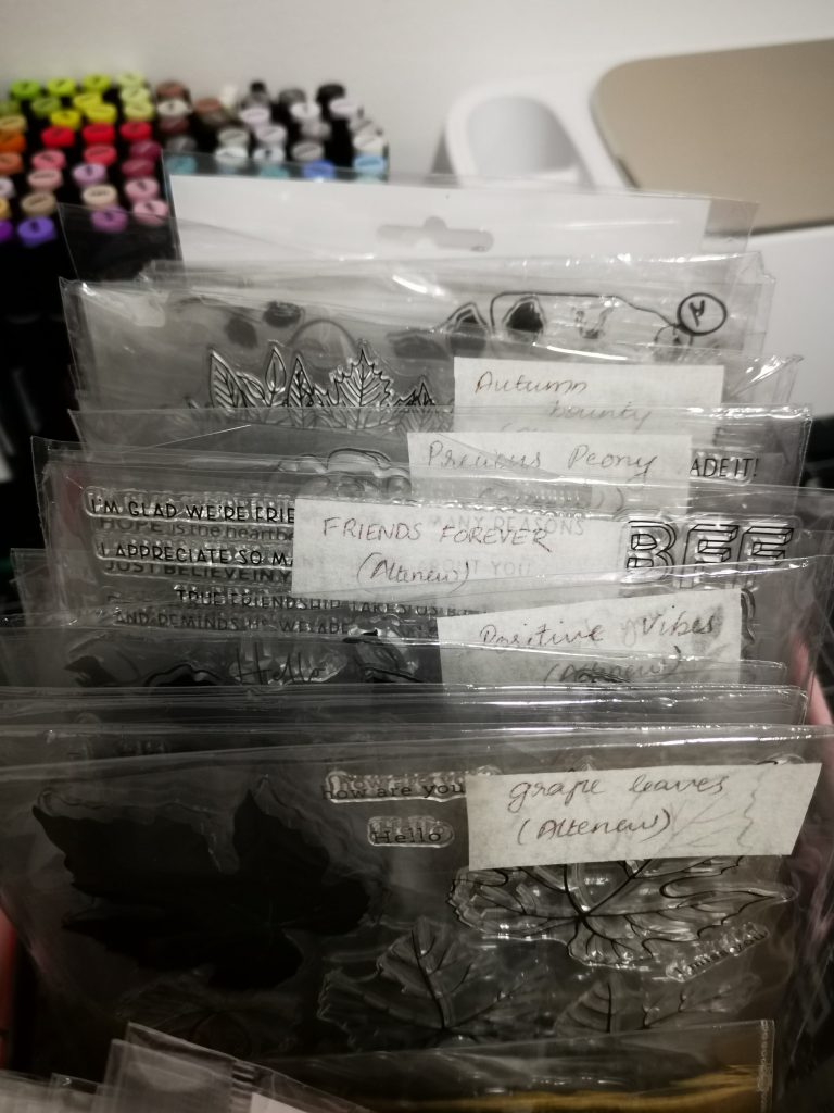
Stamps can also be stored in containers or baskets. I have divided into two and stored the smaller ones in a smaller card box. While bigger stamps where put in clear acetate bags got from the dollar tree. a piece of white tape was stuck on the top of it and the name of the stamp set and its corresponding brand name was written on it. I have also placed the coordinating die set in the same bag.
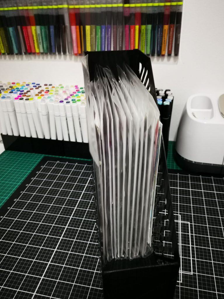
Stamps can also be kept in table holders like this. Here I have kept the stamps as it is. All of the above stamps are from altenew so they have same package sizes. which makes things easier to organize.
I have used similar holders to keep my nesting or stand alone dies . My stencils are also being organized the same way. Another way to organize dies are using magnetic sheets. Unfortunately my shipment got delayed, so cant feature it in the blog.

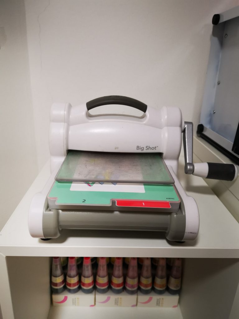
Keeping your machine handy is another tip while organizing your stuffs. I have kept my cricut Maker on the table, while my sizzix Big shot is being placed on the top of my shelf.
I have also put up a floating shelf on the wall, where I usually place my latest or most favorite works. It in fact ,motivates you to do much better. So what are you waiting for, Start crafting, let your creative juices flow, and create a space that encourages you to feel more like yourself.
I would like to use this opportunity to thank Karo Tries ( craftsy hacks) for being such an inspiration. And Yess … I’m participating in the Creativity Inspired: Simply Organized Craft Room Makeover Contest! by Altenew.
Go give it a try. No matter how small your craftroom is. I know that definitely going to be your HAPPY PLACE.

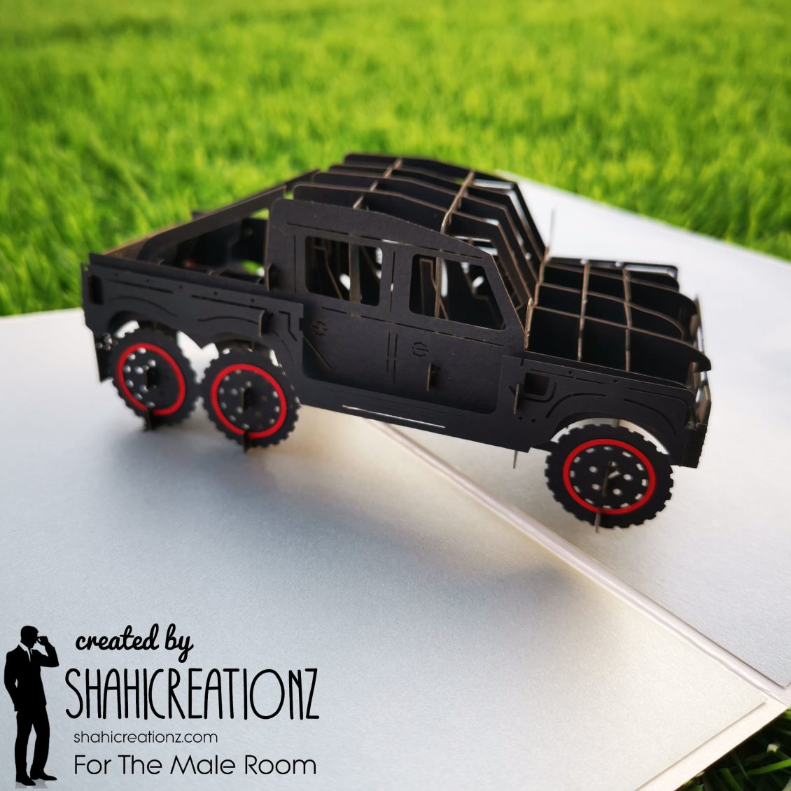
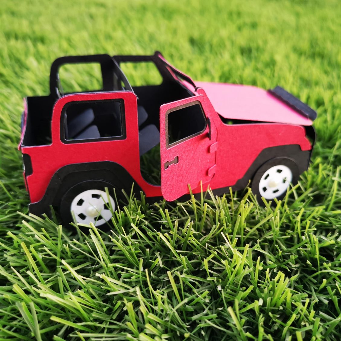
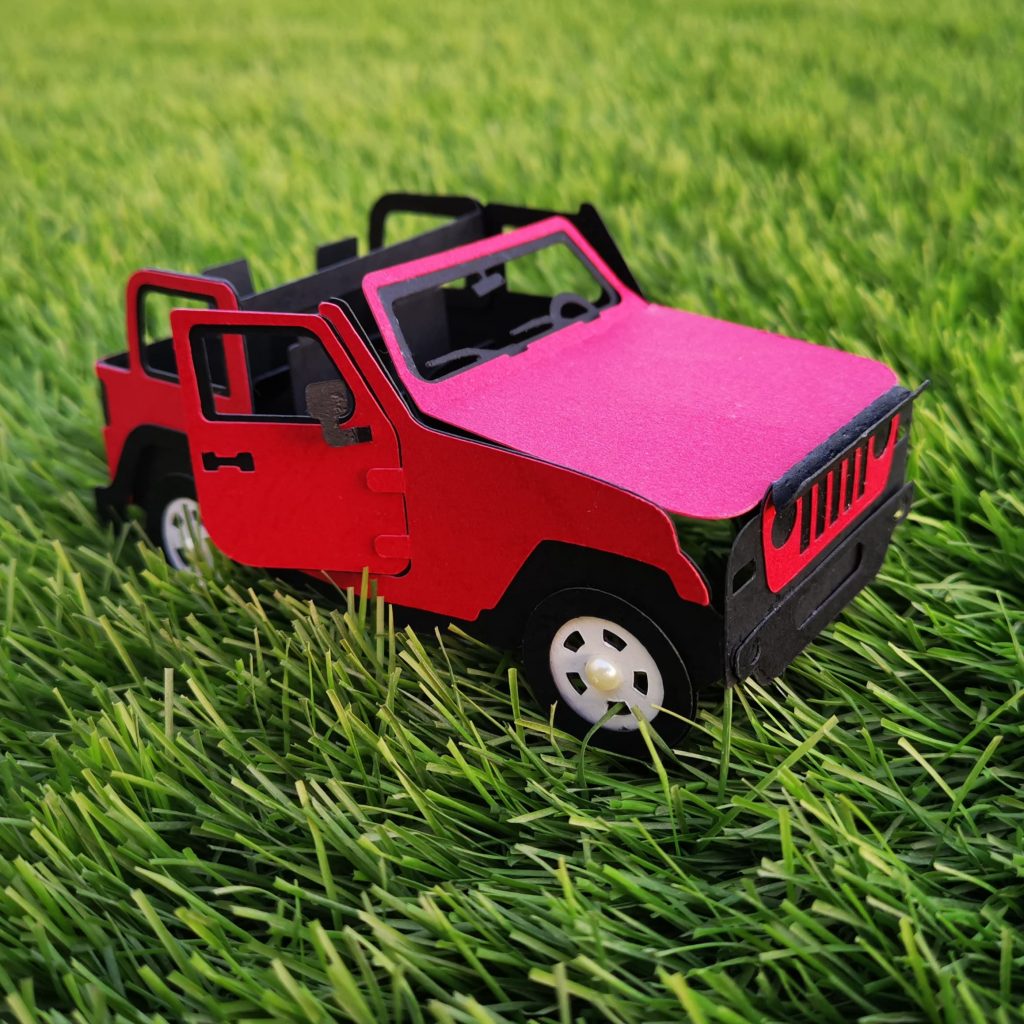
Truck Pop up card
The Male room craft challenge has always been a happy place for me. I used to eagerly wait for its new challenges and announcements.
As you all know, I was one among the honourable Mentions on their Challenge #137 – Landscapes
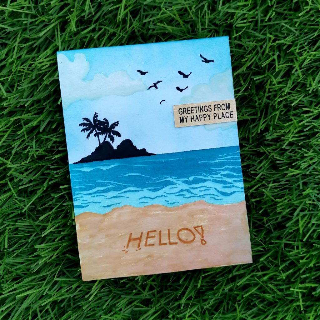
Then I was selected as the winner of the Challenge #140 – Sport

Each time I was really happy and excited to receive these mentions.
But I had no idea what was about to happen next. I got an invite from Jane, to be a design team member of my favorite challenge blog – The Male Room.I’m honored to accept this position in the team and will work hard to make the team proud!
The theme of the new challenge today on The Male Room Challenge Blog and theme for this month : Challenge#144 Toys.

So here is my first DT card for The Male Room Challenge Blog. Subhanallah!! I’m on cloud nine! All excited and thrilled.
Have a look at the challenge blog here for all the challenge details and to see the cards from the rest of the Design Team. https://themaleroomchallengeblog.blogspot.com/2020/11/challenge-144-toys.html
The toy I choose to work with this project is “truck”. Truck, jeep, aeroplane etc are one among the favorite toys, a baby boy would love playing with.
I have cut down the parts of the truck using my Cricut Maker. I have chose black cardstock paper for the truck. While the base of the card was done with white and shimmer golden cardstock. To give an added look to the card, I choose red cardstock paper for rings of the tyre.
Hope you all like it. Do share your valuable thoughts with me.

I am also entering my pop up card to AAA birthday card challenge #Game 19 – For A Child
Go check out their page and do enter the challenge. https://aaabirthday.blogspot.com/2020/11/game-19-for-child.html?m=1
Jeep Popup card
My brother fell sick last day, and stayed in bed throughout the day. So, I wanted to make something that cheers him up from bed. That’s when this idea popped up in my head. I decided to make him a miniature 3d pop up card of his jeep. His jeep is something which is really special for him. He has named it “Raphael” . I just want him to start missing those rides on her. And it did worked out.

This is his jeep, isn’t it just beautiful ♥️
Now here are some snaps of my Pop up card.
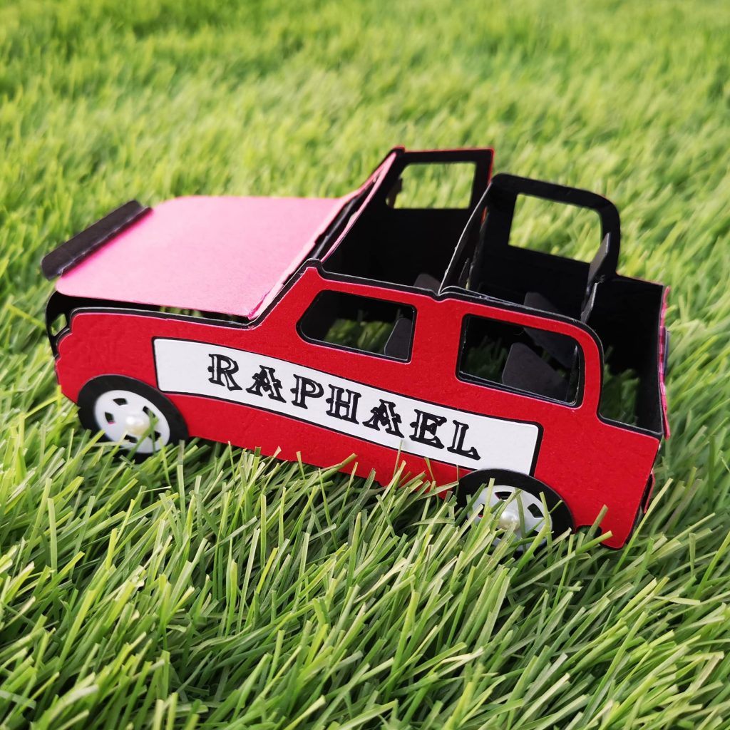
As she is someone who has taken him for all his memorable drives, I thought of entering this popup card into @themaleroomcraftchallengeChallenge #142 – Travel
Try Entering your challenge using the link below :https://themaleroomchallengeblog.blogspot.com/2020/09/challenge-142-travel.html?m=1

Wanna see how it pops up? Here it is….
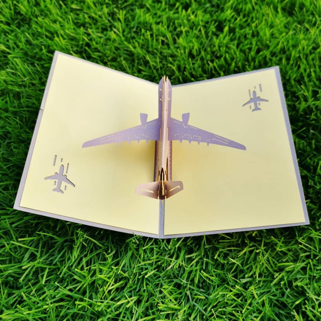
I know this lock down has made us all set at home. My hubby who usually travels every month for official meetings is with me here at home.
So I thought I would dedicate this travel card for him.
Here it is.. An aeroplane pop up card.
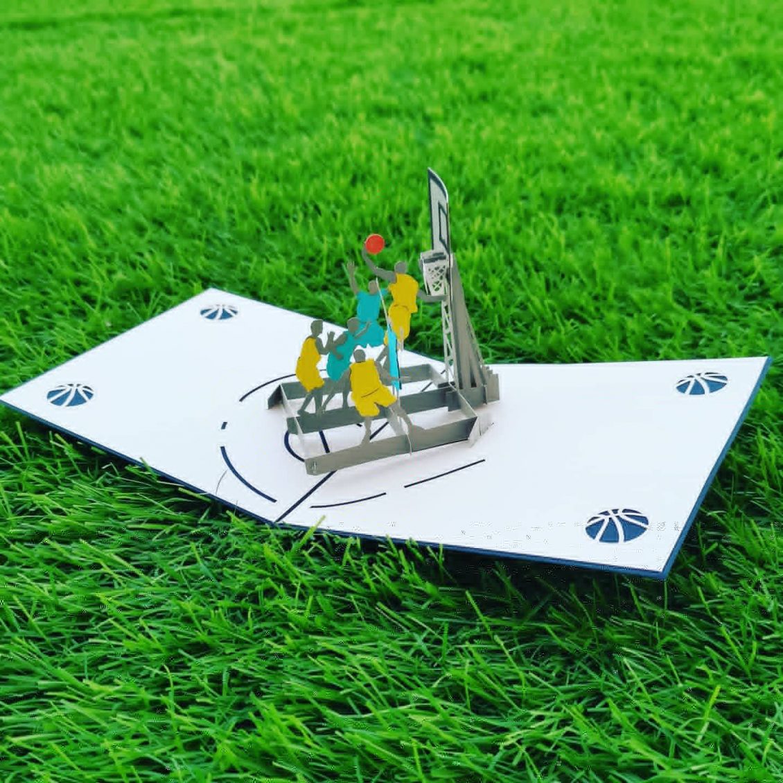
Basketball pop up card
Here is another pop up card from @shahicreationz made exclusively for my husband. He is one of the best basketball player I have ever met in my life. “Ability may get you to the top, but it takes character to keep you there. I’m really proud of you my dear ❤️”
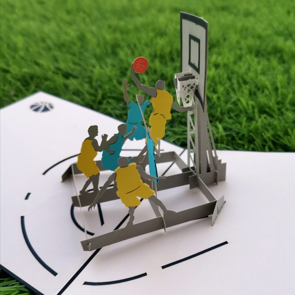
I’m also adding this card to the maleroomcraftchallenge for the month of July. (Challenge #140 – Sport)

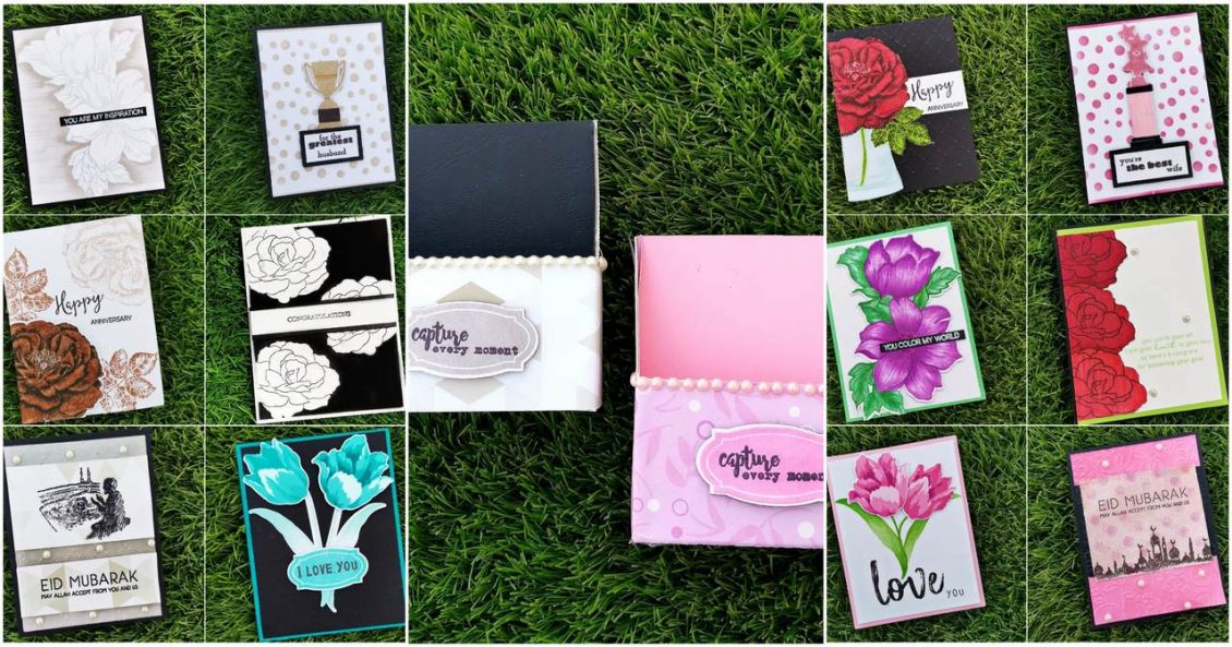
AECP Level 1 – Final Challenge
I cannot believe I am finally here, writing a post for Altenew Academy – AECP Level 1 – Final Challenge and am so excited to share my projects I have created for this challenge!
My challenge contained in
- Some components learned from the classes in Level 1,AECP
- Sets of Feminine cards and Masculine cards . (which is not easy for someone like me who loves flowers and try to incorporate them into most of my cards)
- Cards with similar and cohesive theme as the rest of the set
- a minimum of 4 to 12 cards per set
- Everything packed in a very nice way that can be give to your loved one
- Inserted a recycled thing in the project
As a part of basic planning, i decided to set a theme for my masculine and feminine card sets. For that i choose two color pallets from the internet.
The male color palette includes colors such as black,light grey,dark grey,dark brown,light brown,dark turquoise etc.
While the feminine color pallet includes colors like mulberry,dark pink, light pink, off white,red ,green etc.
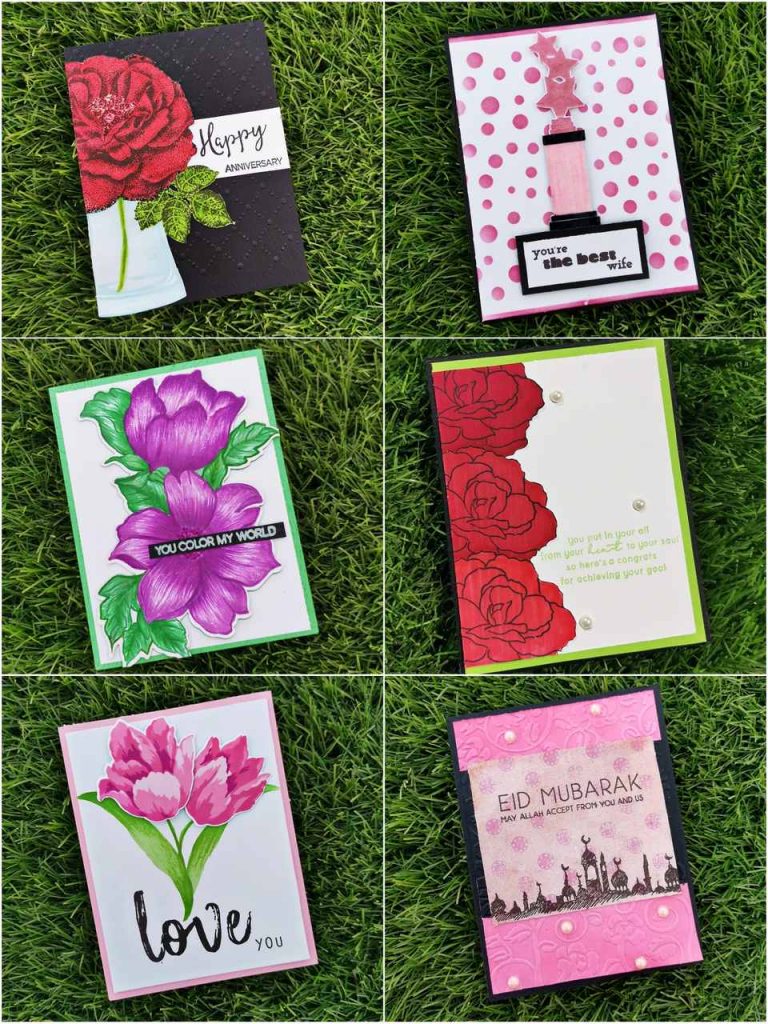
Then i categorized the cards into different themes and occasions, each pair of cards were made with the same stamp set reciprocal to their color theme. Here, i am planning to introduce the cards according to their theme. and they are as follows:
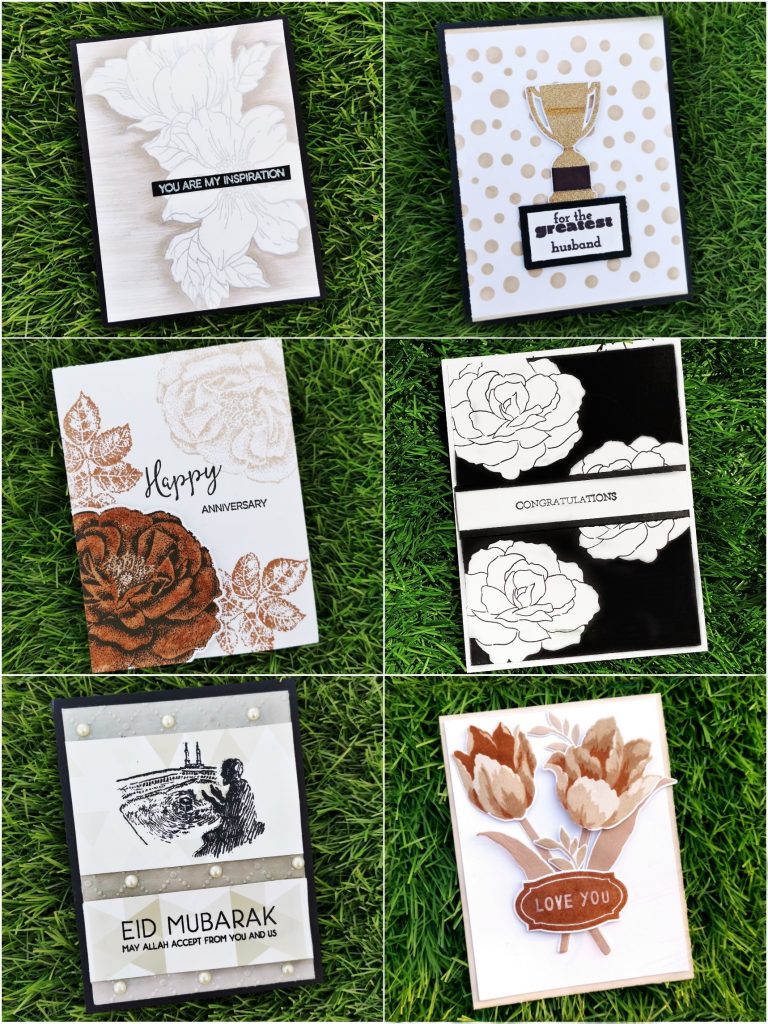
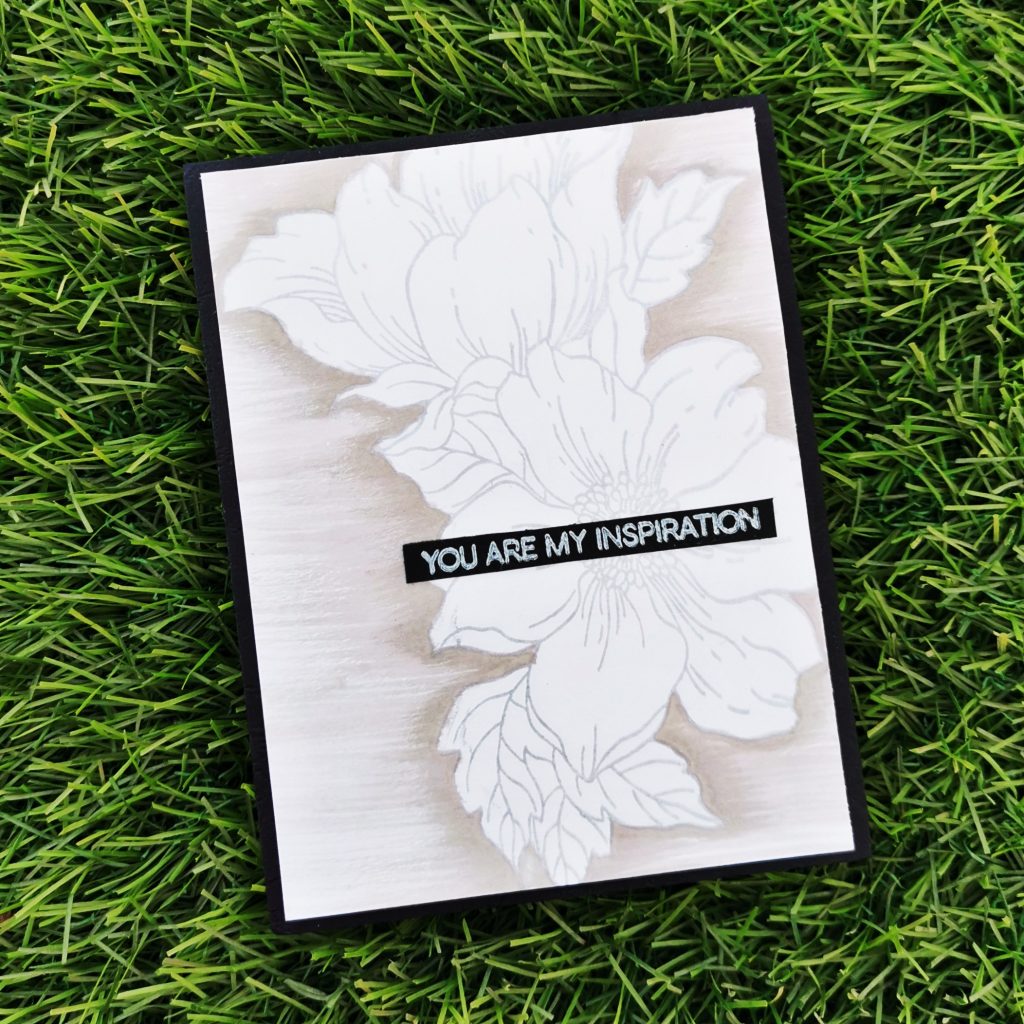
1. Inspiration Card
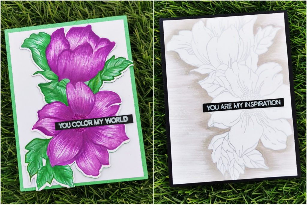
Telling someone that they have been an inspiration for you is like making them feel happy of their existence in your life This inspiration card is something like that.
a) Masculine Card
Products used-
Ink:
Limestone crisp die ink from Altenew
silverlake crisp die ink from Altenew
Tsukineko Versa Mark Dazzle Pigment Ink
Hero Arts Unicorn Pigment Ink
Stamps and Dies:
Statement flower stamp set from Altenew
Halftone Circles stamp set from Altenew
Other:
Neenah classic crest white card stock
black card stock paper
Water color palette from altenew
watercolor brush from altenew
Misti stamping tool
Methods used-
Irresistible inking techniques( Painting with Ink pads )
Clean and simple boutique cards(simple styling /metallic details)
For The Guys
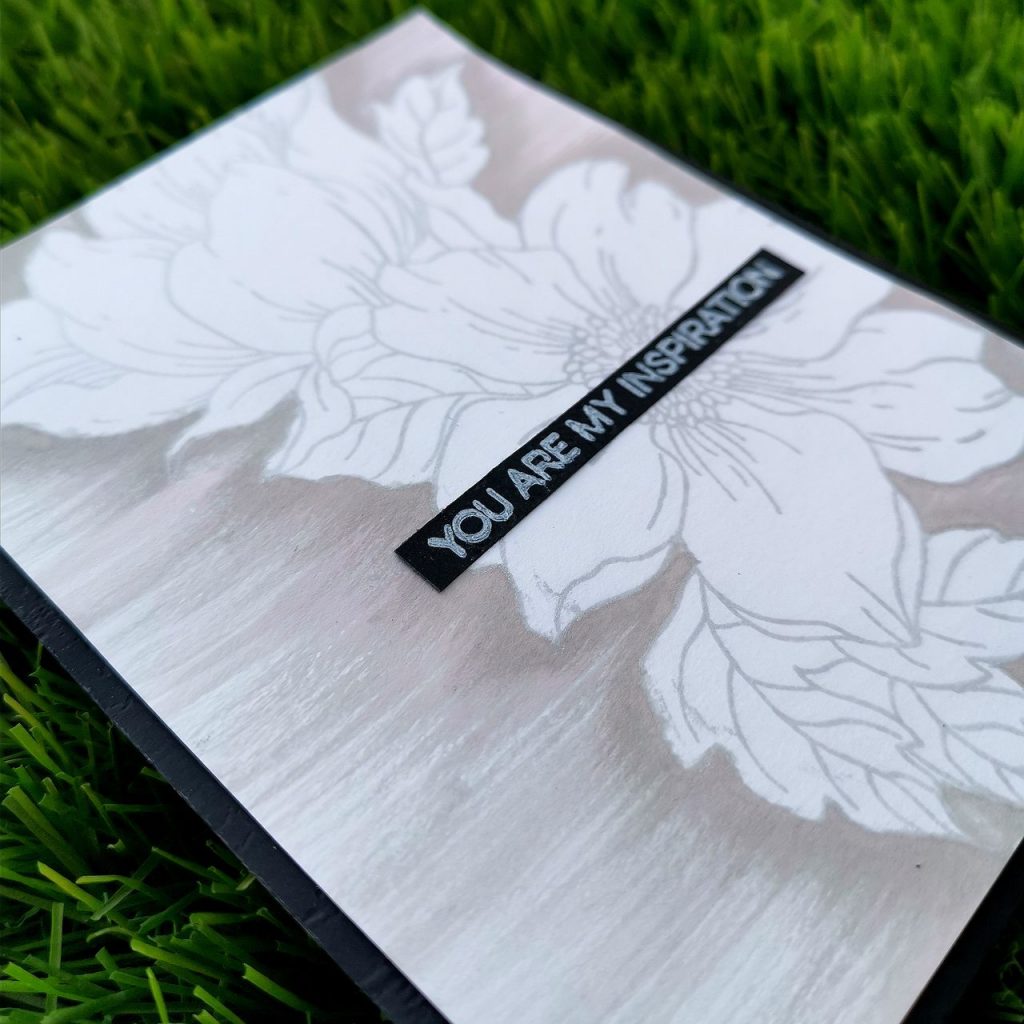
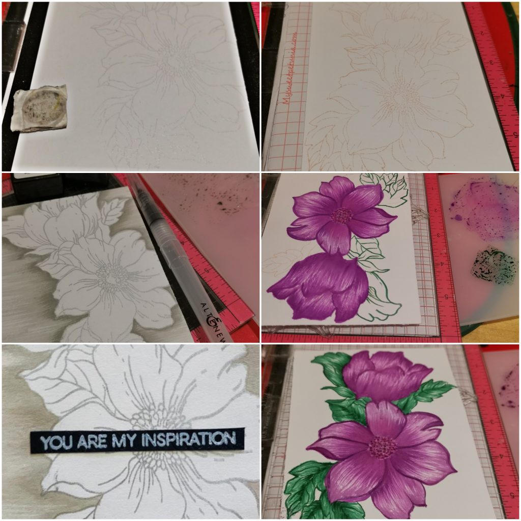
Sometimes all you need to create an amazing card is plain white cardstock, a stamp and some ink. So I trimmed a white card stock into 4*5 1/4 and stamped a flower from statement flower stamp set with Dazzle pigment ink. Then I stamped the crisp die inks on my watercolor pallet and blended them with my watercolor brush . i blended the outline of the flower with it from darker to lighter shade .Once done,I stamped a sentiment from the halftone circles stamp set ”you are my inspiration” on a black card stock paper and trimmed it into a sentiment strip and glued it to the middle of the flower. finally i stuck this card to a 4 1/4 *5 1/2 black card stock paper. If you focus on the card,you can find that the shadings are done in a particular direction. Its acombination of various horizontal lines. It helps us to get the gradient look on the card ,as well as the geometrical feature gets fullfilled. One of the best things about these cards are that they are the easiest to create, and perfect for beginners.
b) Feminine Card
Products used-
Ink:
Midnight violet Dye Ink from Altenew
lavender fields Dye Ink from Altenew
Deep iris Dye Ink from Altenew
Hunter Green Crisp Dye Ink from Altenew
Sweet leaf Crisp Dye Ink from Altenew
Just green CrispDye Ink from Altenew
Scattered straw distress ink
Hero Arts Unicorn Pigment Ink
Stamps and Dies:
Statement flower stamp set from Altenew
Halftone Circles stamp set from Altenew
Other:
Neenah classic crest white card stock
Misti stamping tool
Watercolor palette from altenew
Watercolor brush from altenew
Black card stock paper
Green card stock paper
Methods used-
Irresistible inking techniques( Painting with Ink pads )
Easy die cutting ( Stamps and Matching Dies )
Clean and simple boutique cards(simple styling)
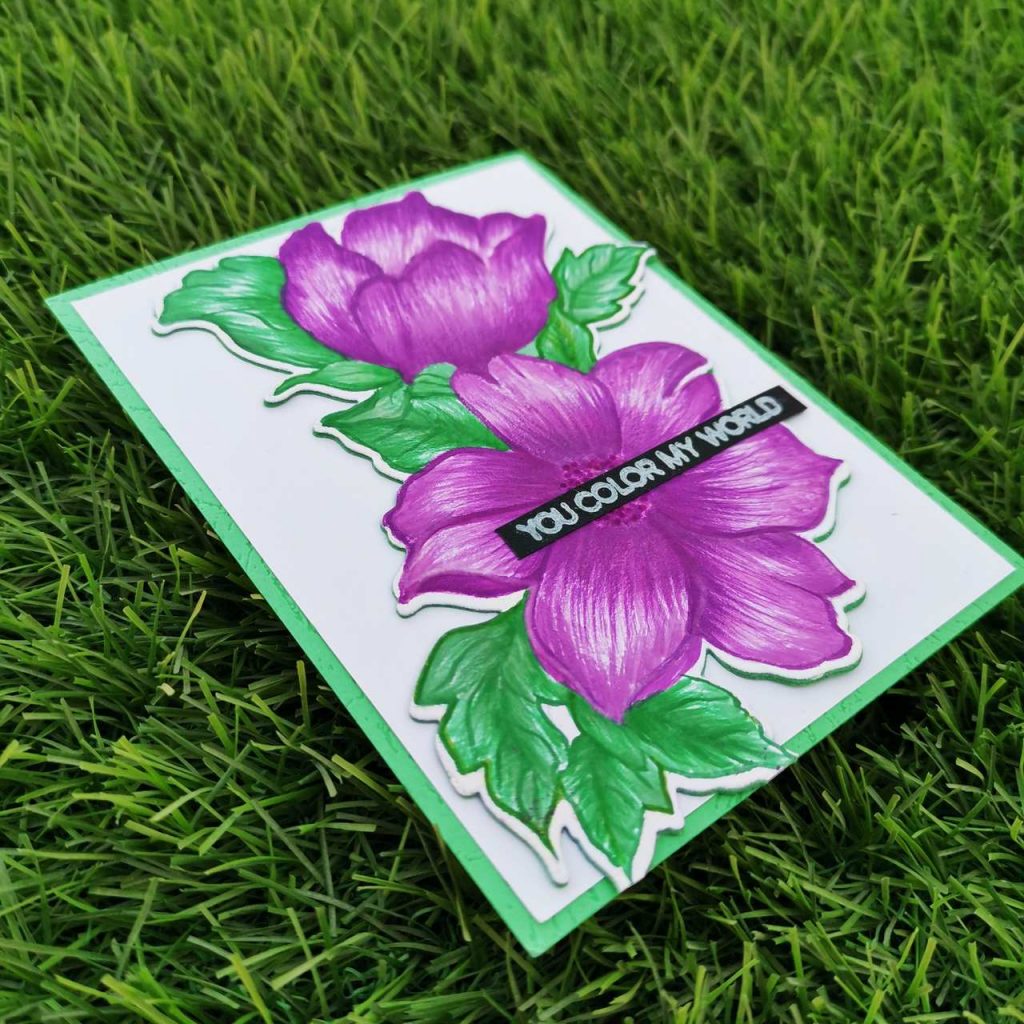
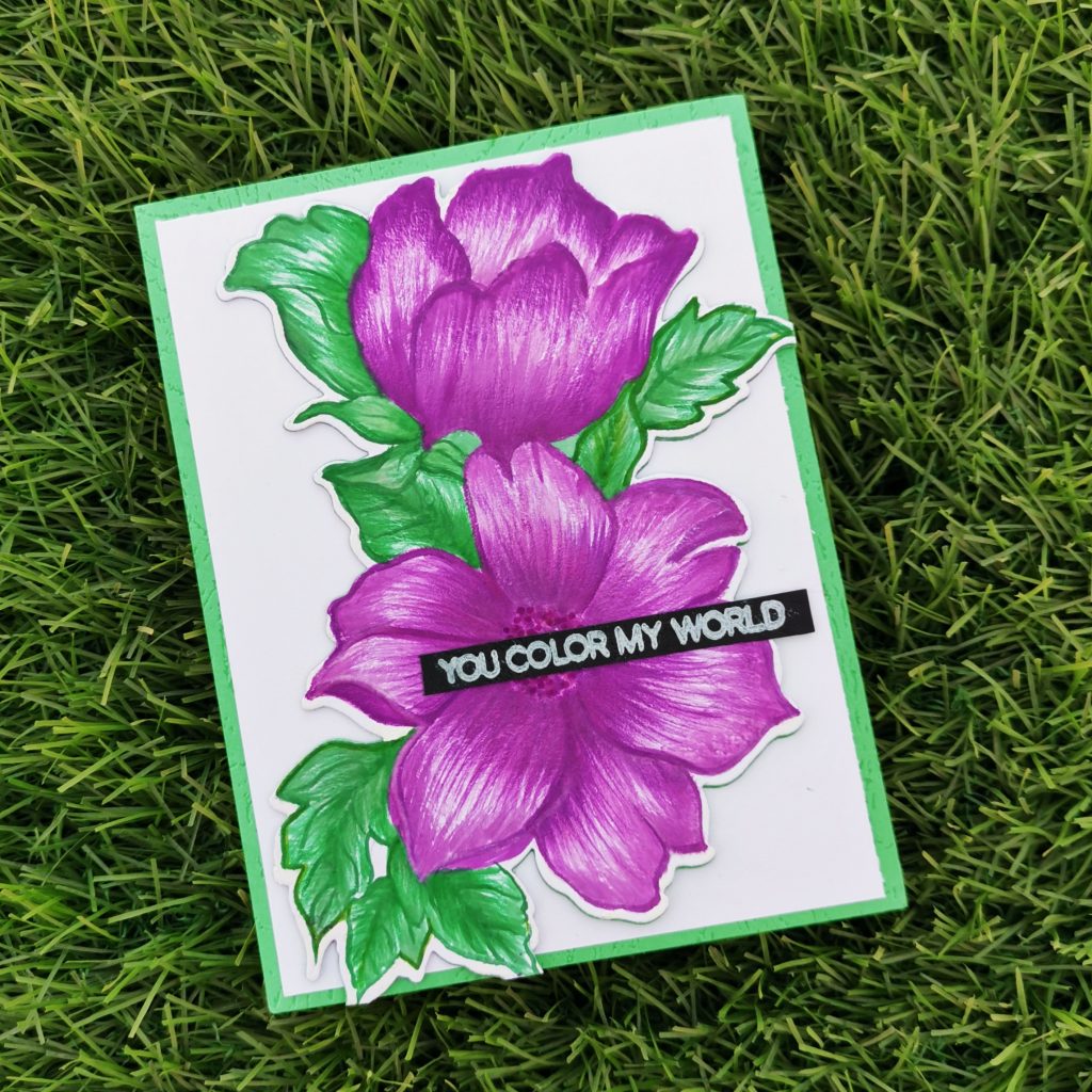
I stamped a flower from statement flower stamp set with distress ink on a white card stock paper. After stamping my crisp die inks on my watercolor pallet I painted my flower with it. Then die cut it with its coordinating dies. And stuck it on a trimmed white card stock of 4*5 1/4. Once done,I stamped a sentiment from the halftone circles stamp set ”you color my world” with white pigment ink on a black card stock paper and trimmed it into a sentiment strip and glued it to the middle of the flower. finally i stuck this card to a 4 1/4 *5 1/2 green card stock paper.
2. Appreciation Card
A special way to tell your spouse how much you love and appreciate them.
a) Masculine Card
Products used-
Ink:
Sand Dunes Crisp Dye Ink
Rocky Shore Crisp Dye Ink
Stamps and Dies:
Trophy Life Stamp set
Other:
Neenah classic crest white card stock
Embossing Ink from Altenew
Tinsel gold, Ranger Embossing powder
Round circle stencil
Sizzix bigshot die cutting machine
Kokuyo Dotliner strong adhesive Tape
Foam tape
Heat gun
Misti stamping tool
HeroArts Embossing heat gun
Methods used :
Clean and simple boutique cards(simple styling /metallic details)
Ink blending techniques (Ink Blend a cardstock)
Easy die cutting ( Stamps and Matching Dies )
All About Layering (1&2)
Let It Shine Lesson (Embossing Powder)
For The Guys(Geometrics)
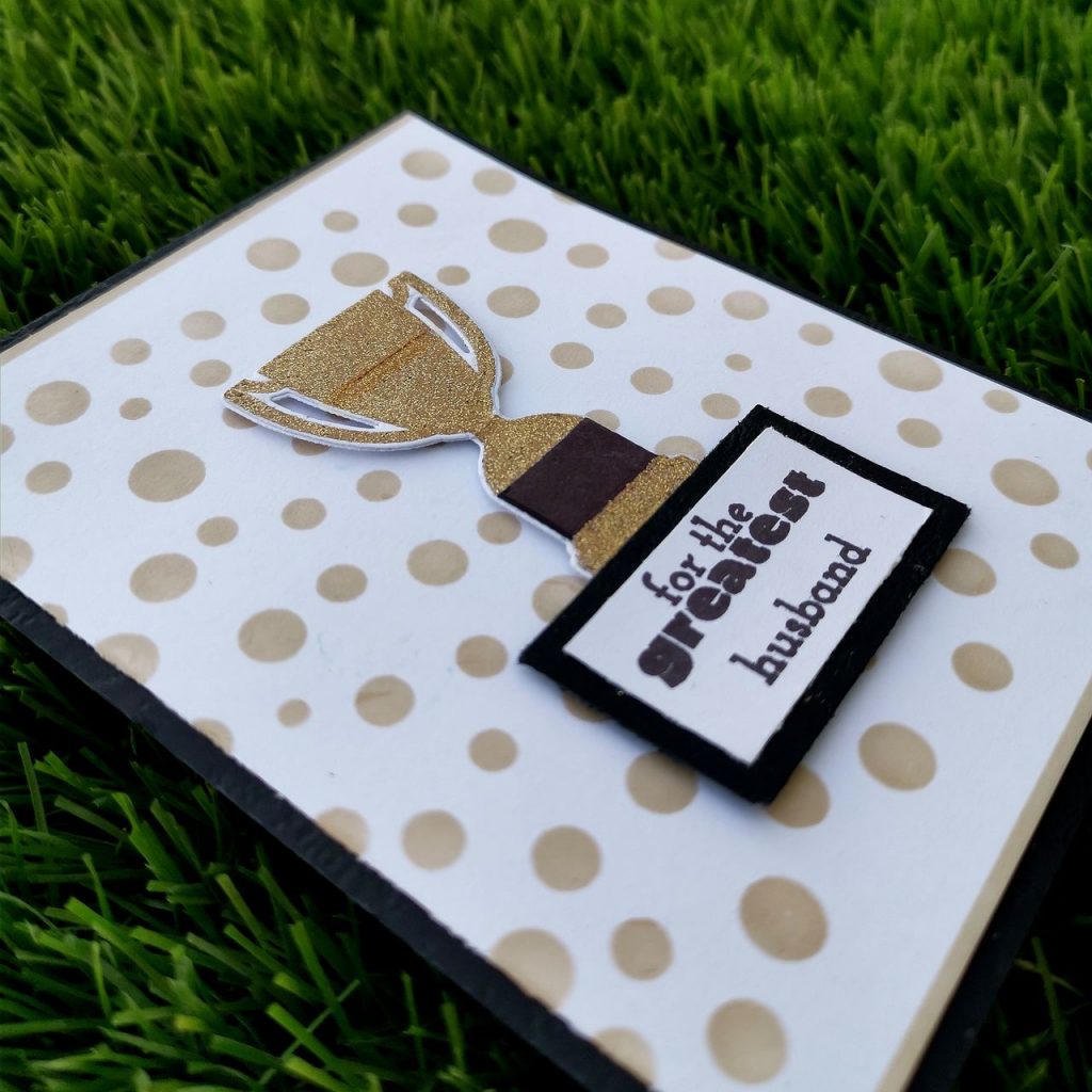
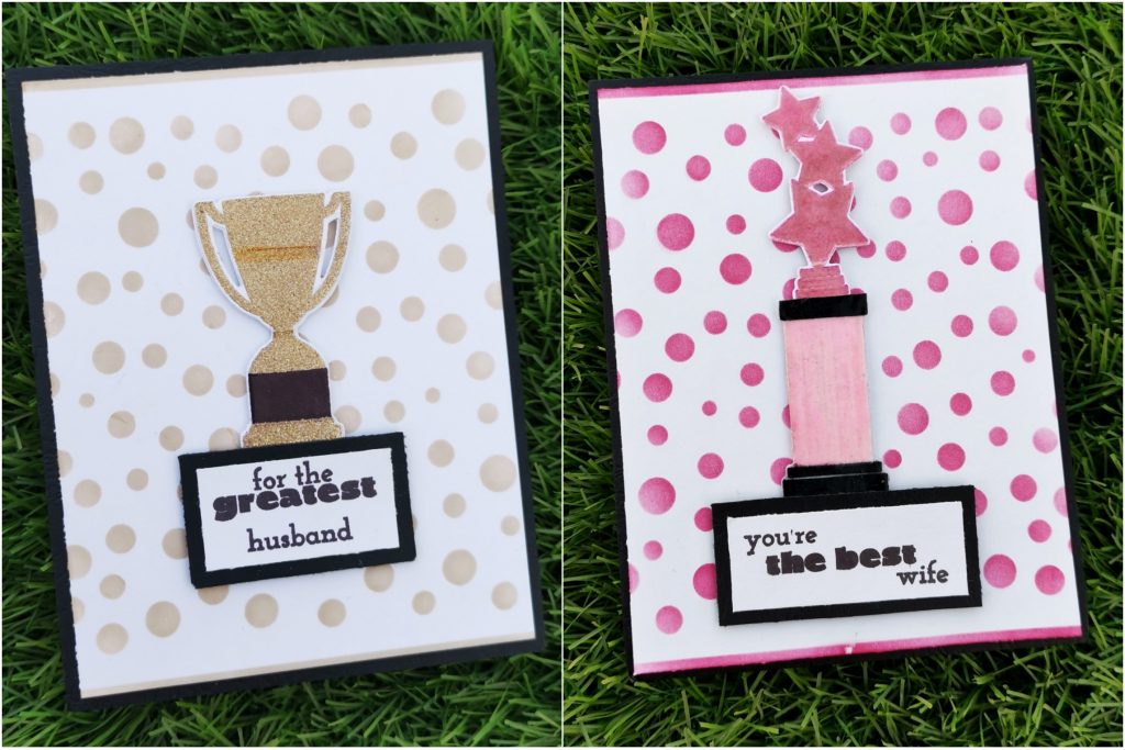
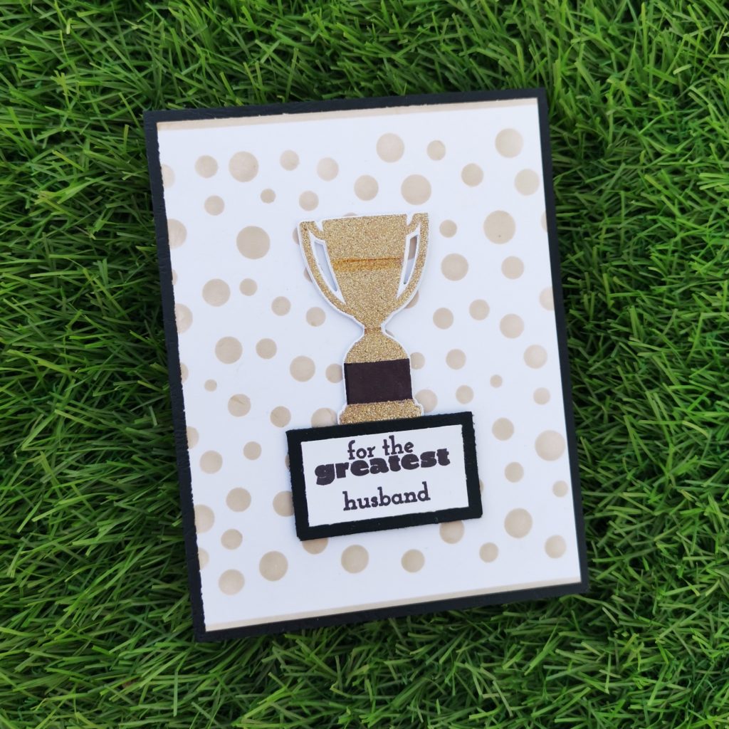
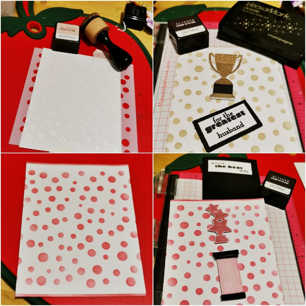
I trimmed a white card stock into 4*5 1/4 and placed the circle round stencil on the card stock. I ink blended Sand Dunes Crisp Dye Ink and Rocky Shore Crisp Dye Ink over the card stock. I also blended a thin strip on the top and bottom of the card stock . These circles add to the geometrical element to the card.Then I took a white cardstock paper and dusted it with some sort of antistatic powder .This fine layer of powder will prevent embossing powder from sticking to areas where you don’t want it to stick.Then I stamped the trophy with clear embossing ink and then embossed it with Tinsel gold Embossing powder from Ranger. Before heat setting my embossing powder, I used a dry brush to sweep away any stray pieces of embossing powder. These little specs will expand as they heat and turn in to blobs. Quickly brushing away strays will give us great results every time. Then I heatset it with my heat gun. The base of the trophy was stamped with jet black. I choose a sentiment from the same set and stamped it on a white card stock paper i trimmed it down and stuck it to a black card stock paper.and later on trimmed that too, leaving a small black border. I stuck it on the base card using foam tape.
b) Feminine Card
Products used- Ink:
Pinkalicious Crisp Dye Ink
Pinkalicious Crisp Dye Ink
Rubellite Crisp DyeInk
Stamps and Dies:
Trophy Life Stamp set
Other:
Neenah classic crest white card stock
Embossing Ink from Altenew
clear Embossing powder from Altenew
Round circle stencil
sizzix bigshot diecutting machine
Kokuyo Dotliner strong adhesive Tape
Foam Tape
Misti stamping tool
HeroArts Embossing heat gun
Methods used-
Ink blending techniques (basic ink Blended background/emboss resist)
Easy die cutting ( Stamps and Matching Dies )
Irresistible inking techniques( Painting with Ink pads )
All About Layering (1&2)Let It Shine Lesson ( Embossing Powder)
I trimmed a white card stock into 4*5 1/4 and placed the stencil on the card stock. I ink blended it with Pinkalicious Crisp Dye Ink and Rubellite Crisp Dye ink. I also blended a thin strip on the top and bottom of the card stock . Then on a white card stock paper I stamped the trophy with the same crisp dye inks and then stamped clear embossing ink on it. It was a must to prep my surface with some sort of antistatic powder tool before clear embossing it. This fine layer of powder will prevent embossing powder from sticking to areas where you don’t want it to stick.
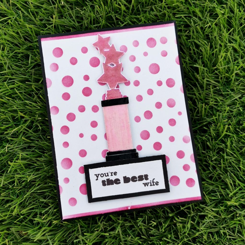
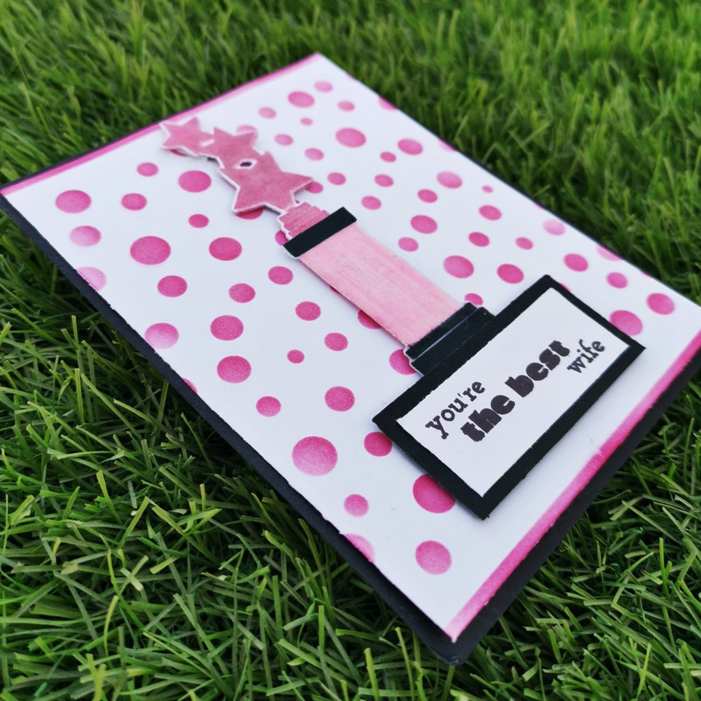
Then I embossed it with clear Embossing powder from Ranger. While heat setting it, I made sure to Heat it to the max. I made my heat tool to heat up to its hottest point before taking it to the paper. This will minimize the amount of time it takes for the powder to melt and will minimize warping. The base of the trophy was stamped with jet black. For the middle portion of the trophy ,I stamped my crisp die inks on my watercolor pallet and I painted that part with it. I choose a sentiment from the same set and stamped it on a white card stock paper i trimmed it down and stuck it to a black card stock paper.and later on trimmed that too, leaving a small black border. I stuck it on the base card using foam tape.
3. Eid Card
Eid has reached the corner, what else more do you want to celebrate.
a) Masculine Card
Products used-
Ink:
Evening Gray Crisp Dye Ink
Galactic Stream Crisp Dye Ink
Tsukineko Stazon Jet black Ink
Stamps and Dies:
Eid Greetings Stamp Set
Eid al Adha Stamp Set
Other:
Sizzix big shot die cutting machine
Misti stamping tool
Neenah classic crest white card stock
Black card stock paper
Sizzix Embossing folder
recycled envelope
sticking pearls(white)
Methods used–
Used Recycled product
Easy Ink blending techniques ( ink Blend a cardstock)
Let It Shine Lesson (Embellishments)
For The Guys (Geometrics)
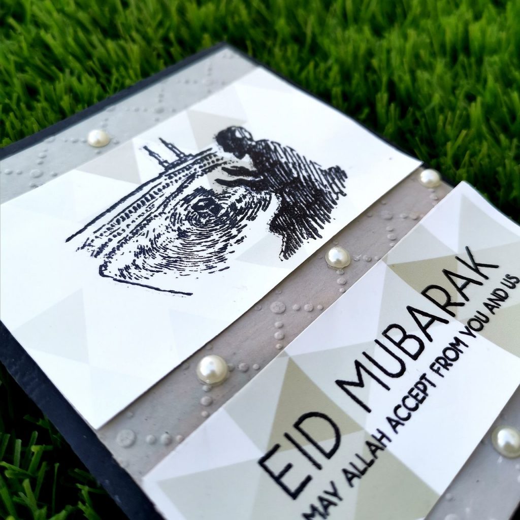
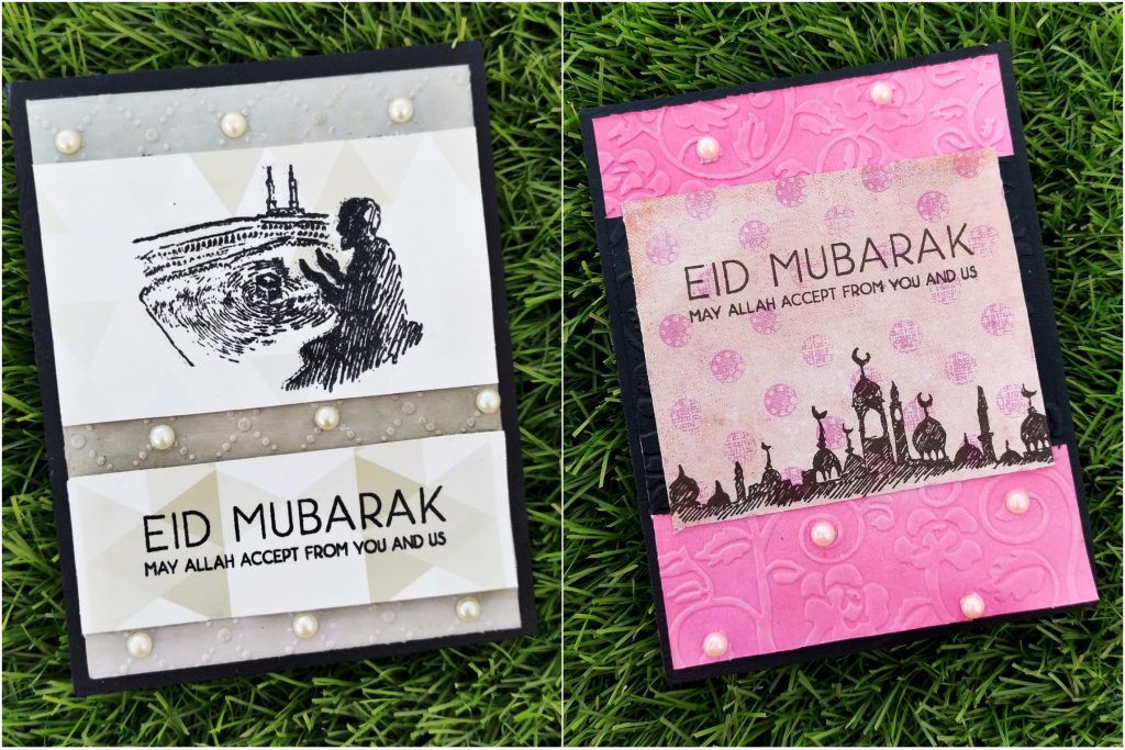
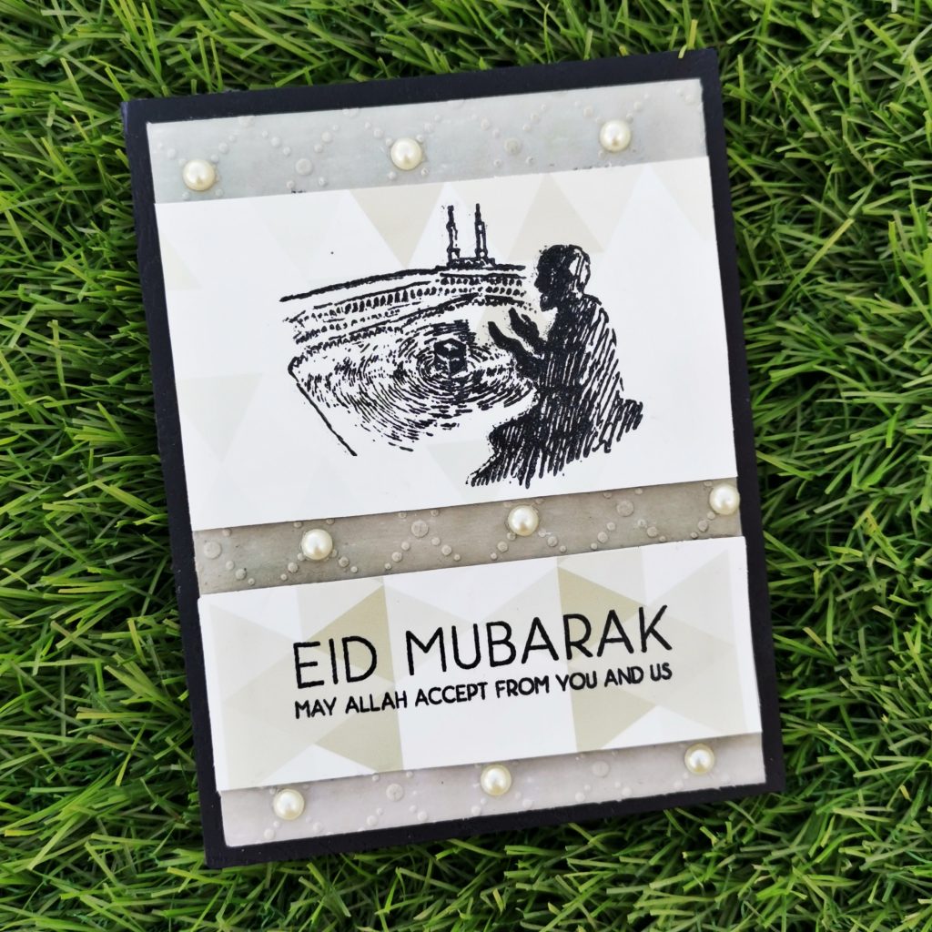
Initially I trimmed a white card stock paper into 4*5 1/4 and ink blended it with my Evening Gray Crisp Dye Ink and Galactic Stream Crisp Dye Inks. Then i kept it between an embossing folder from sizzix and ran it through my big shot die cutting machine. Then I trimmed the recycled paper(i trimmed it out from an envelope, found in my mom’s room) into 2 pieces. The smaller strip was stuck below the bigger one leaving few inches gap. Another reason for me to choose this envelope was due to the geometrical structure on that paper. It has got various number of triangles in diffrent grey shades.This enriches the masculine beauty of the card as a whole. I stamped the haram(mosque with kaaba) picture sentiment on the top piece and the sentiment of eid greetings on the paper below it. Then i stuck some pearls on the embossed areas.
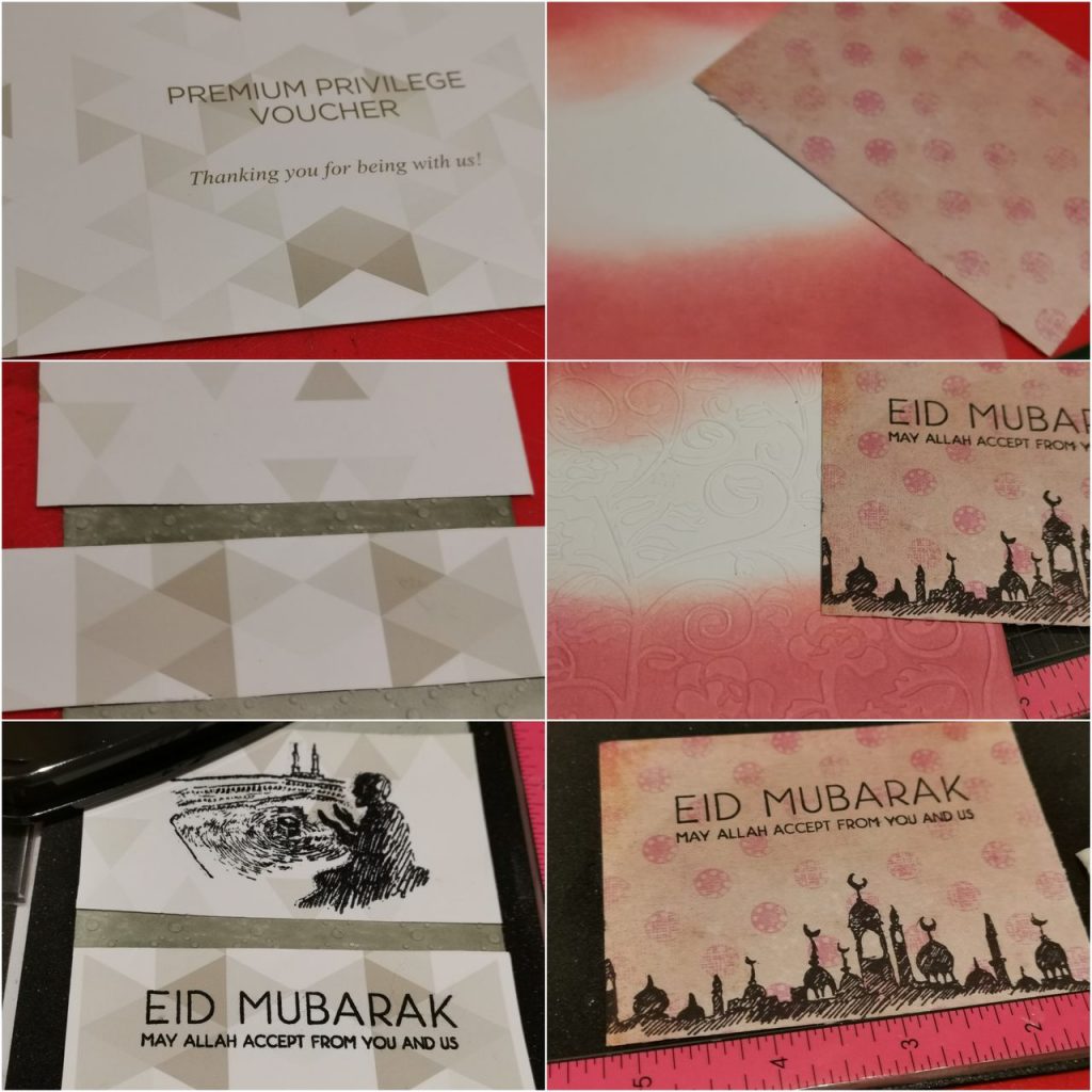
b) Feminine Card
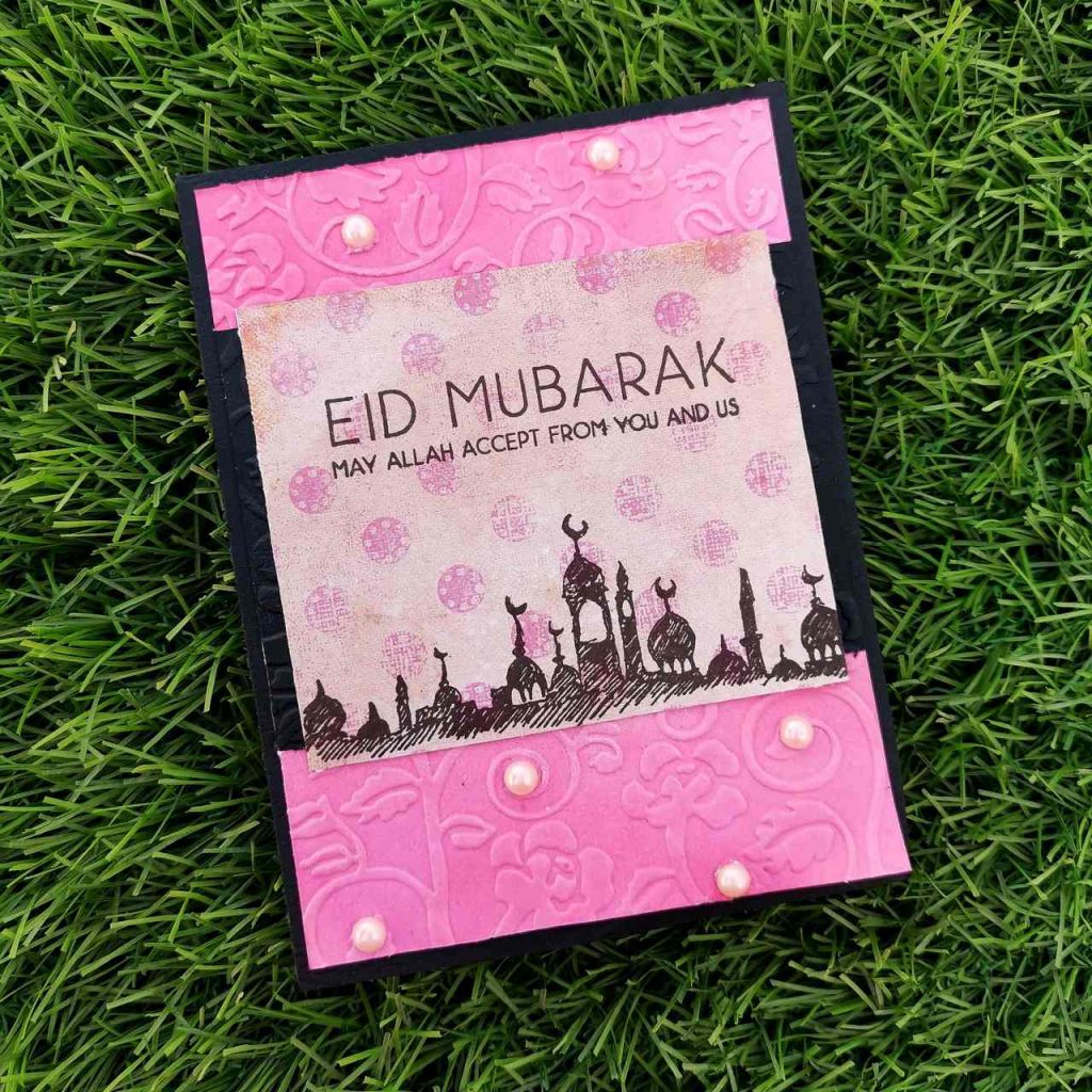
Products used-
Ink:
Pinkalicious Crisp Dye Ink
Coral Berry Crisp Dye Ink
Jet Black Crisp Dye Ink
Stamps and Dies:
Eid Greetings Stamp Set
Eid al Adha Stamp Set
Other:
Sizzix bigshot die cutting machine
Neenah classic crest solar white cardstock
Kokuyo Dotliner strong adhesive Tape
Misti stamping tool
Embossing folder for aliexpress
recycled paper
sticking pearls (pink)
Methods used–
Used Recycled product
Easy Ink blending techniques ( ink Blend a cardstock)
Let It Shine Lesson (Embellishments)
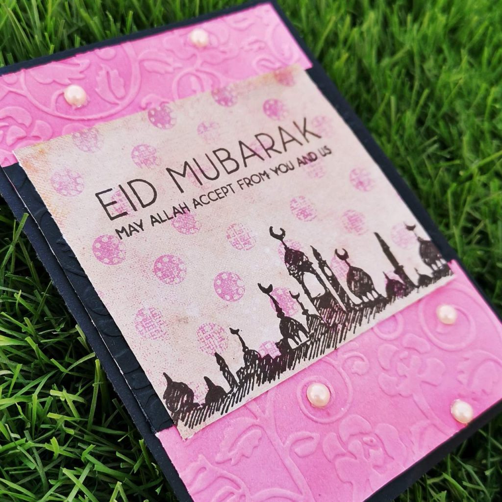
Initially I trimmed a white card stock paper into 4*5 1/4 and ink blended it with my Pinkalicious Crisp Dye Ink and Coral Berry Crisp Dye Inks from altenew. Then i kept it between an floral embossing folder and ran it through my sizzix big shot. Then I trimmed the recycled paper(pink craft paper from a wedding invitation) into a size which fits the width of the card. Here my paper was smaller than the width of the actual card, so i stuck it on a black card stock strip.The pattern paper was an inch more in length than the black strip. Then i stamped the mosque stamp on the bottom part and the sentiment on the the top on the pattern paper with jet black ink. then i struck it on a black card stock paper of size 4 1/4*5 1/2. Then i stuck some pearls on the embossed areas.
4. Love you Card
Saying I love you with a greeting card is something which you can forever treasure in your life.
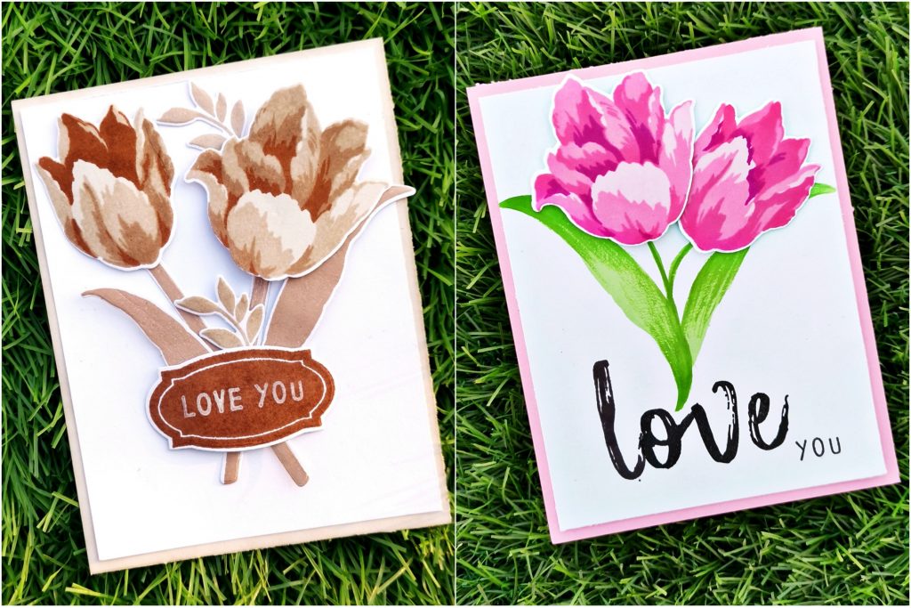
a) Masculine Card
Products used-
Ink:
Dew Drops Crisp Dye Ink
Aqualicious Crisp Dye Ink
Teal Cave Crisp Dye Ink
Galactic Stream Crisp Dye Ink
Jet Black Crisp Dye Ink
Stamps and Dies:
Build-A-Flower: Triumph Tulip Layering Stamp & Die Set
Build-A-Flower: Columbine Layering Stamp & Die Set
Apothecary Labels Stamp & Die Bundle
I love you calyptus from lawn fawn
Other:
Sizzix bigshot
Kokuyo Dotliner strong adhesive Tape
Foam tape
Misti stamping tool
Methods used-
Easy Die Cutting Techniques ( Stamps and Matching Dies )
All About Layering (1&2)
For The Guys
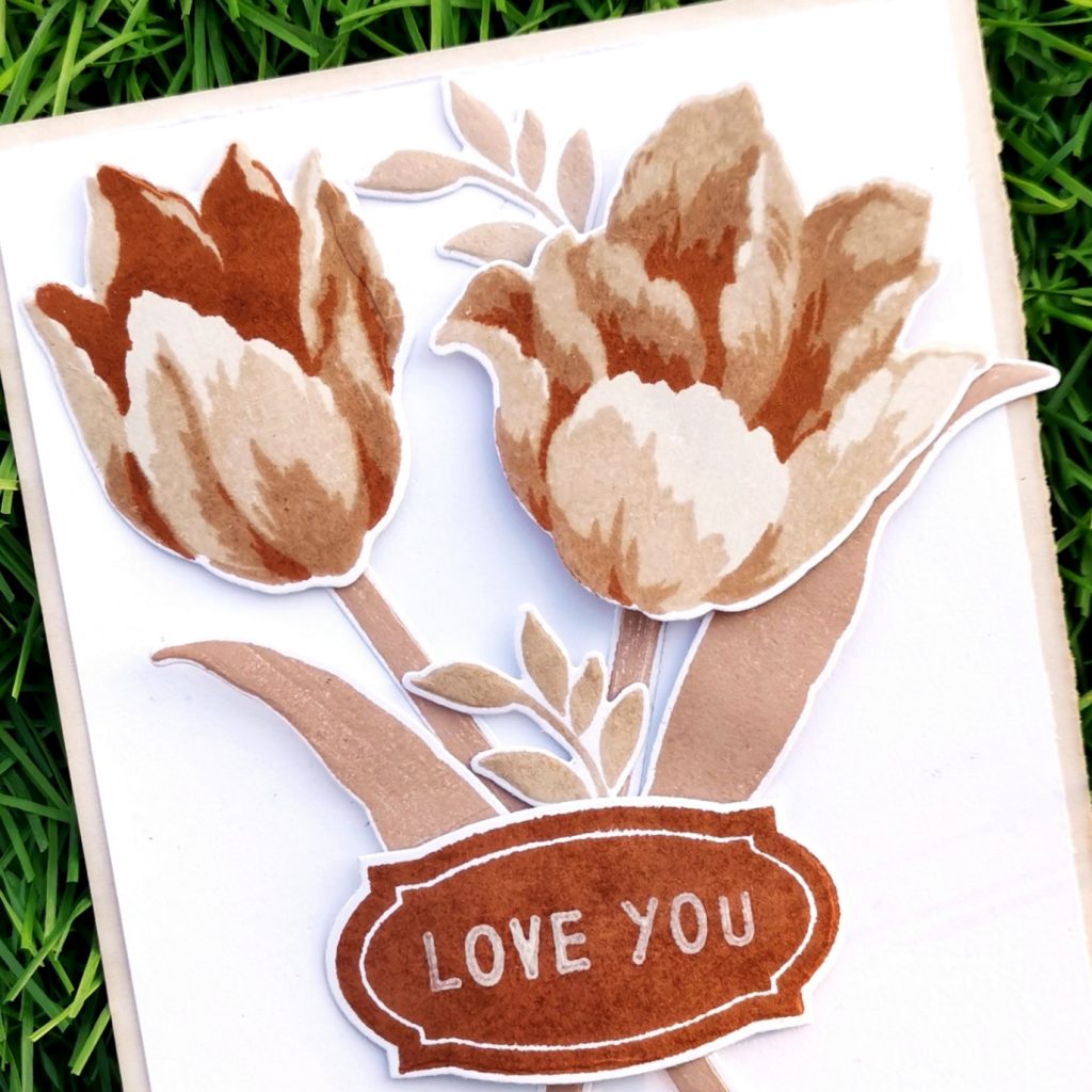
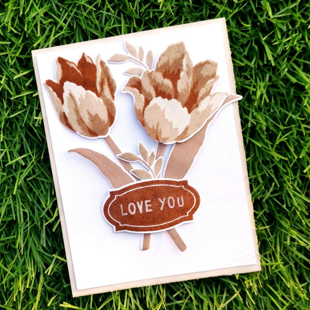
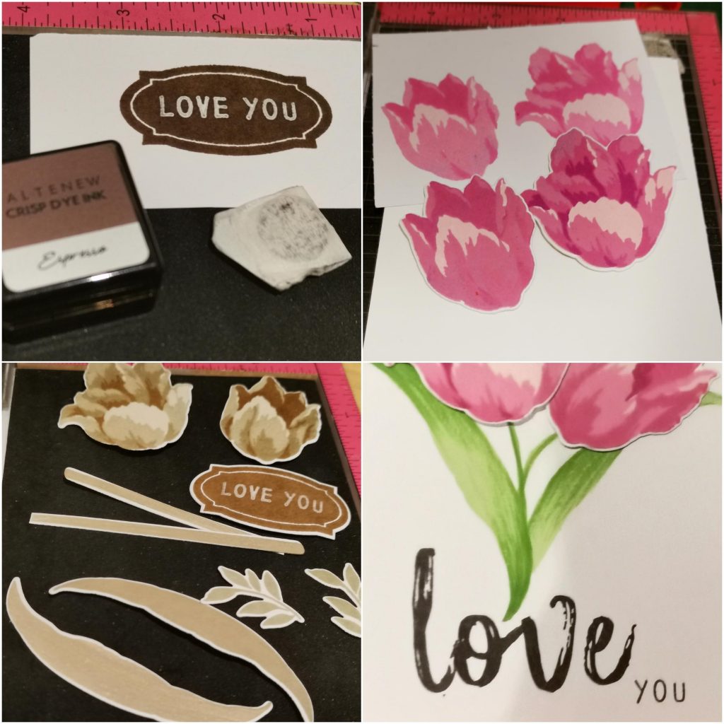
I trimmed a black card stock into 4*5 1/4 and kept it aside. Then stamped triumph tulip flowers on a white card stock paper with Dew Drops Crisp Dye Ink, Aqualicious Crisp Dye Ink, Teal Cave Crisp Dye Ink and Galactic Stream Crisp Dye Ink from Altenew. I stamped the leaves with the lightest shade. And then die cut it with the coordinating die set. Then I stamped a darker shade on my watercolor pallet and then colored the leafs by shading over it using a water color brush. The stem was from an another build a flower set(Columbine layering stamp set) The die cut pieces were stuck on the black cardstock paper which was kept aside in the beginning. Then I stamped an Apothecary Label using the same shade on a white card stock paper and die cut it with a coordinating die. That label add on to the beauty of the card. This can also be considered as the masculine geometcrical ellement of the card, apart from the color theme. Then I stamped a “I love you” sentiment with jet black ink on it using a stamp set from lawn fawn. I didn’t have a darker card stock paper matching to the theme. So I inkblended a white card stock with the same crisp die ink. I trimmed it out into 4 1/4* 5 1/2 and placed it behind the black cardstock paper.
b) Feminine Card
Products used-
Ink:
Pinkalicious Crisp Dye Ink
Rubellite Crisp Dye Ink
Pink diamond Crisp Dye Ink
Razzleberry Crisp Dye Ink
Firefly Crisp Dye Ink
Grass field Crisp Dye Ink
Stamps and Dies:
Build-A-Flower: Triumph Tulip Layering Stamp & Die Set
Mega brush Alpha stamp set
I love you calyptus from lawn fawn
Other:
Sizzix bigshot die cutting machine
Kokuyo Dotliner strong adhesive Tape
Foam tape
Misti stamping tool
Methods used–
Easy die cutting ( Stamps and Matching Dies )
All About Layering (1&2)
Irresistible inking techniques( Painting with Ink pads )
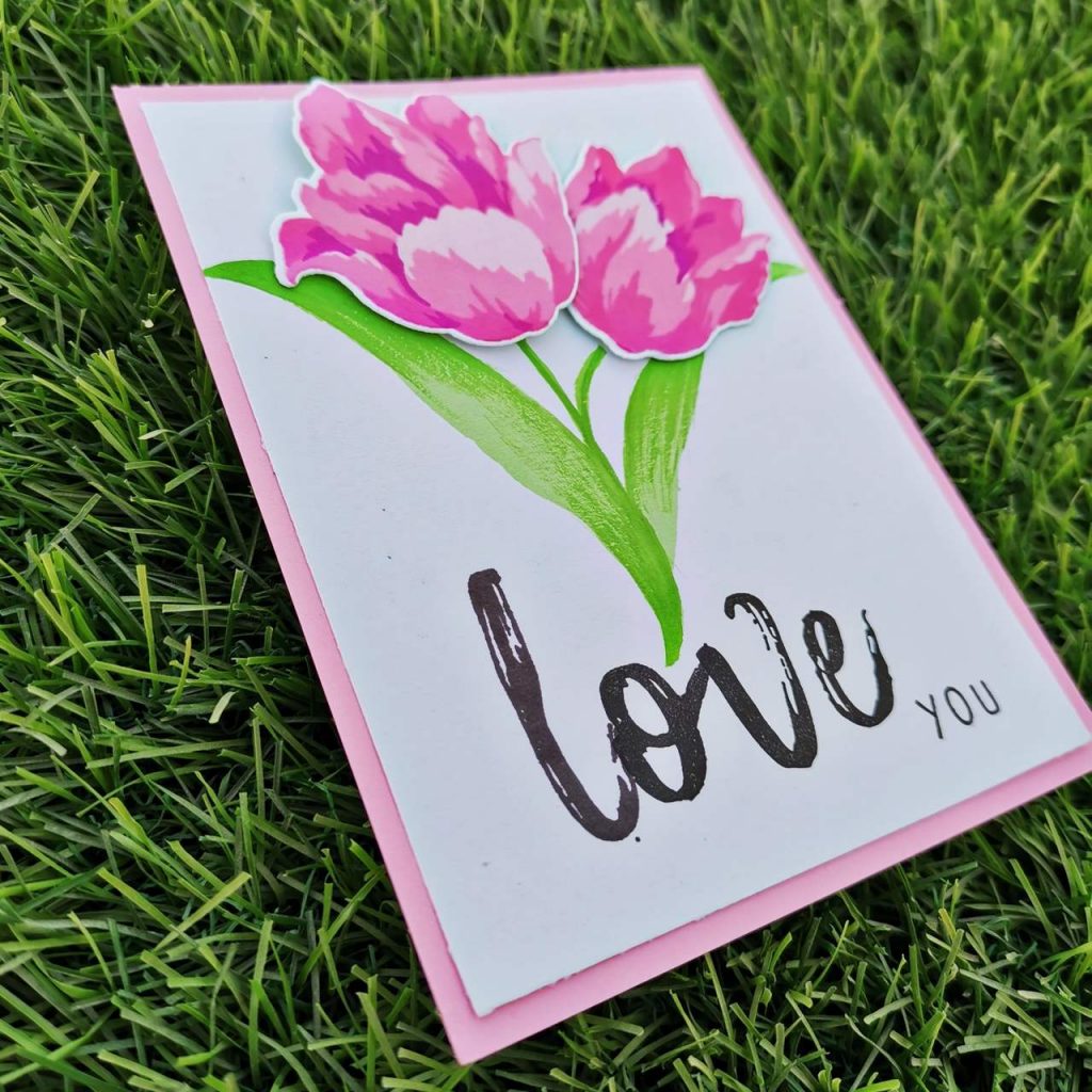
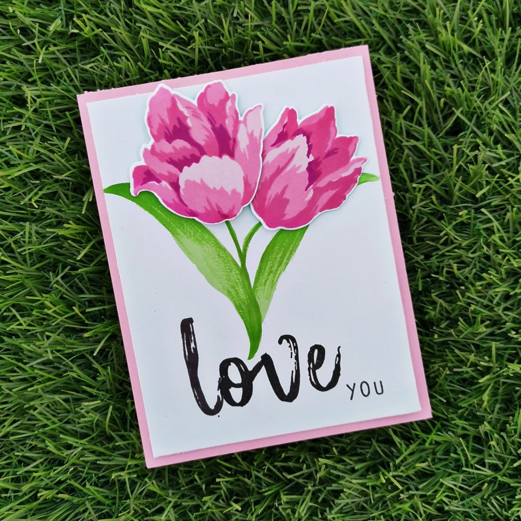
I trimmed a Neenah classic crest white card stock paper into 4*5 1/4. Then I stamped my triumph tulips with Pinkalicious Crisp Dye Ink, Rubellite Crisp Dye Ink, Pink diamond Crisp Dye Ink and Razzleberry Crisp Dye Ink. And then I die cut it with its coordinating dies. The leaves were stamped in firefly Crisp Dye Ink on the white cardstock paper. Then I stamped a darker shade on my watercolor pallet and then colored the leafs by shading over it using a water color brush. The stem was also drawn using the same method. Then I stuck the Tulip flowers on the card using form tape. On the lower side of the card I stamped love using the alphabet stamps from Mega brush Alpha stamp set from Altenew. I prefered using the jet black crisp die ink for it. I also stamped “you” from I love you calyptus stamp set from lawn fawn. At the end I trimmed a pale pink cardstock paper into 4 1/4 *5 1/2 card. And stuck it behind the white one.
5.Congratulation Card
Events in life call for a congratulations such as: a job promotion, graduation or just about anything that is a really important achievement for someone . So here I make a job promotion feminine card and a graduation masculine card.
a) Masculine Card
Products used-
Ink:
Jet Black Crisp Dye Ink
Stamps and Dies:
Build-A-Flower :Begonia layering stamp and die set.
Other:
Black Artistic marker from Altenew
Neenah classic crest solar white card stock
Light green cardstock paper
Black card stock paper
Kokuyo Dotliner strong adhesive Tape
Misti stamping tool
Methods used–
Clean & Simple Boutique Cards (Simple Styling)
For The Guys
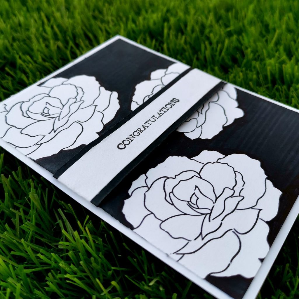
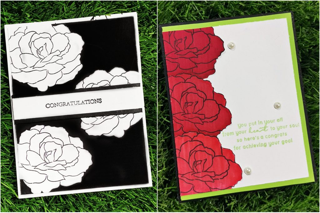
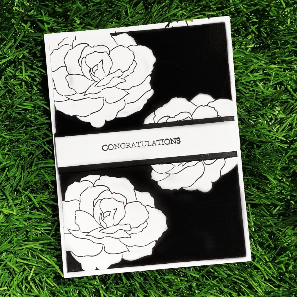
I trimmed a Neenah classic crest solar white cardstock into 4 *5 1/4 card stock. And stamped the outline stamp of build a flower begonia randomly on the cardstock. I choose this particular stamp set from Altenew because it gives a circle dimension to the flowers. Then leaving the inner part plain. I colored the outer part of the flowers with Jet black artistic markers.I did them as repeated thin strips.once that is done, I trimmed a Neenah classic crest solar white cardstock into thin strip and stamped “congratulations”, from sweetest peas stamp set on it. Then I covered that strip with black cardstock paper. And stuck it towards the middle of the card. The rectangle strip sentiment , horizontal marker lines, the black and white color code all together enriches the masculine look of the card. The technique used in making of the cards is really easy and simple . Any beginners can give a try on it
b) Feminine Card
Products used-
Ink:
Jet Black Crisp Dye Ink
Firefly Crisp Dye Ink
Stamps and Dies:
Build-A-Flower: Begonia layering stamp and die set
Say it with love stamp set from Altenew
Other:
Velvet Artistic marker from Altenew
Crimson Artistic marker from Altenew
Ruby Red Artistic marker from Altenew
Sticky pearls (white)
Sizzix bigshot die cutting machine Neenah classic crest solar white cardstock
Kokuyo Dotliner strong adhesive Tape
Misti stamping tool
Methods used–
Clean & Simple Boutique Cards (Simple Styling)
Let It Shine Lesson (Embellishments)
Seasonal Scene Building(Masking A Scene)
I trimmed a Neenah classic crest solar white cardstock into 3 3/4 *5 card stock. Then stamped Build-A-Flower: Begonia layering stamp on the left corner of the card with jet black crisp die ink from Altenew. Then masking it with a die cut piece of the same flower set, I stamped the next flower slightly above it. I stamped 3 begonias in the same way. Then I colored them with 3 variations of red artistic markers. Then I trimmed a green cardstock paper into 4 *5 1/4 and stuck it behind my cardstock paper. I also trimmed a black cardstock paper into 4 1/4 *5 1/2 and placed it behind the green cardstock paper. Thus the 3 layer of cardstock paper brings a little more dimension to the card. And at the end I stamped my sentiment with Firefly Crisp Dye Ink towards the right side of the card
6. Anniversary card
A Happy Anniversary card is usually given by a wives and husbands to each other. But here is something special for the most wonderful couple i have ever met in my life.
a) Masculine Card
Products used-
Ink–
Espresso Crisp Dye Ink
Mocha Crisp Dye Ink
Rocky Shore Crisp Dye Ink
Sand Dunes Crisp Dye Ink
Jet Black Crisp Dye Ink
Stamps and Dies:
Calming Reverie Stamp & Die Bundle from Altenew
Happy Pomegranates Stamp Set from Altenew
Other:
Sizzix bigshot die cutting machine
Neenah classic crest solar white cardstock
Kokuyo Dotliner strong adhesive Tape
Foam tape
Misti stamping tool
Methods used–
Easy die cutting ( Stamps and Matching Dies )
All About Layering (1&2)
For The Guys (Geometrics)
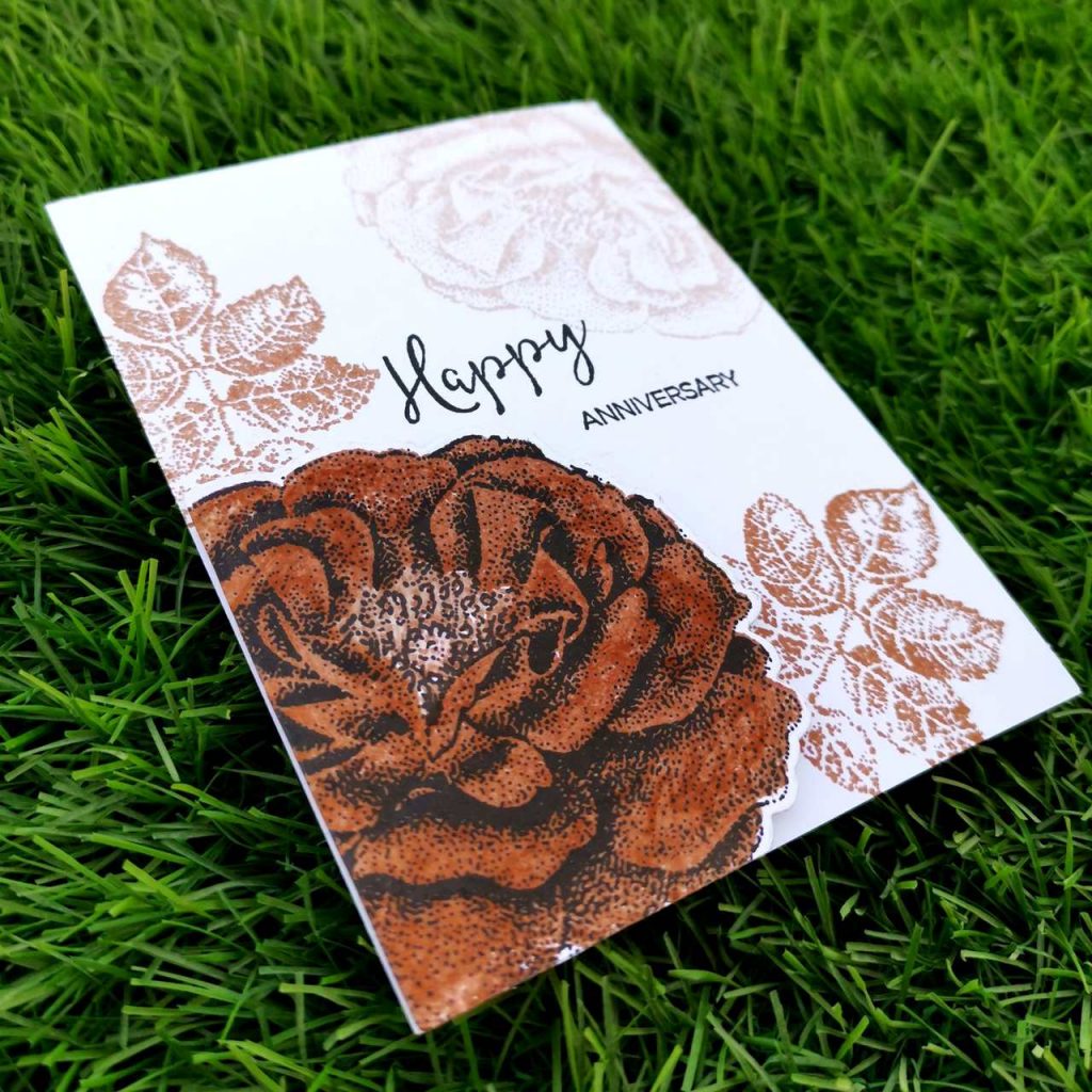
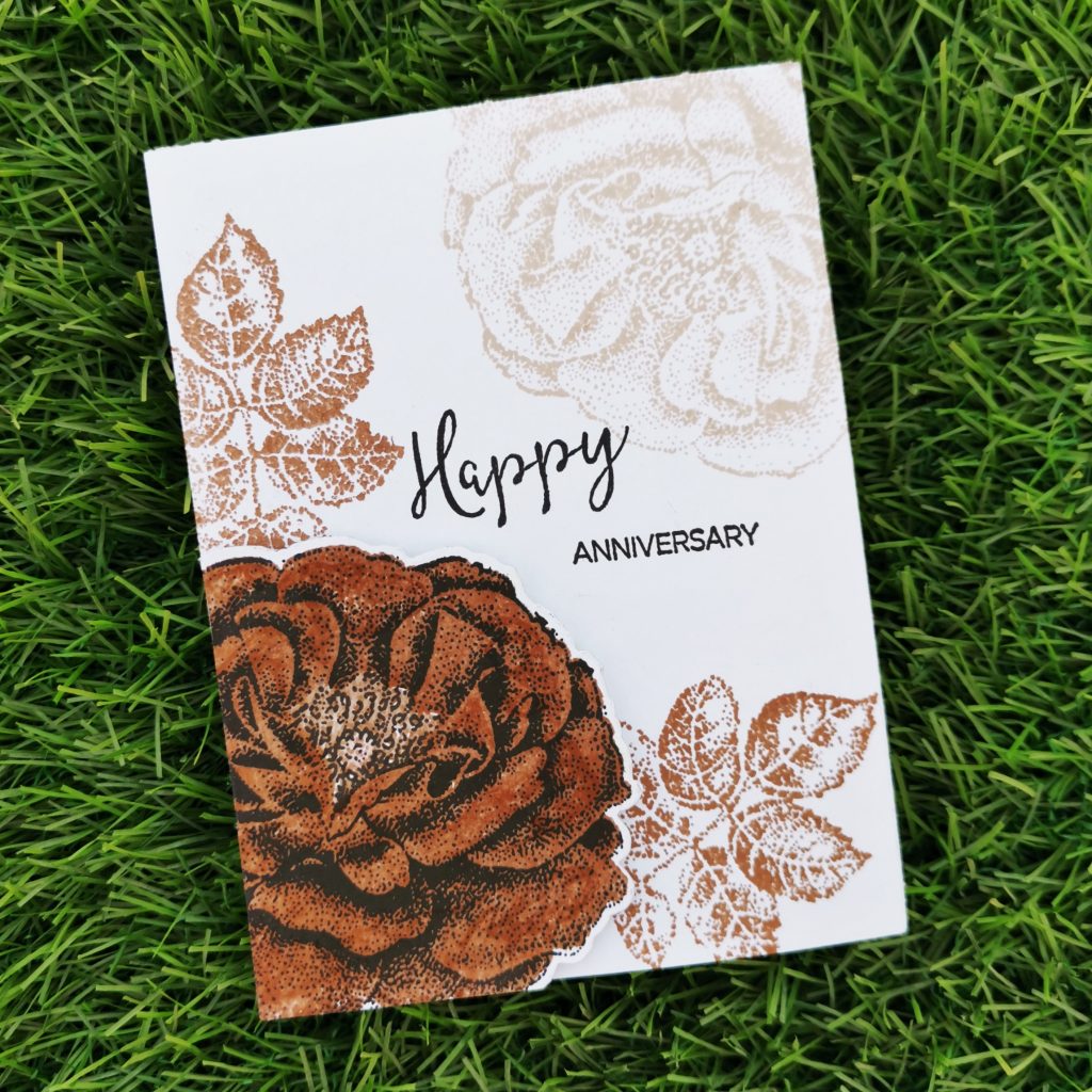
I trimmed a Neenah classic crest solar white cardstock into 4 *5 1/4 card stock. Then I took an another card stock paper and stamped Calming Reverie Stamp with Mocha and Rocky Shore Crisp Dye Ink (light shading) and the second layer was done with Jet black crisp die ink. Then I trimmed it with its coordinating dies. I stamped the leaves towards the right side of the flower. The flower by itself gives a semi circle geometric feature to the card. A similar flower stamp was done towards the top right corner of the card with. I stuck the die cut flower with foam tape and stamped happy anniversary with jet black ink towards the center of the card. Both “happy” and “anniversary” sentiments were from the happy pomegranates stamp set from Altenew.
b) Feminine Card
Products used-
Ink:
Heartbeat Crisp Dye Ink
Vineyard berry Crisp Dye Ink
Caribbean Sky Crisp Dye Ink
Firefly Crisp Dye Ink.
Jet Black Crisp Dye Ink
Stamps and Dies:
Calming Reverie Stamp & Die Bundle from Altenew
Happy Pomegranates Stamp Set from Altenew
Other:
Sizzix bigshot die cutting machine
Neenah classic crest solar white cardstock
Misti stamping tool
Embossing folder from Sizzix
Methods used–
Easy die cutting ( Stamps and Matching Dies )
All About Layering (1&2)
Irresistible inking techniques( Painting with Ink pads )
Seasonal Scene Building(Masking A Scene/Oversized Scenes)
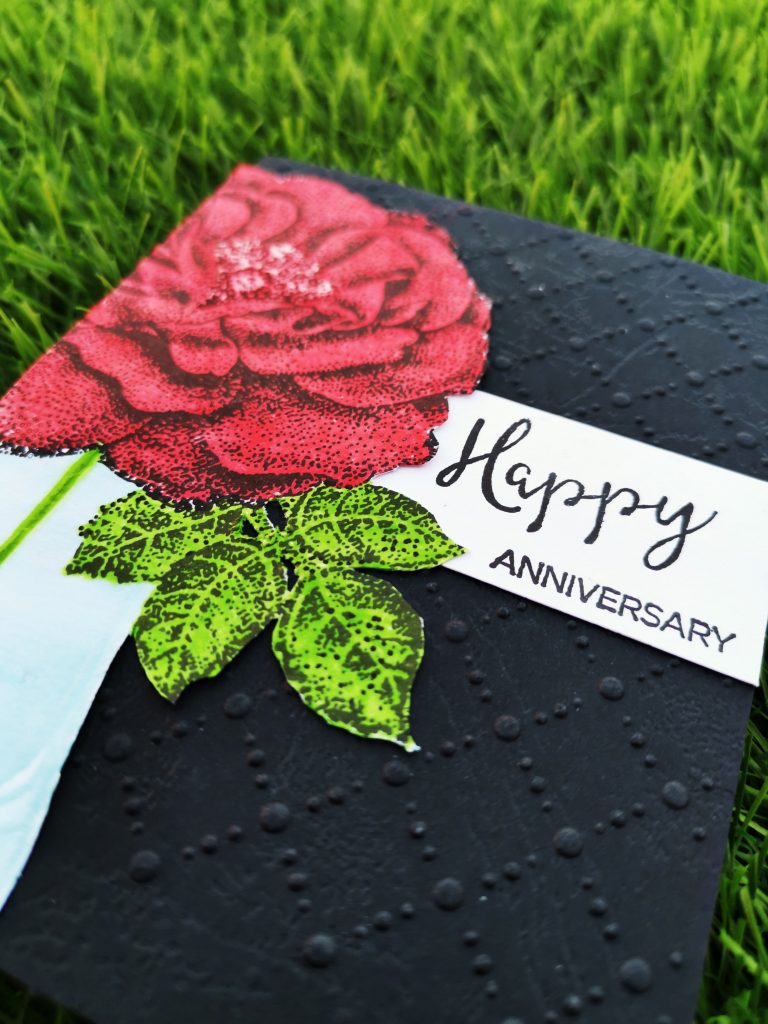
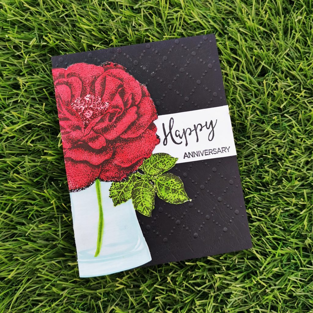
Initially I trimmed a black cardstock into 4 1/4 *5 1/2. Then kept it between a sizzix embossing folder ran it through by sizzix big shot die cutting machine. In an another Neenah classic crest solar white cardstock I stamped the flower from Calming Reverie Stamp Set with Heartbeat Crisp Dye Ink and Vineyard berry Crisp Dye Ink. By masking it with its coordinating stencil, I stamped the leaf too with Firefly Crisp Dye Ink. I stamped the vase from versatile vases stamp set by masking both the flower and the leaf. I stamped Caribbean Sky Crisp Dye Ink on my watercolor pallet and I painted it using a water color brush. Then I trimmed it and pasted it into the black cardstock paper. The I stamped happy anniversary to a white card stock paper with jet black crisp die ink from Altenew. Trimmed it and pasted it to the side of the flower vase.
Wrapping up the cards
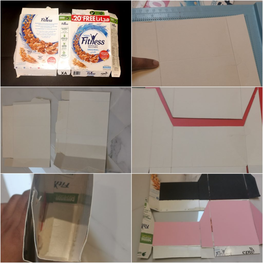
Alhamdulilah, done with the making of the cards. Now it’s time to set up a package for it. I have made a bundle of cards today. Each masculine as well as feminine card sets have almost 6 cards. I wanted to make a cover which can act as a storage as well as a display able package for my cards and I needed it fast.Like most crafters, space is precious to us, so I needed something narrow and tall rather than short and wide!This is what I came up with!
I took a cereal box from the kitchen and opened it up. Focusing on it’s length, I trimmed it into half. I did this for 2 reasons. Firstly I didn’t want something which was this tall. Secondly, as I trimmed it into half, I could make 2 of them with the same box.
Now focusing on the side of the box. I trimmed it into 2. This makes the width of our card holder reduced into half of its size. And the other half can be used for the opposite side of the card. Then I kept my greeting card of that cereal sheet, and marked its length. I just marked half inch extra so that the cards won’t be tight inside the box. I scored a line there with my scoring board. Then I measured the same width as on the left side and scored it on the right side too. Base parts can be trimmed as per our convince to fold. For the mascunine holder I stuck black cardstock inside thebox,while for the feminine holder i choose pink.Then I stuck the opposite part together to it by overlapping its sides. Now u can get a top opened box.
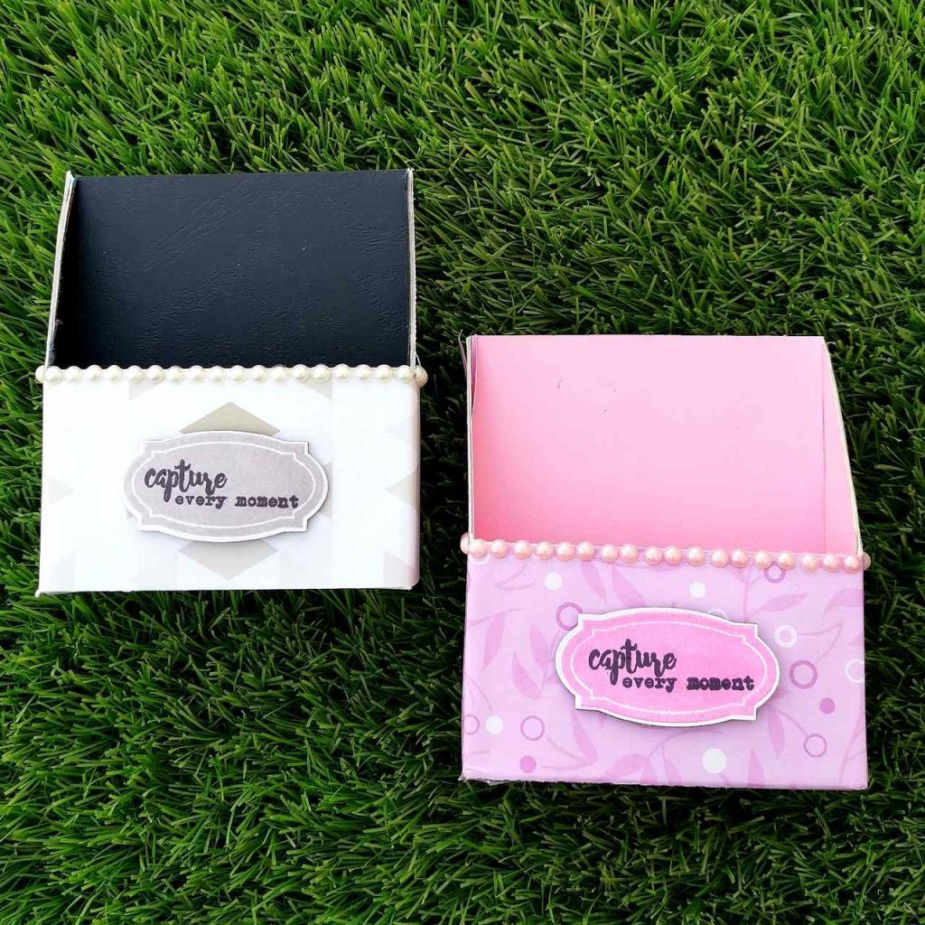
I didn’t want my package to be closed completely on the front. So I trimmed half way through the front of the card. (trimmed only the front portion). Then I drew, a diagonal line connecting the back portion and the front of the card. I trimmed it along the lines. Then I stuck the outer side of the box with recycled papers and pattern papers. To add more look, I stuck some sticky pearls too. That’s when I decided to add a personal touch to it. So I stamped an Apothecary label stamp on a white card stock paper with cohesive theme color code. I stamped a sentiment which says “capture every moment” (Say Cheese Stamp Set from Altenew) with jet black crisp die ink from Altenew.
So that’s it. Finally I have come to the end of my project at level 1 AECP. I am really glad to be a part of our aecp community. They just help us to get out the best in us in all the ways possible. I would like to take this opportunity to thank the most lovely lady of Altenew Academy, Erum. She is someone who always offered me encouragement every step of the way.I had some technical issues with my blog and it did took few days to get fixed. But she stood up by my side with all her support. A big shout out to her, for understanding. Thank you!
Finally I am very grateful to all of you visiting my blog, I truly appreciate the support.Hope to see you all soon with another project from AECP. Until then happy stamping and thanks for stopping by!
-shahi
For the guys(Take 2 )
So here is my second take on the course “For the guys” from Altenew academy. I am a person who is usually comfortable with Masculine cards, but this time it isn’t the same. Sticking to altenew products is the greatest challenge I’m facing right now. I don’t have much of my craft supplies in hand with me right down. Which narrows my mind with less opinions. Yet I’m trying my level best to think outside the box. So this how it began.
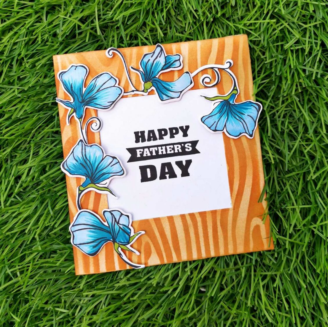
I trimmed two 4 1/4 *4 1/4 Neenah classic crest solar white square cards. The first one was blended with hazelnut crisp die ink from Altenew. Then I placed a wood textured stencil on it and blended it with brown distress ink. I trimmed out a square piece from the middle of my card. Then I placed the other white cardstock behind it and stamped “Happy Father’s day” (best dad from Altenew) with versafine black ink on the center of the card.
Then I stamped some flowers with black ink on a white cardstock paper. I choose the flowers from the sweetest peas stamp set from Altenew. I colored them with 3 shades of blue artistic markers from Altenew( Caribbean sky, ocean waves, dessert night). After die cutting them with their coordinating dies. I placed them on the border of the square die cut. That square shape in the center of the card acts as the basic geometric shape used in this card. So in order to add more geometric shapes, I decided to stick those flowers in a triangle shape. Thus leaving aside a segment of the square, I stuck those flowers around the die-cut.
I have got no idea if my card came out well or not But you do give it a try to learn this course on Masculine cards at https://altenew.com/products/for-the-guys.I hope to see you all soon with another project from AECP. Until then happy stamping and thanks for stopping by!
-shahi
 CASE your fellow AECP Crafter
  Clean & Simple Boutique Cards
  Easy Die Cutting Techniques
  Graduation card
  Let it shine
Recent Comments