Category: Standard Cards
Altenew: Beyond Basic Background
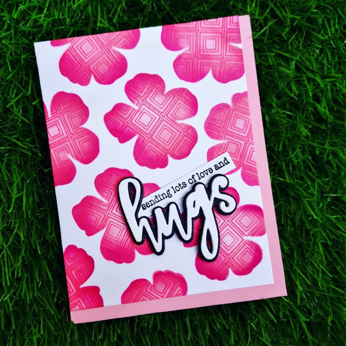
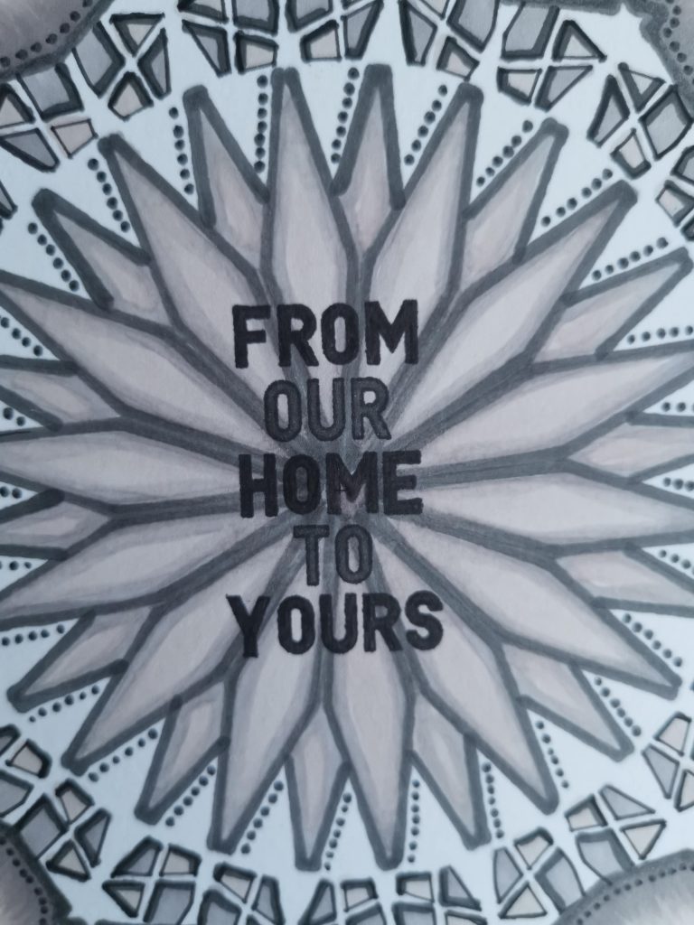
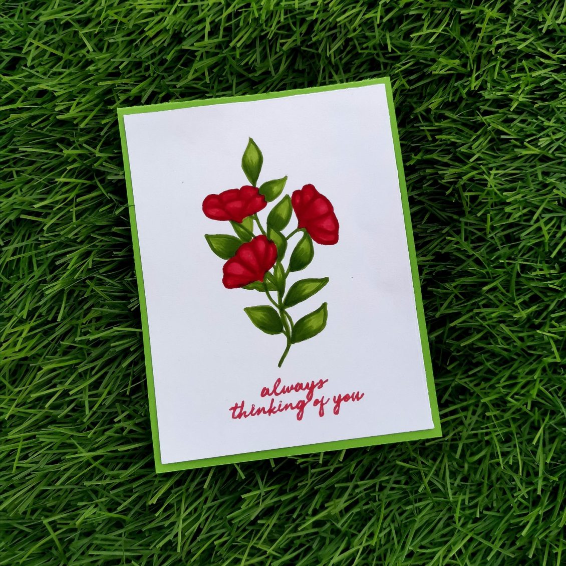
Today I would like to share a card I made for the Beyond Basic Backgrounds by Altenew Academy. I loved the gorgeous cards and the amazing tips that Lydia Evans shared in this course. I found the Beyond Basics Background class really interesting. There are so many interesting ways to create backgrounds on cards that you just don’t think of! This is something which I have never tried doing it before. And I loved how it came out. I have dedicated this cards to all the strong and inspiring women on women’s day on my IG page.
Once again.. Here I am…Sending out lot of love and hugs to all the wonderful women out there 💖
INSTRUCTIONS
- Create a “5 x 6 ” card base from Classic Crest Solar White Cardstock.
- Place the die over the card and die-cut it
- Cut numerous pieces and create a DIY stencil.
- Create a “4 x 5 1⁄4 ” card base from Classic Crest Solar White Cardstock.
- Place the DIY stencil over the blank card stock and stick the sides with masking tape.
- Blend the Die ink over each flowers
- The ink should be lighter towards the center thus giving an Ombre look to the flowers
- Then ink the large background stamp with the darker ink and stamp it over the stencil.
- Then remove the DIY stencil
- Then die cut the sentiment various times to create a thinker dimension
- Stamp the other sentiment on a thin strip of cardstock
- Stick both the die cut sentiment and the sentence sentiment towards the bottom right corner of the card.
- Trim a pink cardstock into 4 1/4 * 5 1/2 and place it behind the cardstock.
- Place the main card towards the top left of the pink card.
TIPS
- Cutting the piece for your stencil larger than your card blank will help you cover the whole area you want covering
- Tack the stencil down with masking tape on either sides, so that it would keep the stencil intact.
- Choose the same shade of color, start blending with the darkest color on the edges, blend this out and then blend the lighter color over the middle
- Try creating an Ombre effect it makes the flowers stands out as it is the slow melting effect of a lighter shade gradually getting darker towards the ends .
- Die cut the sentiment various times to create a thinker dimension
SUPPLIES
- Jet Black Crisp Dye Ink
- Cherry Blossom Crisp Dye Ink Set
- Hello and Hugs Dies Set
- Flowering Cistus Stamp Set
- Shine Like a Diamond Stamp Set
Hope you liked my card. Have a wonderful day and I hope to see you all soon with another project from AECP. Until then happy stamping and thanks for stopping by!
-shahi
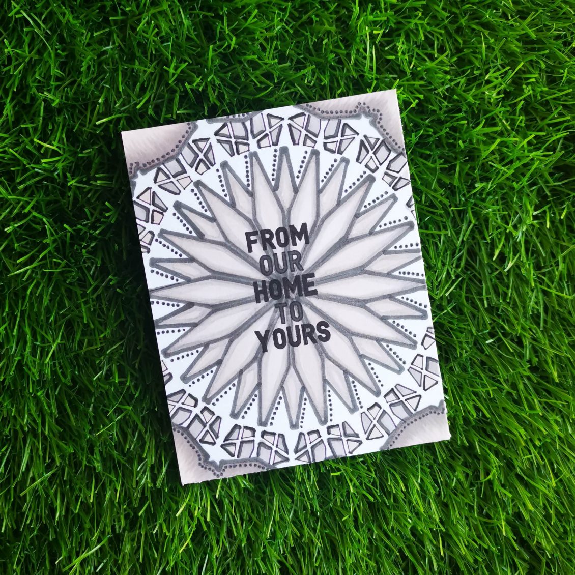
Altenew: Magic Marker Techniques
The next AECP class I tackled was “Magical Marker Techniques”, by Sara Naumann. I enjoyed the fact that Sara uses her markers for more than just coloring in stamped images, in fact, I liked that a lot. I would recommend this class to anyone who is looking for ideas on how to stretch their supplies . I used my artistic markers just for coloring, but through this class, I did explored a new way of using it.
INSTRUCTIONS
- Create a “4 1⁄4 x 5 1⁄2 ” card base from Classic Crest Solar White Cardstock.
- Place linear Stencil over card base and position it to the center of the card.
- Tack it down with masking tape.
- Remove the stencil and retrace the diamonds so they’re heavily outlined, then color in the diamond shapes
- Draw the outline using darker shade of artistic marker and fill them with lighter shades.
- Slightly rotate the stencil and move over to the second layer.
- Fill in the smaller parts according to your creativity and color choice
- Add small dots using the fine tip of the artistic marker
- You’ll have a cool dimensional effect by darkening the outline of the small parts of the stencil.
- Stamp a sentiment from the Holiday Tag sentiment.
- Fill in the sentiment with artistic marker
TIPS
- Tack the stencil down with masking tape on either sides, so that it would keep the stencil flat.
- Choose a color theme to bring up a mandala effect.
- Draw the outline using fine tip of the marker
- Slightly rotate the stencil and move over to the next layers.
- Take advantage of the fine tip of the marker to add dots and dimensions to the card
SUPPLIES
- Jet Black Crisp Dye Ink
- Morning Frost Artistic Marker
- Evening Gray Artistic Marker
- Industrial Diamond Artistic Marker
- Linear Stencil
- Holiday Tag Sentiments
For my card, I followed the techniques from lesson 6 of this course – using Markers with Stencils. I really encourage you taking this class taught by Sara Naumann, it will help you a lot more to understand color and color usage on projects. Hope you liked my card.
Have a wonderful day and I hope to see you all soon with another project from AECP. Until then happy stamping and thanks for stopping by!
-shahi
Altenew: In The Mood For Color
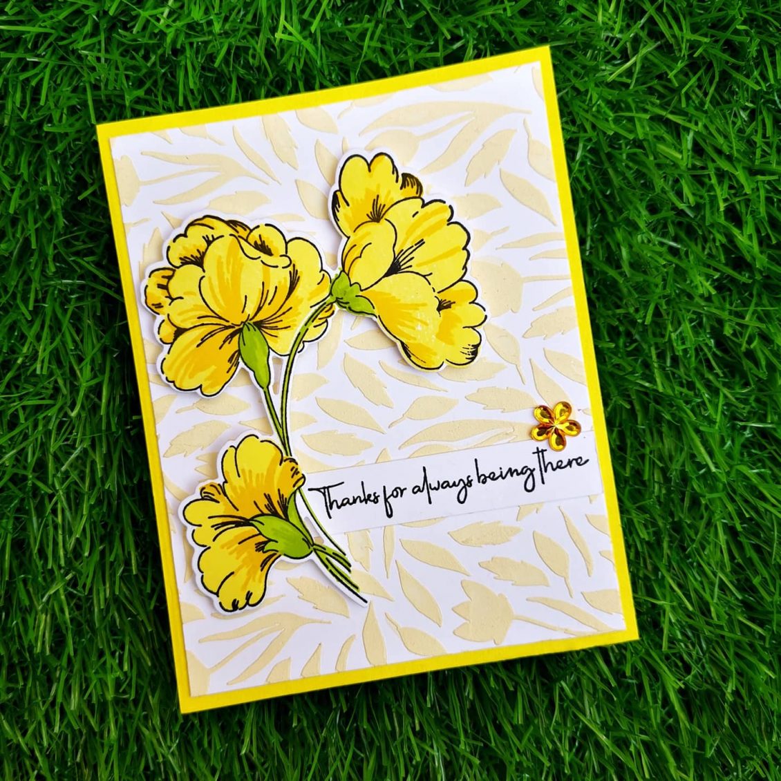
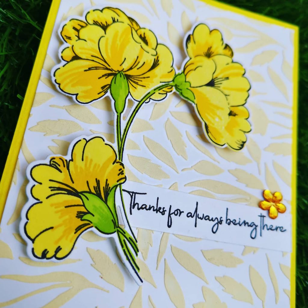
Hi, Thanks for stopping by… It’s so great to see you here! I was very excited to have graduated from Level 1 of the AECP program! That last project was HUGE and took me forever to get completed. After a long gap, I’m now onto my next level of the program. The first class I choose in level 2 is “In The Mood For Color” . In this class Stephnie Klauck shares the impact of colors on ones mood. Here I have focused on the color Yellow . It is the most luminous of all the colors of the spectrum. It’s the color that captures our attention more than any other color. It’s the color of happiness, and optimism, of enlightenment and creativity, sunshine and spring.
INSTRUCTIONS
- Create a 4 ” x 5 1⁄4 ” card base from Classic Crest Solar White Cardstock.
- Place Spring Garden Stencil over card base and mask outlines with masking tape.
- Take some embossing paste on the watercolor palette and add few drops of Buttercream Alcohol Ink and blend it well
- Apply the paste on the cardstock over the stencil.
- Wait until the paste dries
- Stamp the biggest stamp from Sweet Flowers Stamp Set using Obsidian Pigment Ink on a Classic Crest Solar White Cardstock
- Then, stamp in the layers of the flowers with Fresh Lemon and Maple Yellow.
- Then, stamp the floral stem details using Bamboo and Parrot
- Finally, die cut and adhere the florals onto your card base using double sided foam tape.
- Stamp a sentiment from Friends Forever Stamp Set onto a white cardstock strip using Obsidian Pigment Ink
- Stick it near to the floral die cut
- Add your favorite embellishment to enhance the look of the card.
- Finally, add this panel to your yellow card base
TIPS
- Choose the right colors , it allows you to let the sentiment say what you’re feeling, and help the person you’re giving the card to, feel what your feeling.
- Use a stamping tool to stamp your florals. It makes stamping large solid images so much easier since you can double and triple stamp. the included bar magnet can be used to quickly and easily position your cardstock, and the included grid paper makes it easy for you to lay out and align your card’s design.
- Before stamping, use an Anti-Static Pouch tool to remove static from your paper so the powder doesn’t stick where you don’t want it.
- When doing stamp layering, start with the lightest ink color first and then build up to the darkest.
- Add your favorite embellishment to enhance the look of the card.
SUPPLIES
- Obsidian Pigment Ink
- Fresh Lemon Crisp Dye Ink
- Maple Yellow Crisp Dye Ink
- Bamboo Crisp Dye Ink
- Parrot Crisp Dye Ink
- Friends Forever Stamp Set
- Sweet Flowers Stamp & Die Bundle
- Spring Garden Stencil
- Embossing Paste
- Buttercream Alcohol Ink (Artistic marker refill)
- Watercolor palette
I really encourage you taking this class taught by Therese, it will help you a lot more to understand color and color usage on projects. Have a wonderful day and I hope to see you all soon with another project from AECP. Until then happy stamping and thanks for stopping by!
-shahi

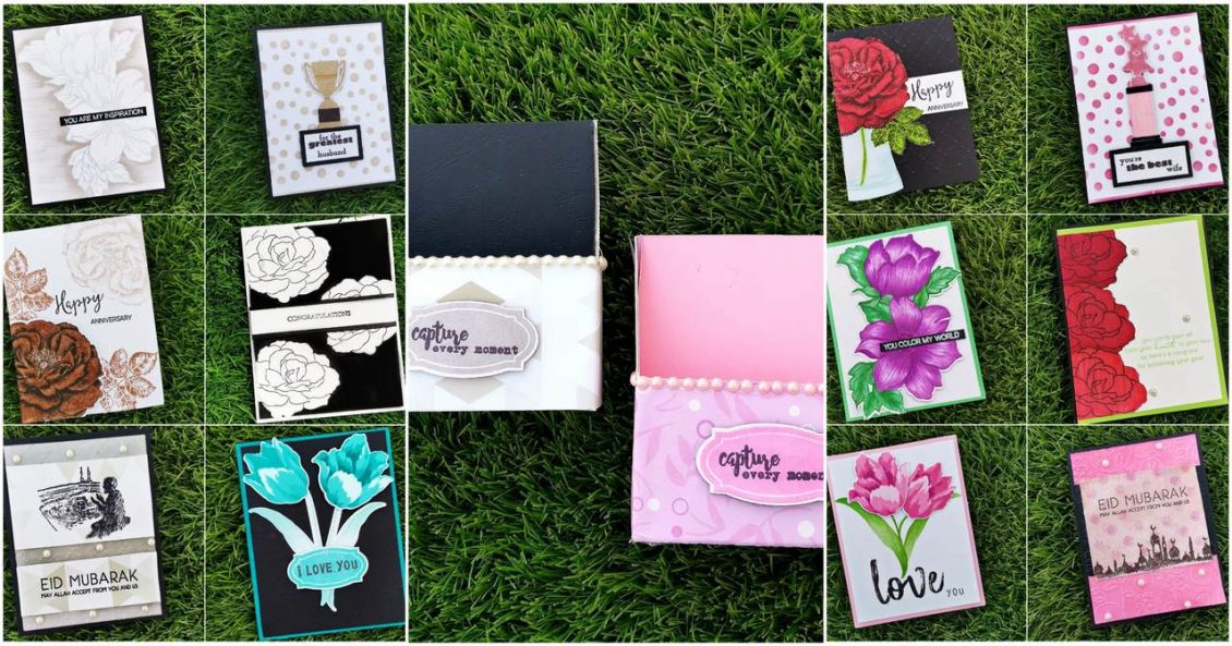
AECP Level 1 – Final Challenge
I cannot believe I am finally here, writing a post for Altenew Academy – AECP Level 1 – Final Challenge and am so excited to share my projects I have created for this challenge!
My challenge contained in
- Some components learned from the classes in Level 1,AECP
- Sets of Feminine cards and Masculine cards . (which is not easy for someone like me who loves flowers and try to incorporate them into most of my cards)
- Cards with similar and cohesive theme as the rest of the set
- a minimum of 4 to 12 cards per set
- Everything packed in a very nice way that can be give to your loved one
- Inserted a recycled thing in the project
As a part of basic planning, i decided to set a theme for my masculine and feminine card sets. For that i choose two color pallets from the internet.
The male color palette includes colors such as black,light grey,dark grey,dark brown,light brown,dark turquoise etc.
While the feminine color pallet includes colors like mulberry,dark pink, light pink, off white,red ,green etc.
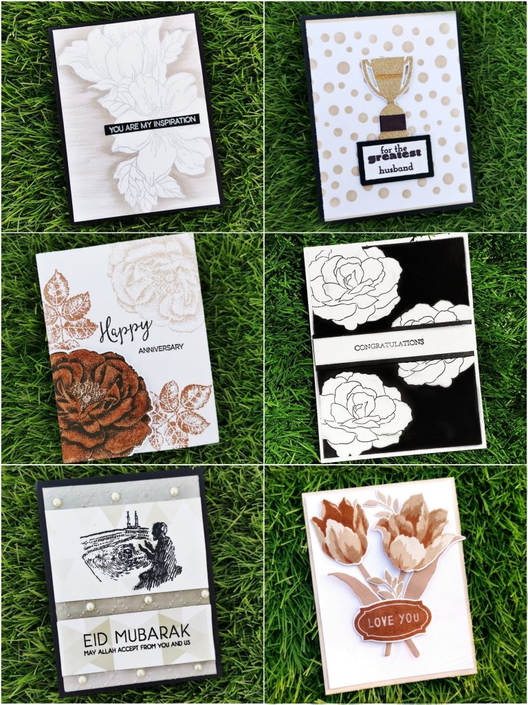
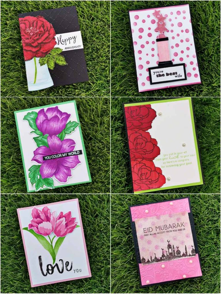
Then i categorized the cards into different themes and occasions, each pair of cards were made with the same stamp set reciprocal to their color theme. Here, i am planning to introduce the cards according to their theme. and they are as follows:
1. Inspiration Card
Telling someone that they have been an inspiration for you is like making them feel happy of their existence in your life This inspiration card is something like that.
a) Masculine Card
Products used-
Ink:
Limestone crisp die ink from Altenew
silverlake crisp die ink from Altenew
Tsukineko Versa Mark Dazzle Pigment Ink
Hero Arts Unicorn Pigment Ink
Stamps and Dies:
Statement flower stamp set from Altenew
Halftone Circles stamp set from Altenew
Other:
Neenah classic crest white card stock
black card stock paper
Water color palette from altenew
watercolor brush from altenew
Misti stamping tool
Methods used-
Irresistible inking techniques( Painting with Ink pads )
Clean and simple boutique cards(simple styling /metallic details)
For The Guys
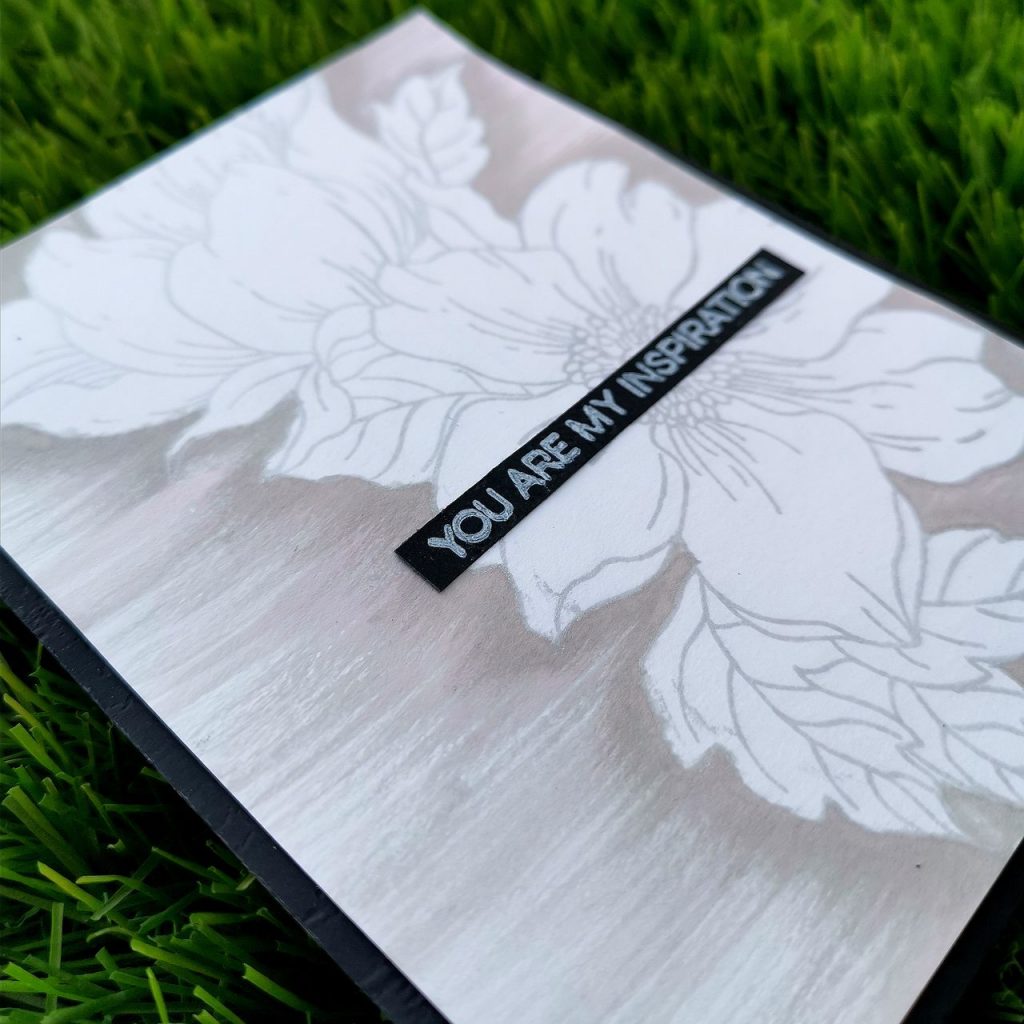
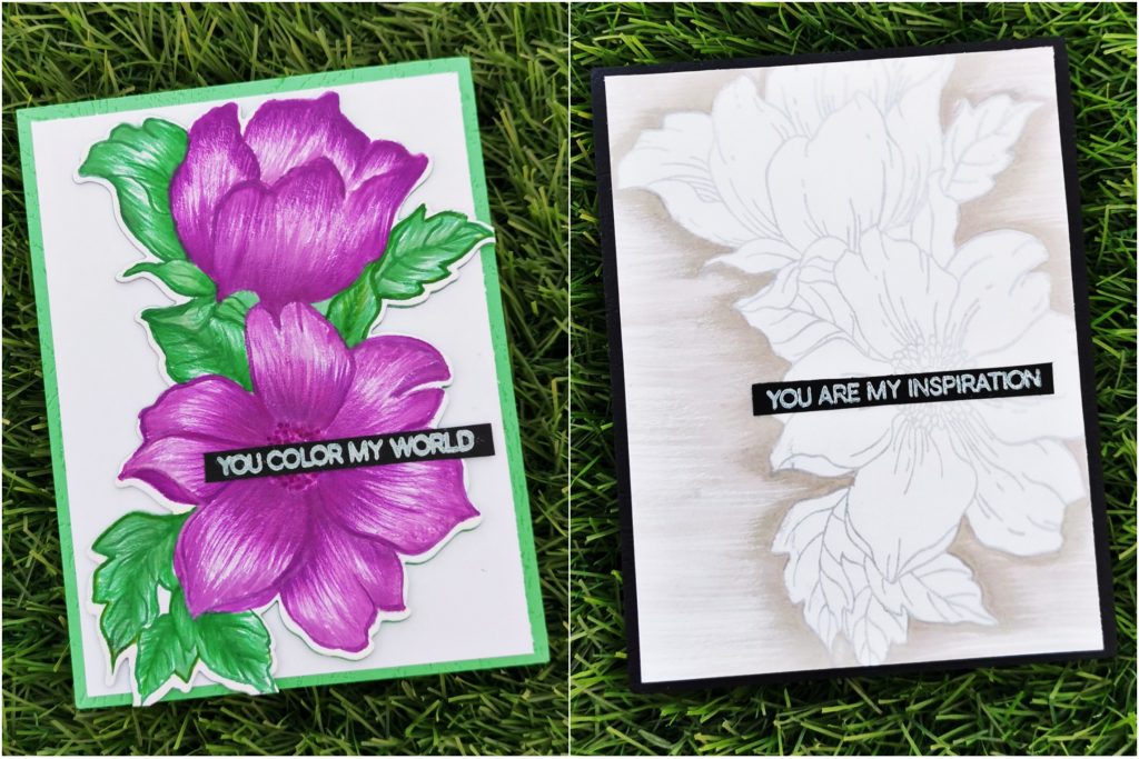
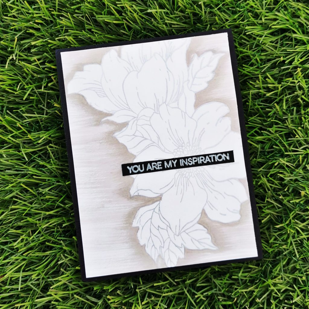
Sometimes all you need to create an amazing card is plain white cardstock, a stamp and some ink. So I trimmed a white card stock into 4*5 1/4 and stamped a flower from statement flower stamp set with Dazzle pigment ink. Then I stamped the crisp die inks on my watercolor pallet and blended them with my watercolor brush . i blended the outline of the flower with it from darker to lighter shade .Once done,I stamped a sentiment from the halftone circles stamp set ”you are my inspiration” on a black card stock paper and trimmed it into a sentiment strip and glued it to the middle of the flower. finally i stuck this card to a 4 1/4 *5 1/2 black card stock paper. If you focus on the card,you can find that the shadings are done in a particular direction. Its acombination of various horizontal lines. It helps us to get the gradient look on the card ,as well as the geometrical feature gets fullfilled. One of the best things about these cards are that they are the easiest to create, and perfect for beginners.
b) Feminine Card
Products used-
Ink:
Midnight violet Dye Ink from Altenew
lavender fields Dye Ink from Altenew
Deep iris Dye Ink from Altenew
Hunter Green Crisp Dye Ink from Altenew
Sweet leaf Crisp Dye Ink from Altenew
Just green CrispDye Ink from Altenew
Scattered straw distress ink
Hero Arts Unicorn Pigment Ink
Stamps and Dies:
Statement flower stamp set from Altenew
Halftone Circles stamp set from Altenew
Other:
Neenah classic crest white card stock
Misti stamping tool
Watercolor palette from altenew
Watercolor brush from altenew
Black card stock paper
Green card stock paper
Methods used-
Irresistible inking techniques( Painting with Ink pads )
Easy die cutting ( Stamps and Matching Dies )
Clean and simple boutique cards(simple styling)
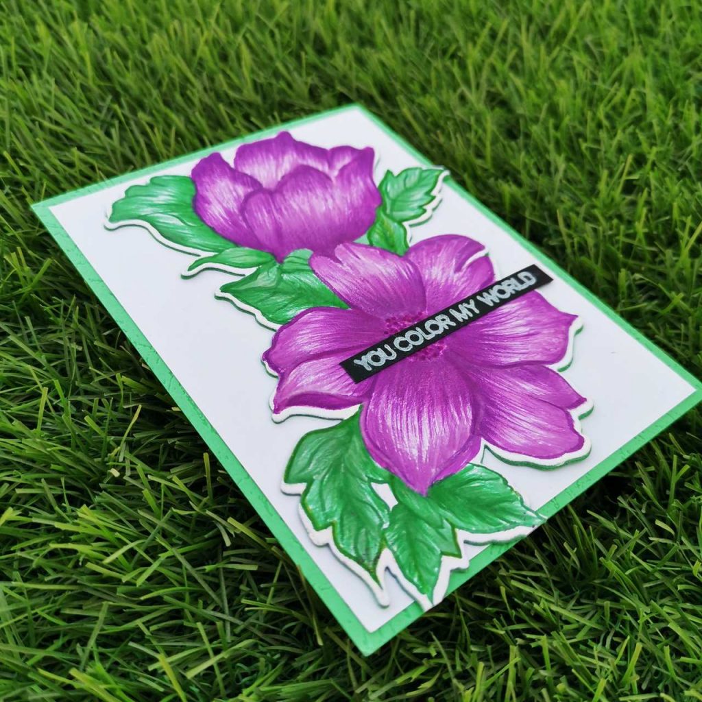
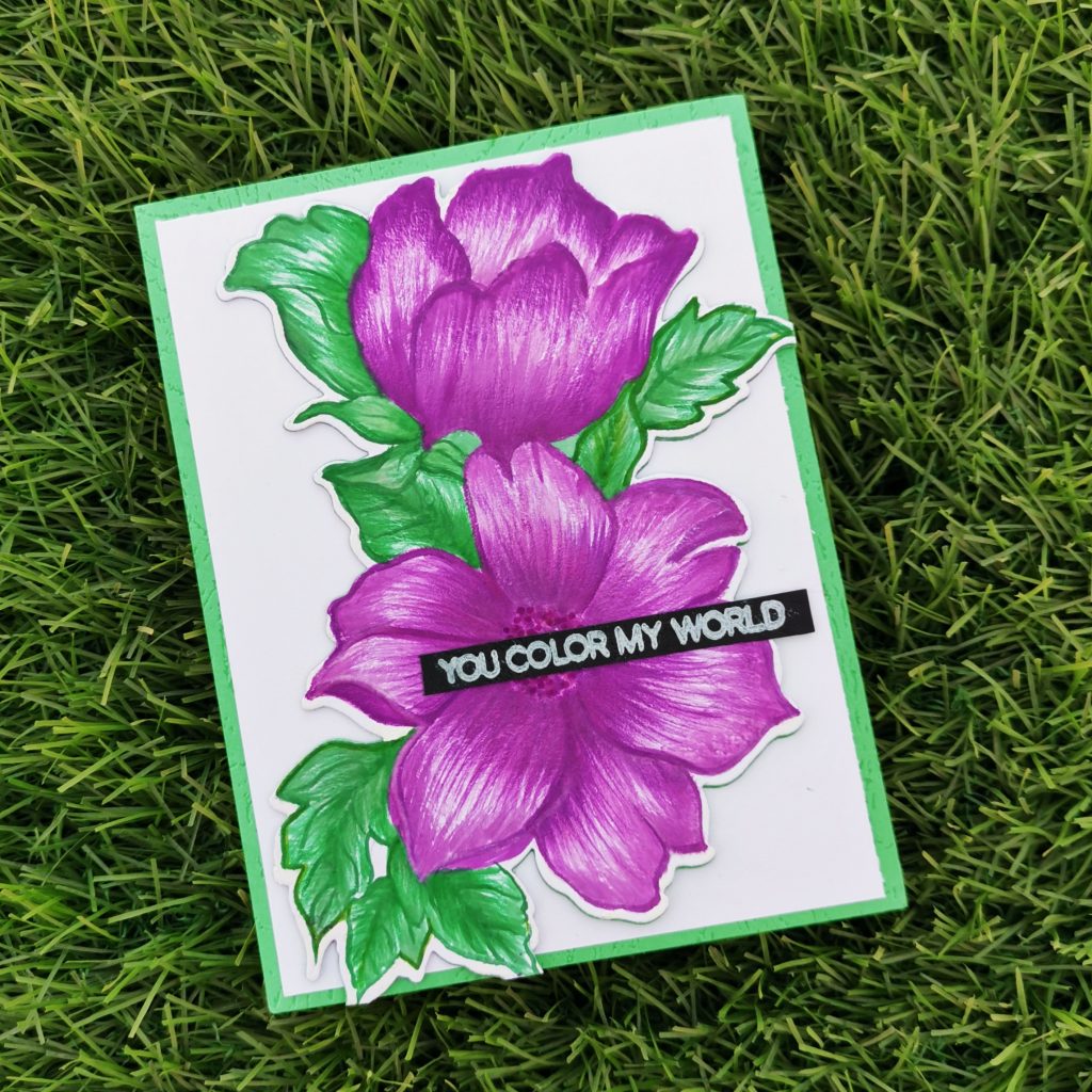
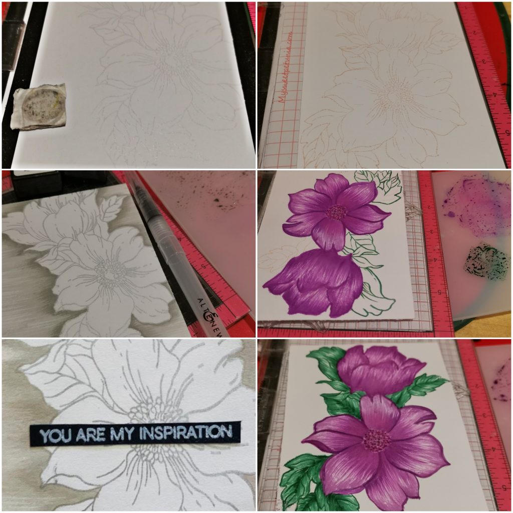
I stamped a flower from statement flower stamp set with distress ink on a white card stock paper. After stamping my crisp die inks on my watercolor pallet I painted my flower with it. Then die cut it with its coordinating dies. And stuck it on a trimmed white card stock of 4*5 1/4. Once done,I stamped a sentiment from the halftone circles stamp set ”you color my world” with white pigment ink on a black card stock paper and trimmed it into a sentiment strip and glued it to the middle of the flower. finally i stuck this card to a 4 1/4 *5 1/2 green card stock paper.
2. Appreciation Card
A special way to tell your spouse how much you love and appreciate them.
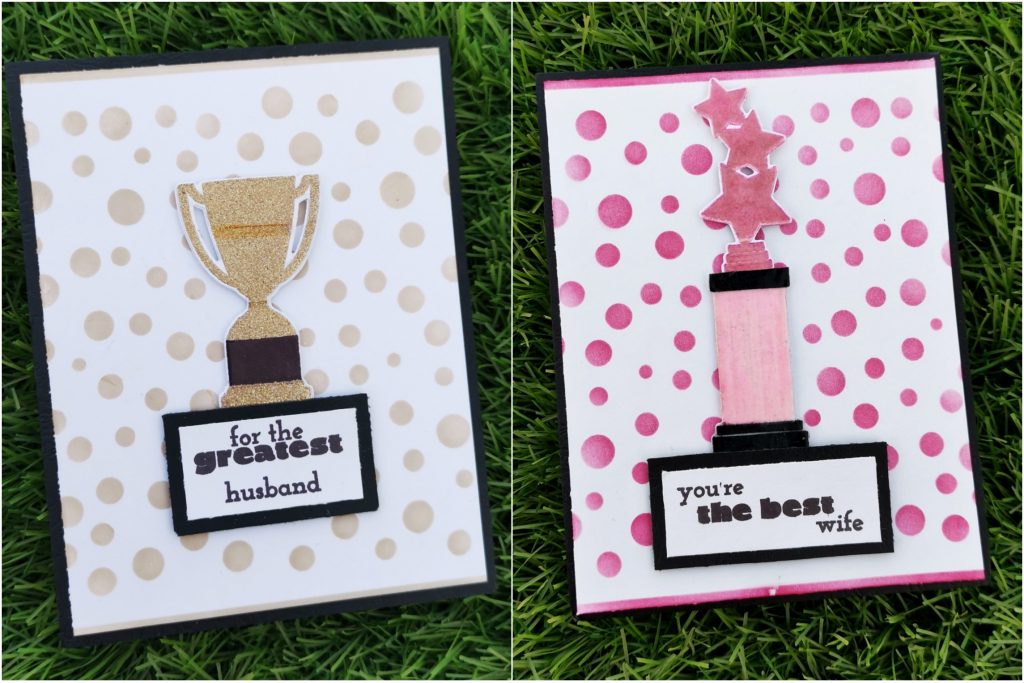
a) Masculine Card
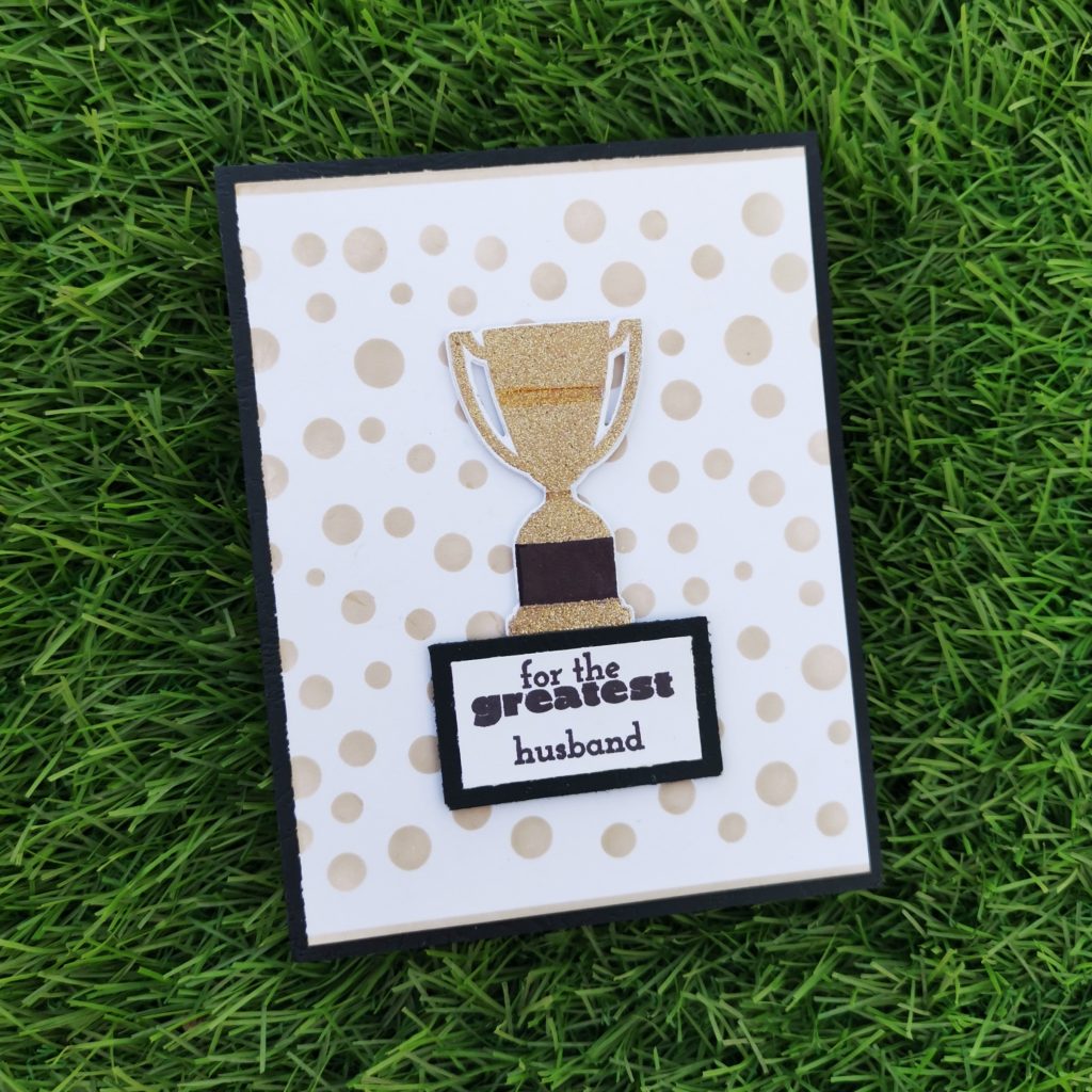
Products used-
Ink:
Sand Dunes Crisp Dye Ink
Rocky Shore Crisp Dye Ink
Stamps and Dies:
Trophy Life Stamp set
Other:
Neenah classic crest white card stock
Embossing Ink from Altenew
Tinsel gold, Ranger Embossing powder
Round circle stencil
Sizzix bigshot die cutting machine
Kokuyo Dotliner strong adhesive Tape
Foam tape
Heat gun
Misti stamping tool
HeroArts Embossing heat gun
Methods used :
Clean and simple boutique cards(simple styling /metallic details)
Ink blending techniques (Ink Blend a cardstock)
Easy die cutting ( Stamps and Matching Dies )
All About Layering (1&2)
Let It Shine Lesson (Embossing Powder)
For The Guys(Geometrics)
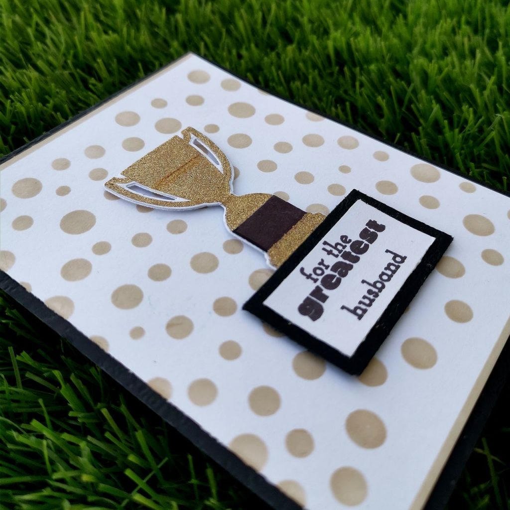
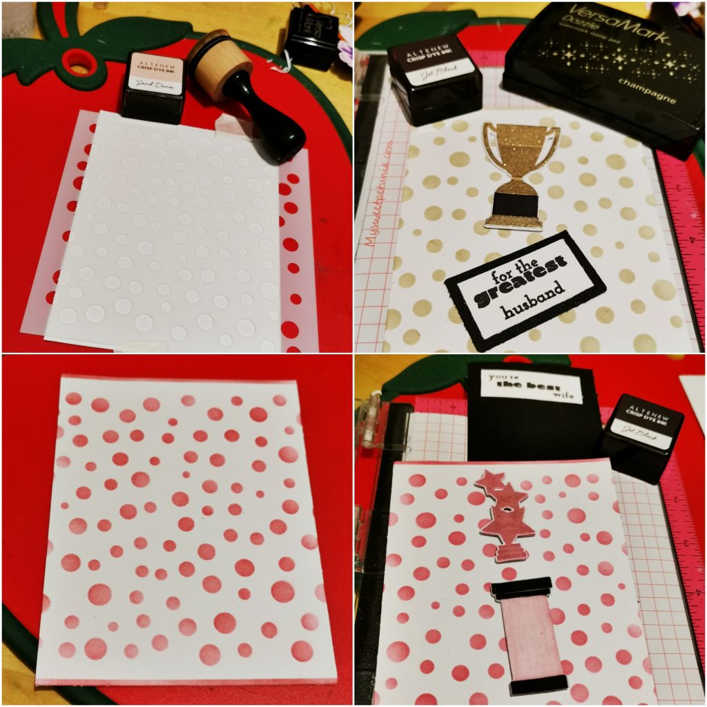
I trimmed a white card stock into 4*5 1/4 and placed the circle round stencil on the card stock. I ink blended Sand Dunes Crisp Dye Ink and Rocky Shore Crisp Dye Ink over the card stock. I also blended a thin strip on the top and bottom of the card stock . These circles add to the geometrical element to the card.Then I took a white cardstock paper and dusted it with some sort of antistatic powder .This fine layer of powder will prevent embossing powder from sticking to areas where you don’t want it to stick.Then I stamped the trophy with clear embossing ink and then embossed it with Tinsel gold Embossing powder from Ranger. Before heat setting my embossing powder, I used a dry brush to sweep away any stray pieces of embossing powder. These little specs will expand as they heat and turn in to blobs. Quickly brushing away strays will give us great results every time. Then I heatset it with my heat gun. The base of the trophy was stamped with jet black. I choose a sentiment from the same set and stamped it on a white card stock paper i trimmed it down and stuck it to a black card stock paper.and later on trimmed that too, leaving a small black border. I stuck it on the base card using foam tape.
b) Feminine Card
Products used- Ink:
Pinkalicious Crisp Dye Ink
Pinkalicious Crisp Dye Ink
Rubellite Crisp DyeInk
Stamps and Dies:
Trophy Life Stamp set
Other:
Neenah classic crest white card stock
Embossing Ink from Altenew
clear Embossing powder from Altenew
Round circle stencil
sizzix bigshot diecutting machine
Kokuyo Dotliner strong adhesive Tape
Foam Tape
Misti stamping tool
HeroArts Embossing heat gun
Methods used-
Ink blending techniques (basic ink Blended background/emboss resist)
Easy die cutting ( Stamps and Matching Dies )
Irresistible inking techniques( Painting with Ink pads )
All About Layering (1&2)Let It Shine Lesson ( Embossing Powder)
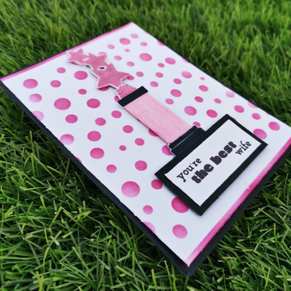
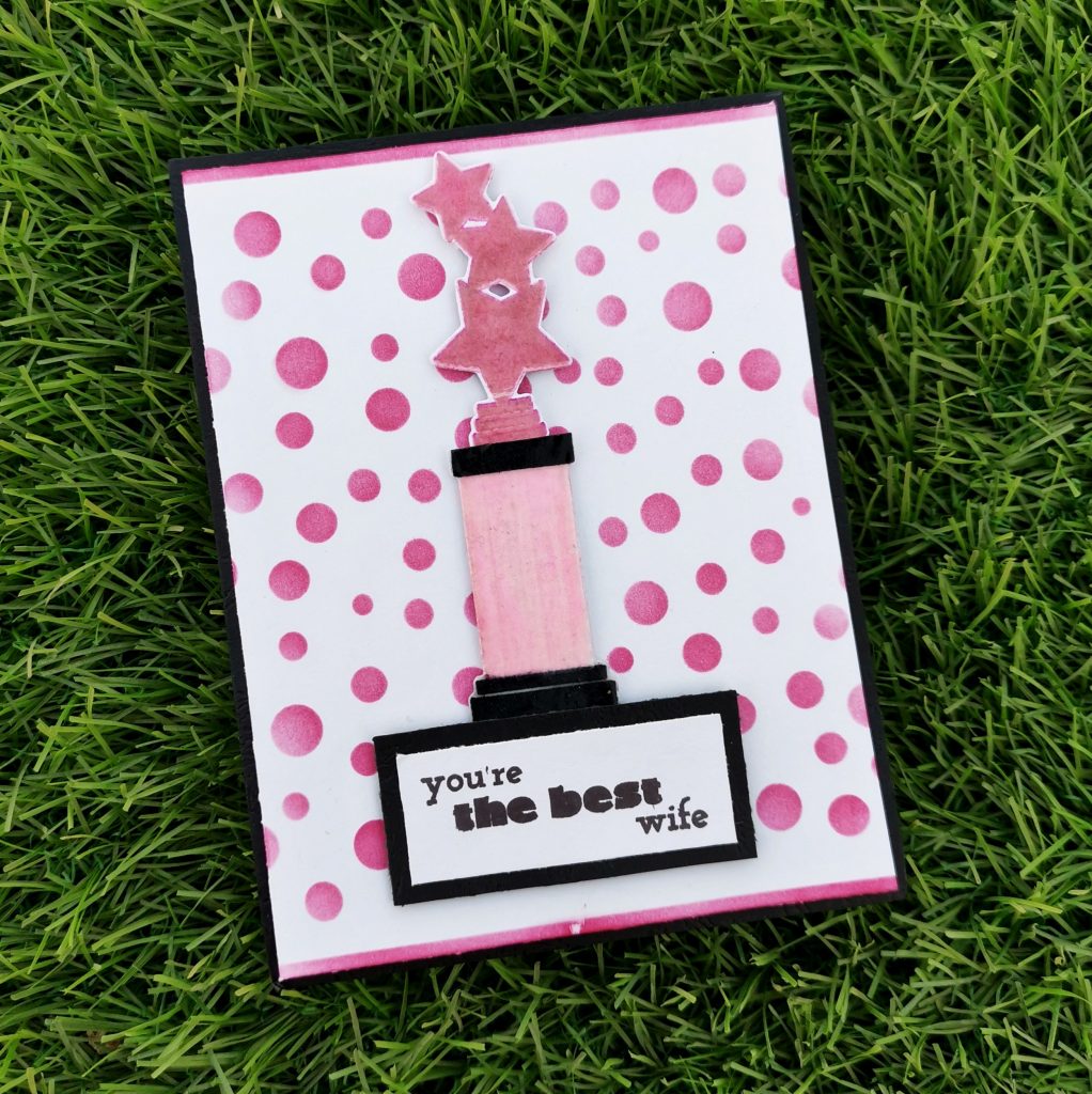
I trimmed a white card stock into 4*5 1/4 and placed the stencil on the card stock. I ink blended it with Pinkalicious Crisp Dye Ink and Rubellite Crisp Dye ink. I also blended a thin strip on the top and bottom of the card stock . Then on a white card stock paper I stamped the trophy with the same crisp dye inks and then stamped clear embossing ink on it. It was a must to prep my surface with some sort of antistatic powder tool before clear embossing it. This fine layer of powder will prevent embossing powder from sticking to areas where you don’t want it to stick.
Then I embossed it with clear Embossing powder from Ranger. While heat setting it, I made sure to Heat it to the max. I made my heat tool to heat up to its hottest point before taking it to the paper. This will minimize the amount of time it takes for the powder to melt and will minimize warping. The base of the trophy was stamped with jet black. For the middle portion of the trophy ,I stamped my crisp die inks on my watercolor pallet and I painted that part with it. I choose a sentiment from the same set and stamped it on a white card stock paper i trimmed it down and stuck it to a black card stock paper.and later on trimmed that too, leaving a small black border. I stuck it on the base card using foam tape.
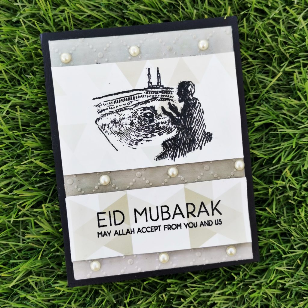
3. Eid Card
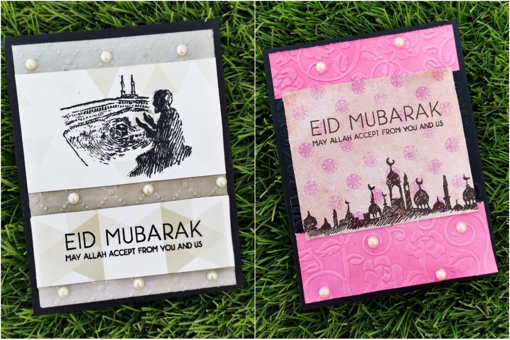
Eid has reached the corner, what else more do you want to celebrate.
a) Masculine Card
Products used-
Ink:
Evening Gray Crisp Dye Ink
Galactic Stream Crisp Dye Ink
Tsukineko Stazon Jet black Ink
Stamps and Dies:
Eid Greetings Stamp Set
Eid al Adha Stamp Set
Other:
Sizzix big shot die cutting machine
Misti stamping tool
Neenah classic crest white card stock
Black card stock paper
Sizzix Embossing folder
recycled envelope
sticking pearls(white)
Methods used–
Used Recycled product
Easy Ink blending techniques ( ink Blend a cardstock)
Let It Shine Lesson (Embellishments)
For The Guys (Geometrics)
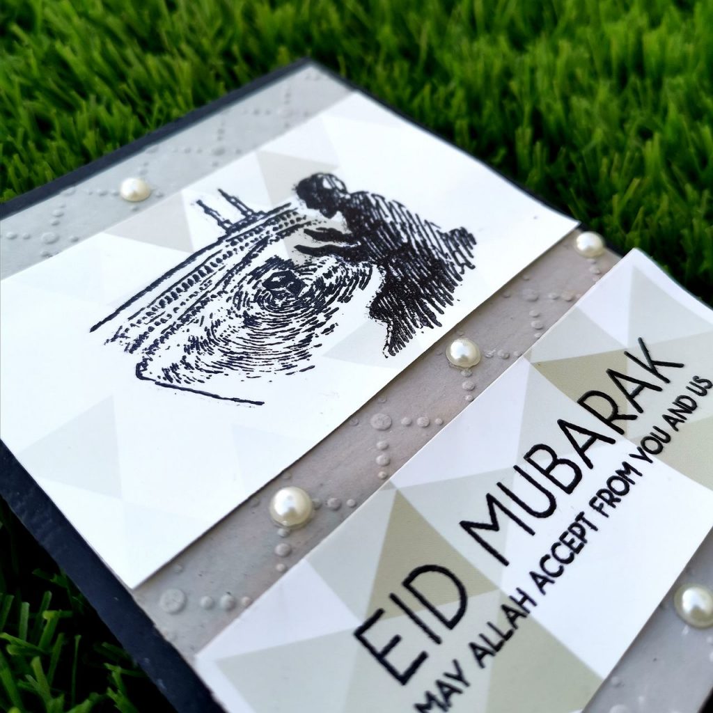
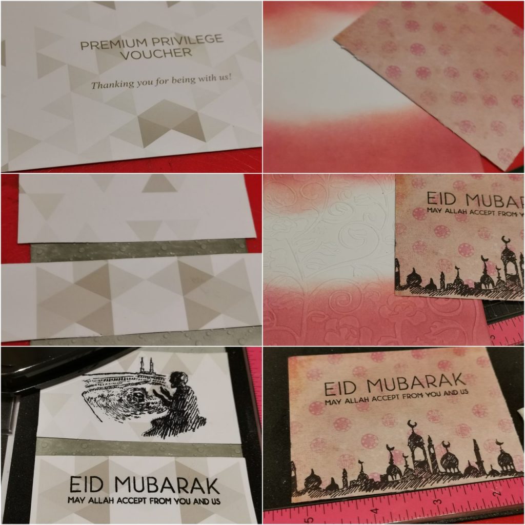
Initially I trimmed a white card stock paper into 4*5 1/4 and ink blended it with my Evening Gray Crisp Dye Ink and Galactic Stream Crisp Dye Inks. Then i kept it between an embossing folder from sizzix and ran it through my big shot die cutting machine. Then I trimmed the recycled paper(i trimmed it out from an envelope, found in my mom’s room) into 2 pieces. The smaller strip was stuck below the bigger one leaving few inches gap. Another reason for me to choose this envelope was due to the geometrical structure on that paper. It has got various number of triangles in diffrent grey shades.This enriches the masculine beauty of the card as a whole. I stamped the haram(mosque with kaaba) picture sentiment on the top piece and the sentiment of eid greetings on the paper below it. Then i stuck some pearls on the embossed areas.
b) Feminine Card
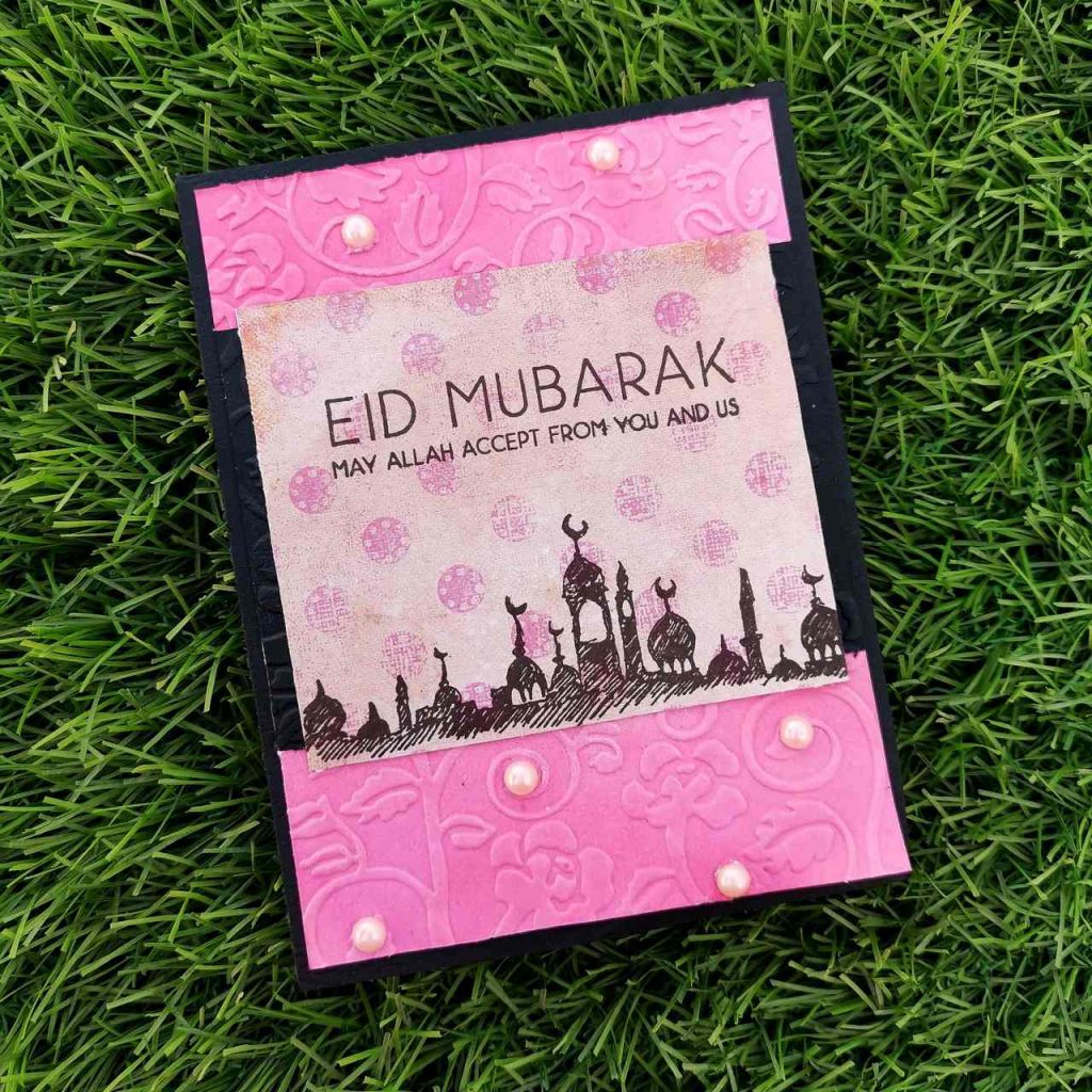
Products used-
Ink:
Pinkalicious Crisp Dye Ink
Coral Berry Crisp Dye Ink
Jet Black Crisp Dye Ink
Stamps and Dies:
Eid Greetings Stamp Set
Eid al Adha Stamp Set
Other:
Sizzix bigshot die cutting machine
Neenah classic crest solar white cardstock
Kokuyo Dotliner strong adhesive Tape
Misti stamping tool
Embossing folder for aliexpress
recycled paper
sticking pearls (pink)
Methods used–
Used Recycled product
Easy Ink blending techniques ( ink Blend a cardstock)
Let It Shine Lesson (Embellishments)
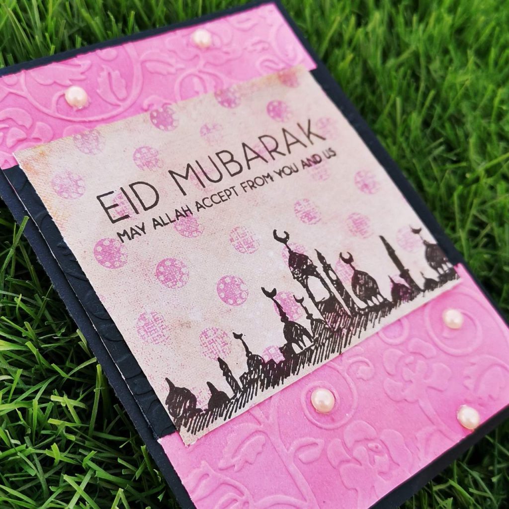
Initially I trimmed a white card stock paper into 4*5 1/4 and ink blended it with my Pinkalicious Crisp Dye Ink and Coral Berry Crisp Dye Inks from altenew. Then i kept it between an floral embossing folder and ran it through my sizzix big shot. Then I trimmed the recycled paper(pink craft paper from a wedding invitation) into a size which fits the width of the card. Here my paper was smaller than the width of the actual card, so i stuck it on a black card stock strip.The pattern paper was an inch more in length than the black strip. Then i stamped the mosque stamp on the bottom part and the sentiment on the the top on the pattern paper with jet black ink. then i struck it on a black card stock paper of size 4 1/4*5 1/2. Then i stuck some pearls on the embossed areas.
4. Love you Card
Saying I love you with a greeting card is something which you can forever treasure in your life.
a) Masculine Card
Products used-
Ink:
Dew Drops Crisp Dye Ink
Aqualicious Crisp Dye Ink
Teal Cave Crisp Dye Ink
Galactic Stream Crisp Dye Ink
Jet Black Crisp Dye Ink
Stamps and Dies:
Build-A-Flower: Triumph Tulip Layering Stamp & Die Set
Build-A-Flower: Columbine Layering Stamp & Die Set
Apothecary Labels Stamp & Die Bundle
I love you calyptus from lawn fawn
Other:
Sizzix bigshot
Kokuyo Dotliner strong adhesive Tape
Foam tape
Misti stamping tool
Methods used-
Easy Die Cutting Techniques ( Stamps and Matching Dies )
All About Layering (1&2)
For The Guys
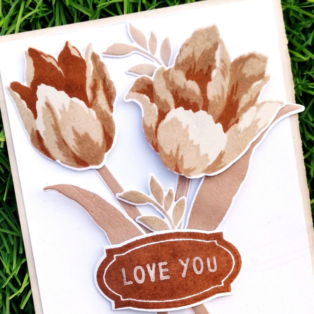
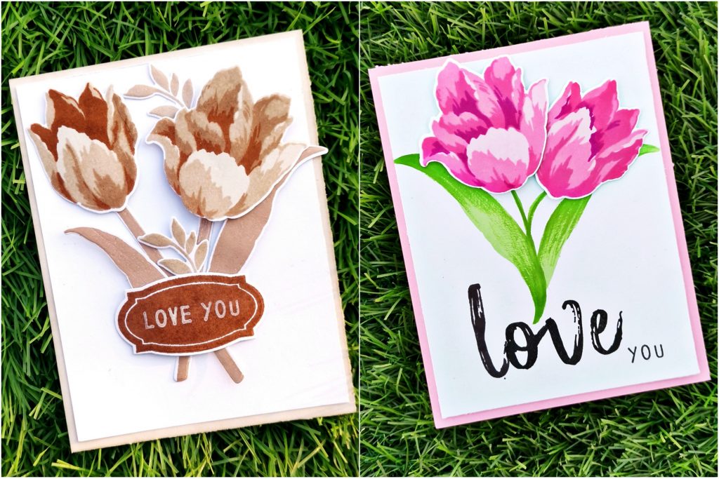
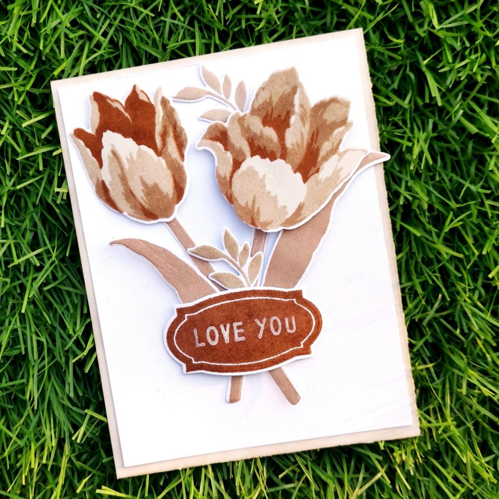
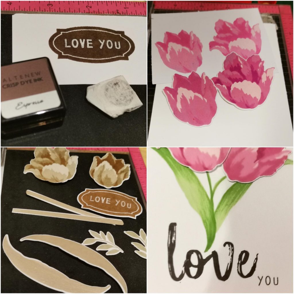
I trimmed a black card stock into 4*5 1/4 and kept it aside. Then stamped triumph tulip flowers on a white card stock paper with Dew Drops Crisp Dye Ink, Aqualicious Crisp Dye Ink, Teal Cave Crisp Dye Ink and Galactic Stream Crisp Dye Ink from Altenew. I stamped the leaves with the lightest shade. And then die cut it with the coordinating die set. Then I stamped a darker shade on my watercolor pallet and then colored the leafs by shading over it using a water color brush. The stem was from an another build a flower set(Columbine layering stamp set) The die cut pieces were stuck on the black cardstock paper which was kept aside in the beginning. Then I stamped an Apothecary Label using the same shade on a white card stock paper and die cut it with a coordinating die. That label add on to the beauty of the card. This can also be considered as the masculine geometcrical ellement of the card, apart from the color theme. Then I stamped a “I love you” sentiment with jet black ink on it using a stamp set from lawn fawn. I didn’t have a darker card stock paper matching to the theme. So I inkblended a white card stock with the same crisp die ink. I trimmed it out into 4 1/4* 5 1/2 and placed it behind the black cardstock paper.
b) Feminine Card
Products used-
Ink:
Pinkalicious Crisp Dye Ink
Rubellite Crisp Dye Ink
Pink diamond Crisp Dye Ink
Razzleberry Crisp Dye Ink
Firefly Crisp Dye Ink
Grass field Crisp Dye Ink
Stamps and Dies:
Build-A-Flower: Triumph Tulip Layering Stamp & Die Set
Mega brush Alpha stamp set
I love you calyptus from lawn fawn
Other:
Sizzix bigshot die cutting machine
Kokuyo Dotliner strong adhesive Tape
Foam tape
Misti stamping tool
Methods used–
Easy die cutting ( Stamps and Matching Dies )
All About Layering (1&2)
Irresistible inking techniques( Painting with Ink pads )
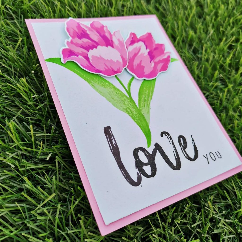
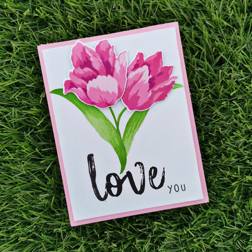
I trimmed a Neenah classic crest white card stock paper into 4*5 1/4. Then I stamped my triumph tulips with Pinkalicious Crisp Dye Ink, Rubellite Crisp Dye Ink, Pink diamond Crisp Dye Ink and Razzleberry Crisp Dye Ink. And then I die cut it with its coordinating dies. The leaves were stamped in firefly Crisp Dye Ink on the white cardstock paper. Then I stamped a darker shade on my watercolor pallet and then colored the leafs by shading over it using a water color brush. The stem was also drawn using the same method. Then I stuck the Tulip flowers on the card using form tape. On the lower side of the card I stamped love using the alphabet stamps from Mega brush Alpha stamp set from Altenew. I prefered using the jet black crisp die ink for it. I also stamped “you” from I love you calyptus stamp set from lawn fawn. At the end I trimmed a pale pink cardstock paper into 4 1/4 *5 1/2 card. And stuck it behind the white one.
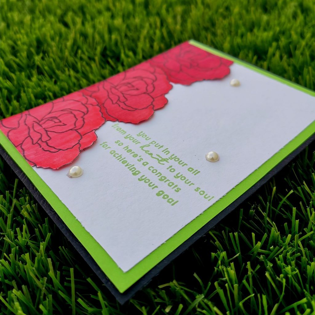
5.Congratulation Card
Events in life call for a congratulations such as: a job promotion, graduation or just about anything that is a really important achievement for someone . So here I make a job promotion feminine card and a graduation masculine card.
a) Masculine Card
Products used-
Ink:
Jet Black Crisp Dye Ink
Stamps and Dies:
Build-A-Flower :Begonia layering stamp and die set.
Other:
Black Artistic marker from Altenew
Neenah classic crest solar white card stock
Light green cardstock paper
Black card stock paper
Kokuyo Dotliner strong adhesive Tape
Misti stamping tool
Methods used–
Clean & Simple Boutique Cards (Simple Styling)
For The Guys
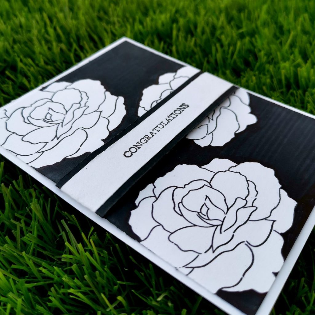
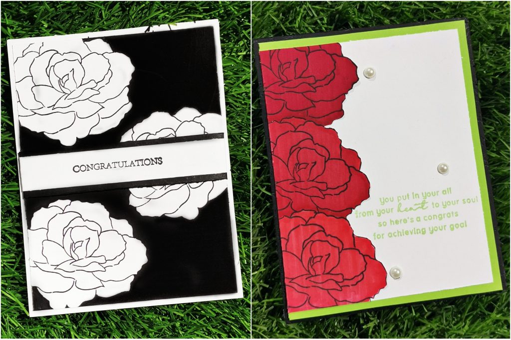
I trimmed a Neenah classic crest solar white cardstock into 4 *5 1/4 card stock. And stamped the outline stamp of build a flower begonia randomly on the cardstock. I choose this particular stamp set from Altenew because it gives a circle dimension to the flowers. Then leaving the inner part plain. I colored the outer part of the flowers with Jet black artistic markers.I did them as repeated thin strips.once that is done, I trimmed a Neenah classic crest solar white cardstock into thin strip and stamped “congratulations”, from sweetest peas stamp set on it. Then I covered that strip with black cardstock paper. And stuck it towards the middle of the card. The rectangle strip sentiment , horizontal marker lines, the black and white color code all together enriches the masculine look of the card. The technique used in making of the cards is really easy and simple . Any beginners can give a try on it
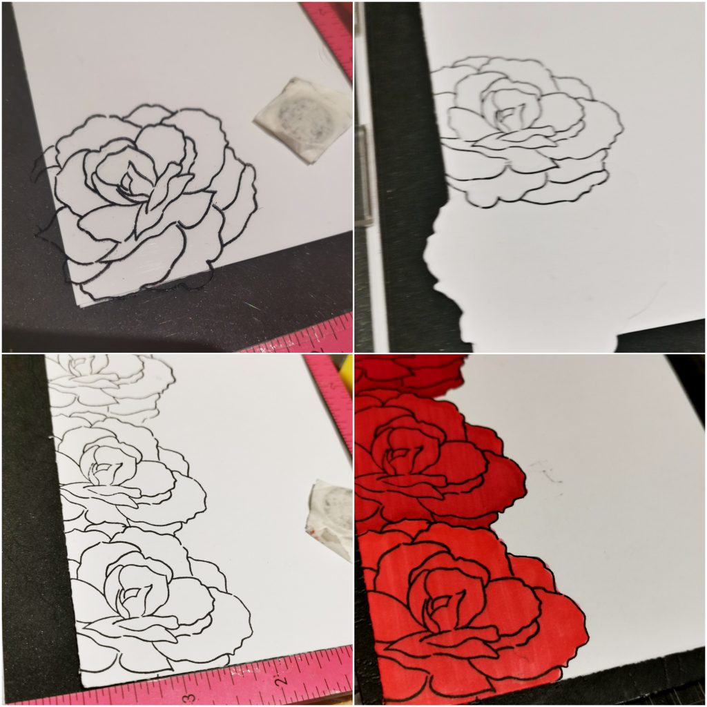
b) Feminine Card
Products used-
Ink:
Jet Black Crisp Dye Ink
Firefly Crisp Dye Ink
Stamps and Dies:
Build-A-Flower: Begonia layering stamp and die set
Say it with love stamp set from Altenew
Other:
Velvet Artistic marker from Altenew
Crimson Artistic marker from Altenew
Ruby Red Artistic marker from Altenew
Sticky pearls (white)
Sizzix bigshot die cutting machine Neenah classic crest solar white cardstock
Kokuyo Dotliner strong adhesive Tape
Misti stamping tool
Methods used–
Clean & Simple Boutique Cards (Simple Styling)
Let It Shine Lesson (Embellishments)
Seasonal Scene Building(Masking A Scene)
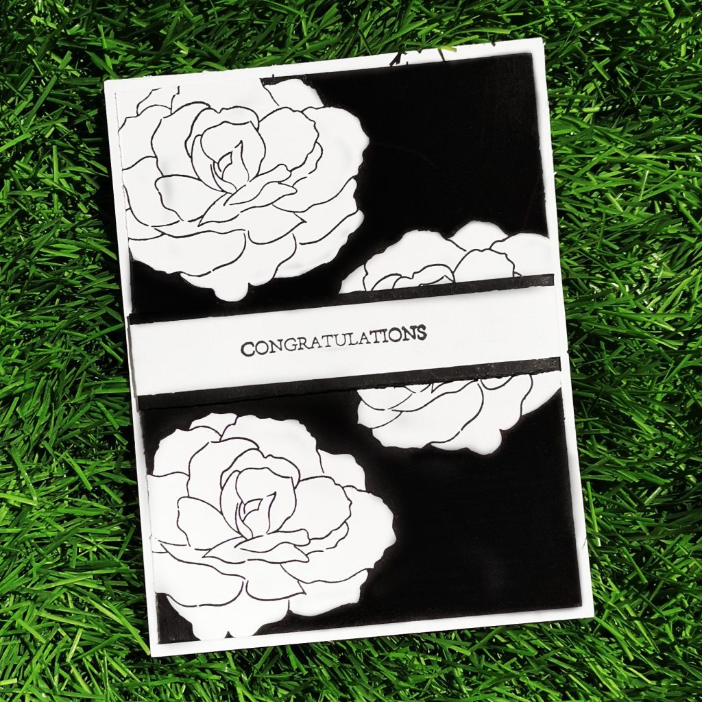
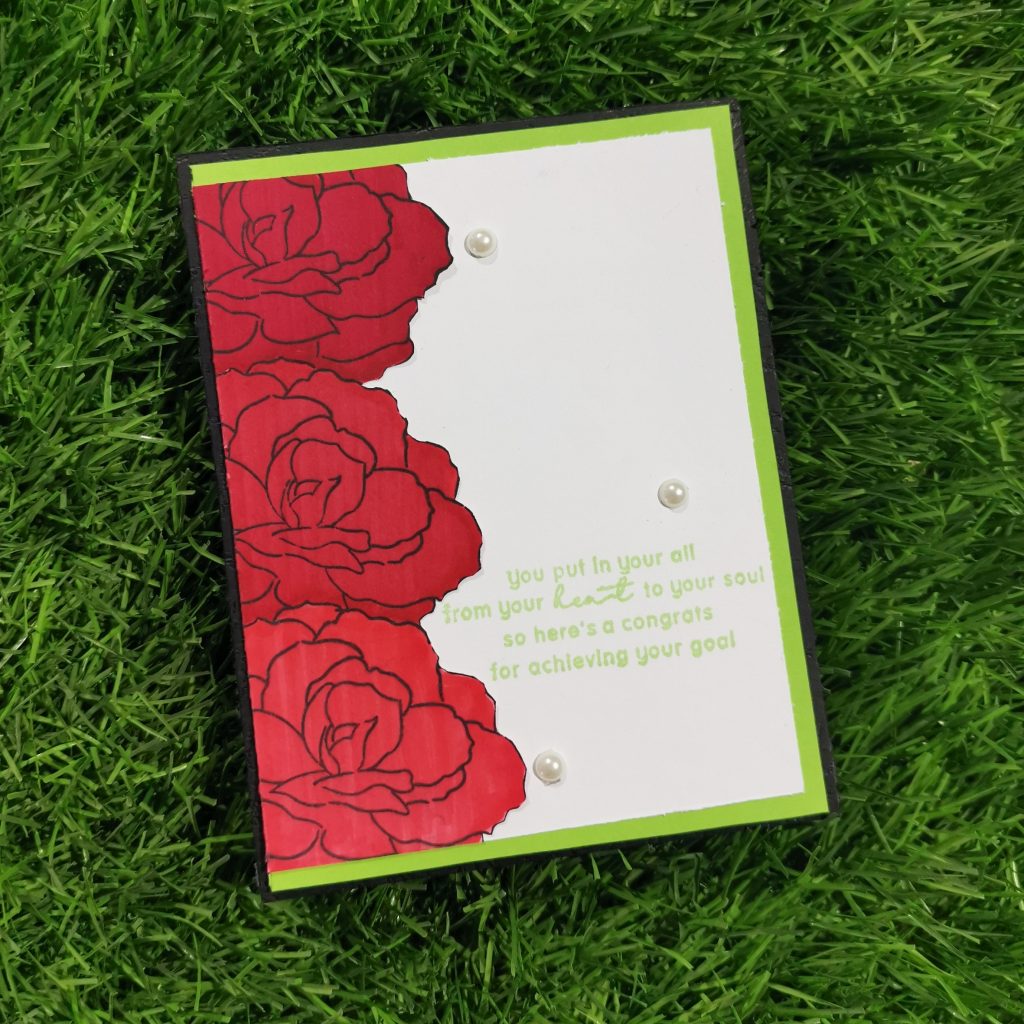
I trimmed a Neenah classic crest solar white cardstock into 3 3/4 *5 card stock. Then stamped Build-A-Flower: Begonia layering stamp on the left corner of the card with jet black crisp die ink from Altenew. Then masking it with a die cut piece of the same flower set, I stamped the next flower slightly above it. I stamped 3 begonias in the same way. Then I colored them with 3 variations of red artistic markers. Then I trimmed a green cardstock paper into 4 *5 1/4 and stuck it behind my cardstock paper. I also trimmed a black cardstock paper into 4 1/4 *5 1/2 and placed it behind the green cardstock paper. Thus the 3 layer of cardstock paper brings a little more dimension to the card. And at the end I stamped my sentiment with Firefly Crisp Dye Ink towards the right side of the card
6. Anniversary card
A Happy Anniversary card is usually given by a wives and husbands to each other. But here is something special for the most wonderful couple i have ever met in my life.
a) Masculine Card
Products used-
Ink–
Espresso Crisp Dye Ink
Mocha Crisp Dye Ink
Rocky Shore Crisp Dye Ink
Sand Dunes Crisp Dye Ink
Jet Black Crisp Dye Ink
Stamps and Dies:
Calming Reverie Stamp & Die Bundle from Altenew
Happy Pomegranates Stamp Set from Altenew
Other:
Sizzix bigshot die cutting machine
Neenah classic crest solar white cardstock
Kokuyo Dotliner strong adhesive Tape
Foam tape
Misti stamping tool
Methods used–
Easy die cutting ( Stamps and Matching Dies )
All About Layering (1&2)
For The Guys (Geometrics)
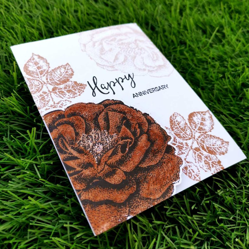
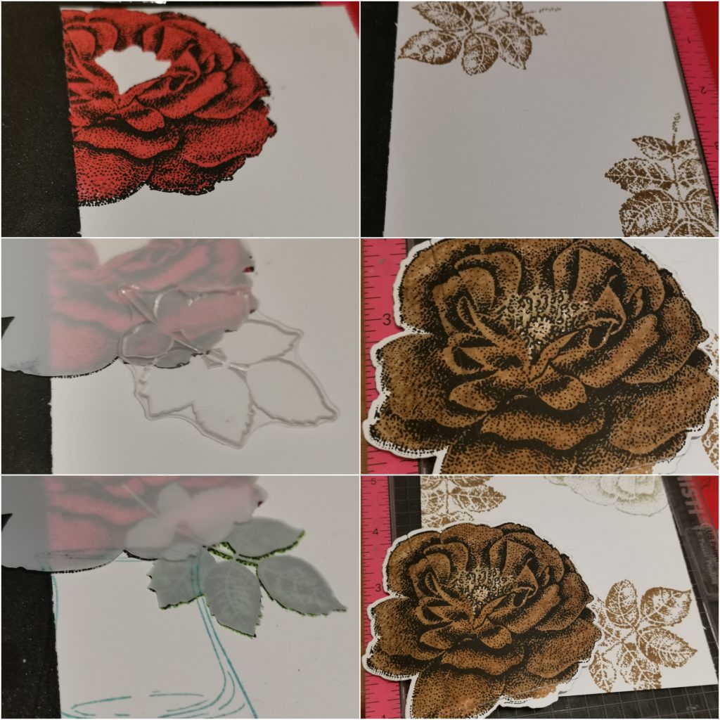
I trimmed a Neenah classic crest solar white cardstock into 4 *5 1/4 card stock. Then I took an another card stock paper and stamped Calming Reverie Stamp with Mocha and Rocky Shore Crisp Dye Ink (light shading) and the second layer was done with Jet black crisp die ink. Then I trimmed it with its coordinating dies. I stamped the leaves towards the right side of the flower. The flower by itself gives a semi circle geometric feature to the card. A similar flower stamp was done towards the top right corner of the card with. I stuck the die cut flower with foam tape and stamped happy anniversary with jet black ink towards the center of the card. Both “happy” and “anniversary” sentiments were from the happy pomegranates stamp set from Altenew.
b) Feminine Card
Products used-
Ink:
Heartbeat Crisp Dye Ink
Vineyard berry Crisp Dye Ink
Caribbean Sky Crisp Dye Ink
Firefly Crisp Dye Ink.
Jet Black Crisp Dye Ink
Stamps and Dies:
Calming Reverie Stamp & Die Bundle from Altenew
Happy Pomegranates Stamp Set from Altenew
Other:
Sizzix bigshot die cutting machine
Neenah classic crest solar white cardstock
Misti stamping tool
Embossing folder from Sizzix
Methods used–
Easy die cutting ( Stamps and Matching Dies )
All About Layering (1&2)
Irresistible inking techniques( Painting with Ink pads )
Seasonal Scene Building(Masking A Scene/Oversized Scenes)
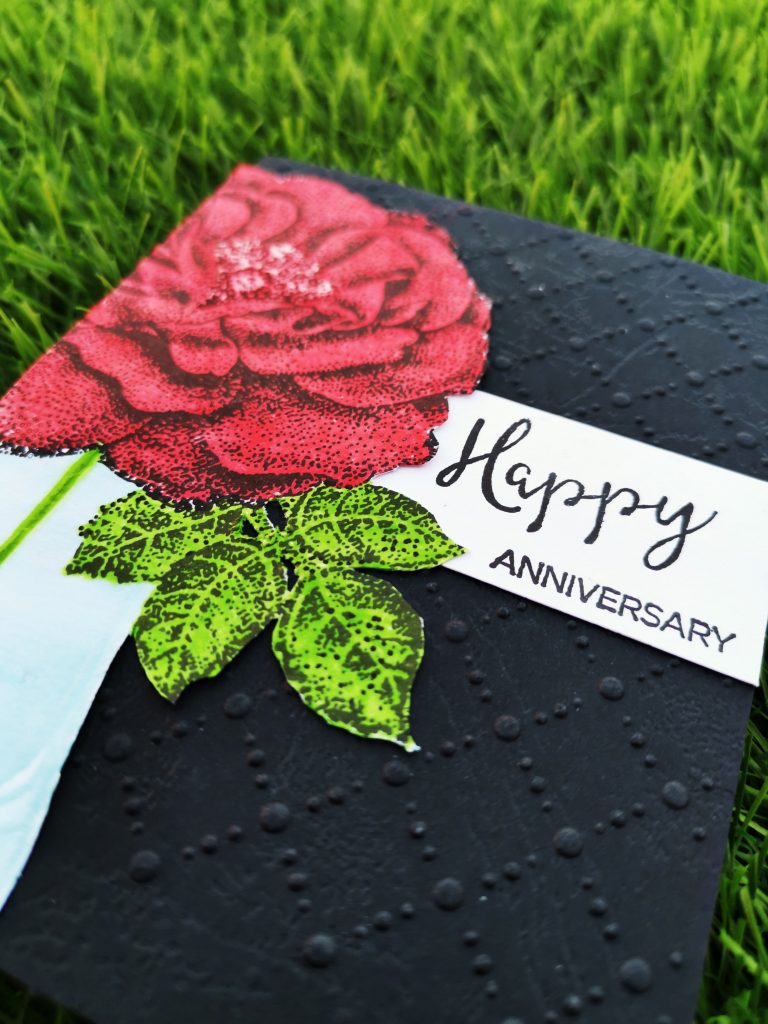
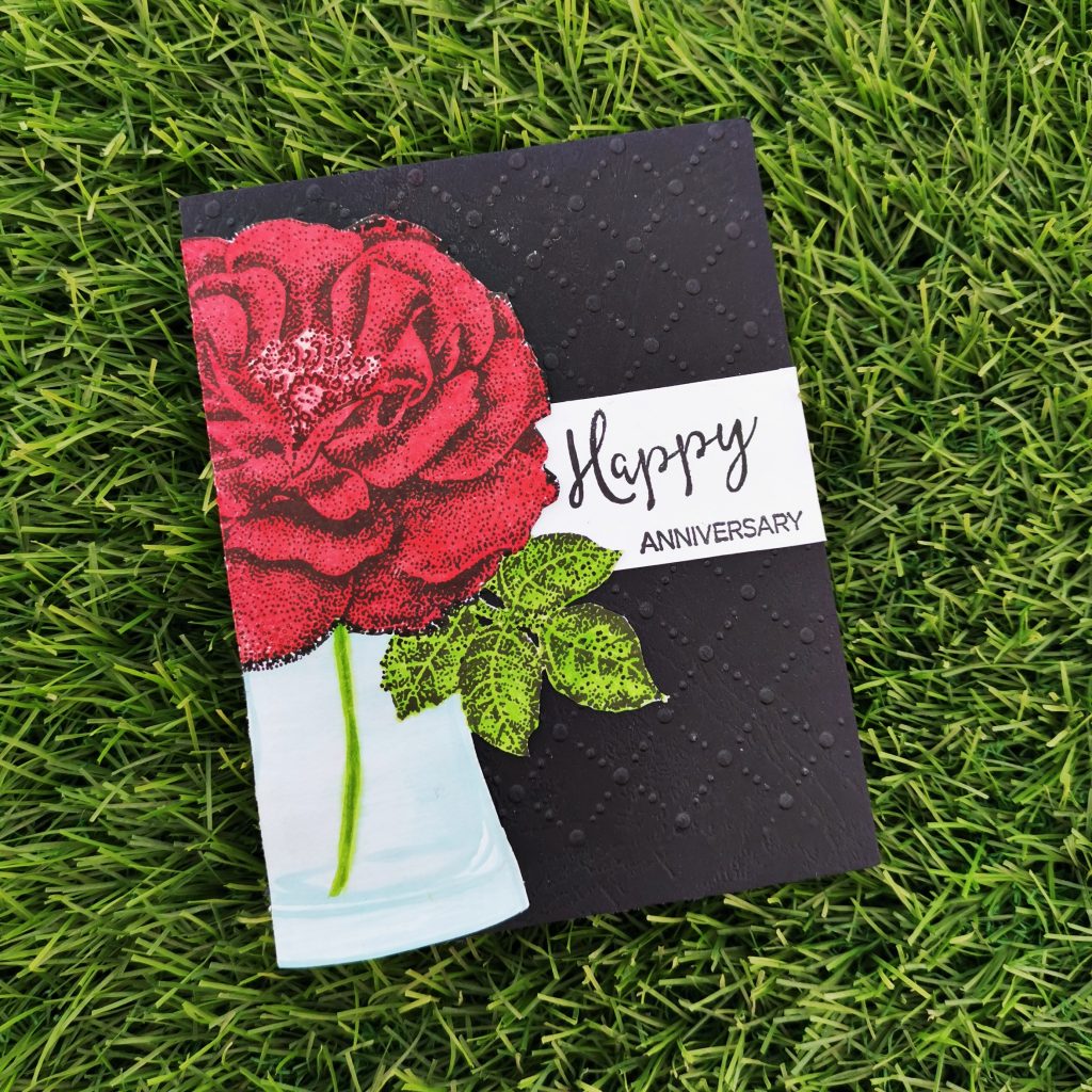
Initially I trimmed a black cardstock into 4 1/4 *5 1/2. Then kept it between a sizzix embossing folder ran it through by sizzix big shot die cutting machine. In an another Neenah classic crest solar white cardstock I stamped the flower from Calming Reverie Stamp Set with Heartbeat Crisp Dye Ink and Vineyard berry Crisp Dye Ink. By masking it with its coordinating stencil, I stamped the leaf too with Firefly Crisp Dye Ink. I stamped the vase from versatile vases stamp set by masking both the flower and the leaf. I stamped Caribbean Sky Crisp Dye Ink on my watercolor pallet and I painted it using a water color brush. Then I trimmed it and pasted it into the black cardstock paper. The I stamped happy anniversary to a white card stock paper with jet black crisp die ink from Altenew. Trimmed it and pasted it to the side of the flower vase.
Wrapping up the cards
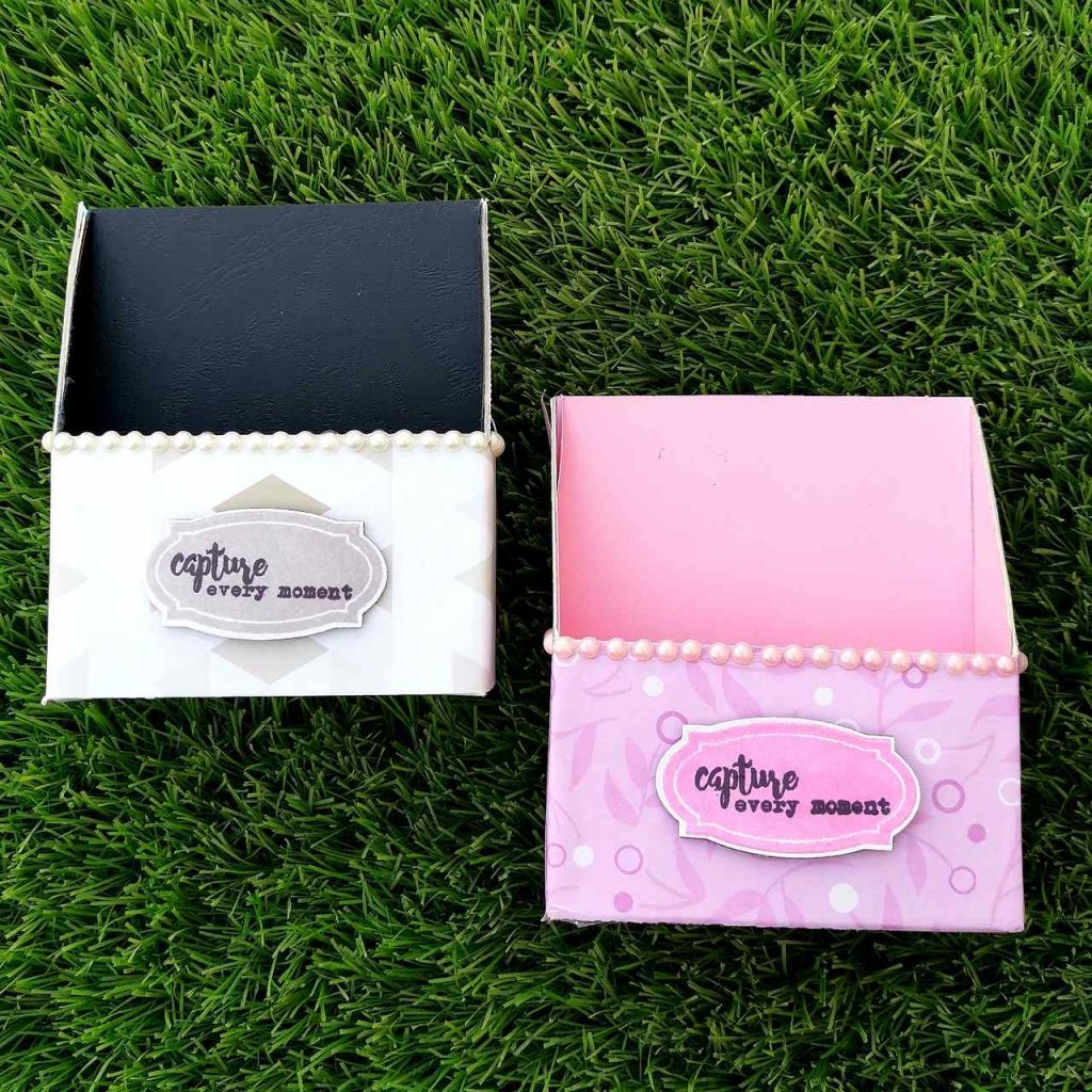
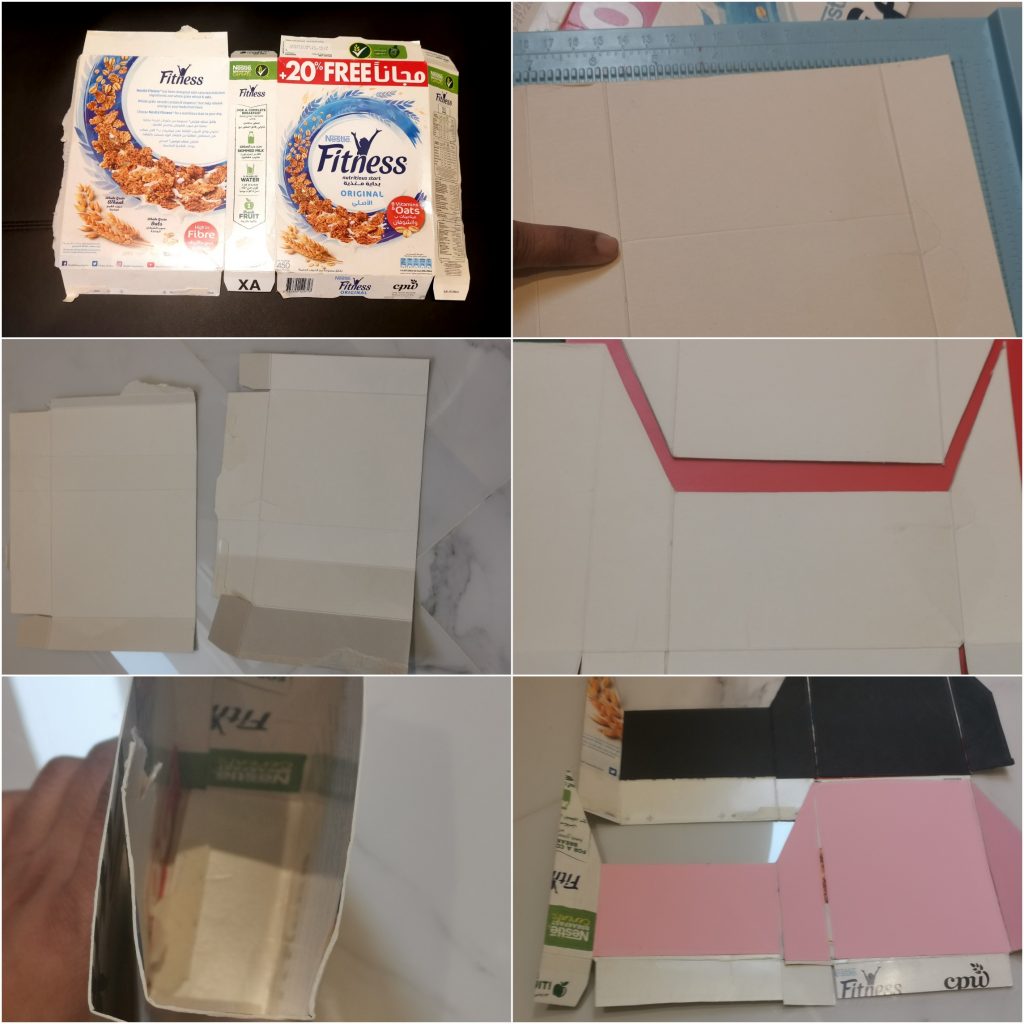
Alhamdulilah, done with the making of the cards. Now it’s time to set up a package for it. I have made a bundle of cards today. Each masculine as well as feminine card sets have almost 6 cards. I wanted to make a cover which can act as a storage as well as a display able package for my cards and I needed it fast.Like most crafters, space is precious to us, so I needed something narrow and tall rather than short and wide!This is what I came up with!
I took a cereal box from the kitchen and opened it up. Focusing on it’s length, I trimmed it into half. I did this for 2 reasons. Firstly I didn’t want something which was this tall. Secondly, as I trimmed it into half, I could make 2 of them with the same box.
Now focusing on the side of the box. I trimmed it into 2. This makes the width of our card holder reduced into half of its size. And the other half can be used for the opposite side of the card. Then I kept my greeting card of that cereal sheet, and marked its length. I just marked half inch extra so that the cards won’t be tight inside the box. I scored a line there with my scoring board. Then I measured the same width as on the left side and scored it on the right side too. Base parts can be trimmed as per our convince to fold. For the mascunine holder I stuck black cardstock inside thebox,while for the feminine holder i choose pink.Then I stuck the opposite part together to it by overlapping its sides. Now u can get a top opened box.
I didn’t want my package to be closed completely on the front. So I trimmed half way through the front of the card. (trimmed only the front portion). Then I drew, a diagonal line connecting the back portion and the front of the card. I trimmed it along the lines. Then I stuck the outer side of the box with recycled papers and pattern papers. To add more look, I stuck some sticky pearls too. That’s when I decided to add a personal touch to it. So I stamped an Apothecary label stamp on a white card stock paper with cohesive theme color code. I stamped a sentiment which says “capture every moment” (Say Cheese Stamp Set from Altenew) with jet black crisp die ink from Altenew.
So that’s it. Finally I have come to the end of my project at level 1 AECP. I am really glad to be a part of our aecp community. They just help us to get out the best in us in all the ways possible. I would like to take this opportunity to thank the most lovely lady of Altenew Academy, Erum. She is someone who always offered me encouragement every step of the way.I had some technical issues with my blog and it did took few days to get fixed. But she stood up by my side with all her support. A big shout out to her, for understanding. Thank you!
Finally I am very grateful to all of you visiting my blog, I truly appreciate the support.Hope to see you all soon with another project from AECP. Until then happy stamping and thanks for stopping by!
-shahi
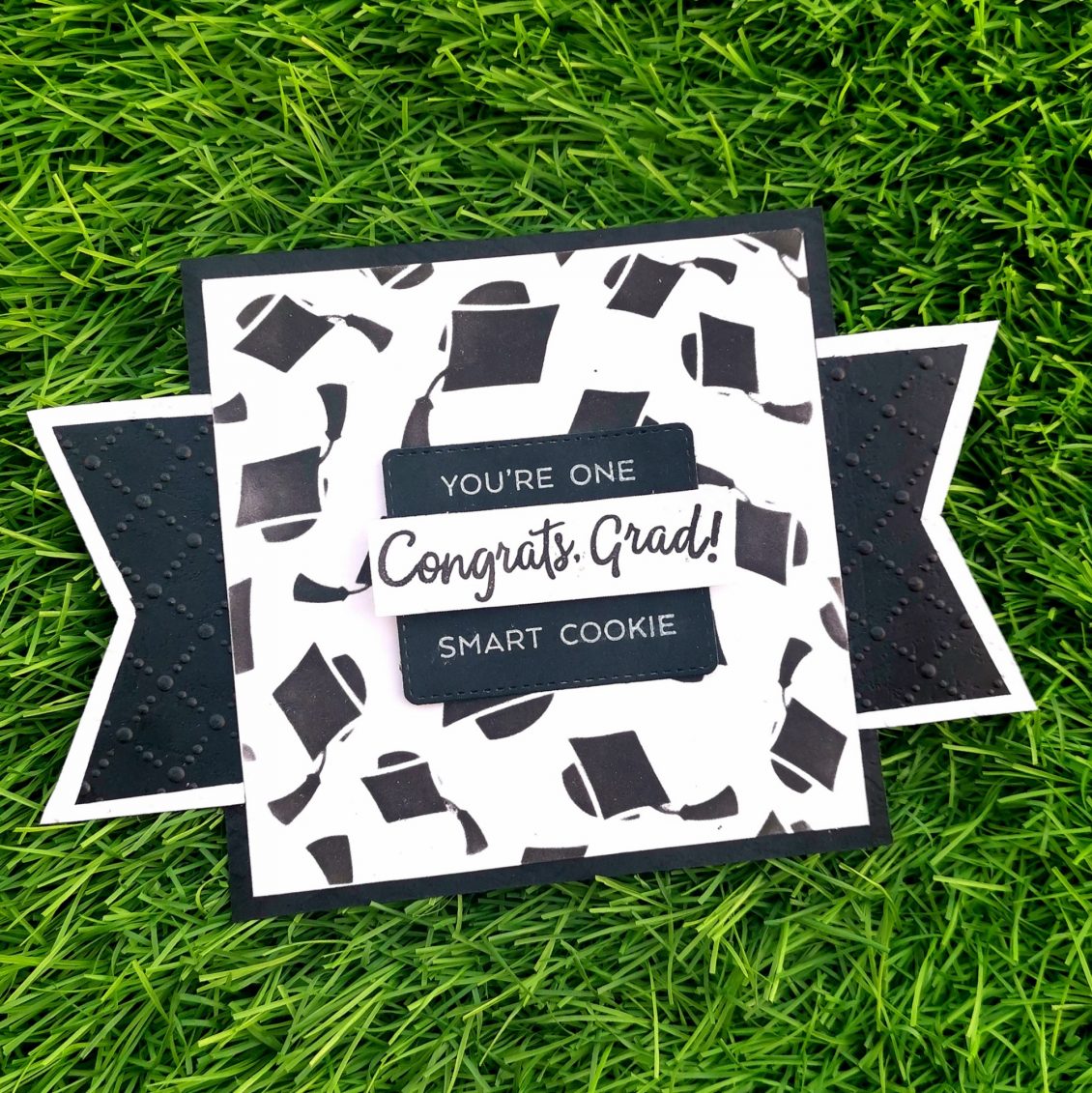
Graduation card
I had prepared this card for my brother in law, who recently completed his ACCA. This card is a combination of back and white colors.
Firstly I trimmed a Neenah classic crest solar white cardstock into 5*5. Then I choose a stencil from Simon says stamp, Graduation Celebration layering set (Sunny Days Ahead). I positioned it on my cardstock paper and blend my versa fine black ink on it.
Then I die cut a black cardstock with rectangle die (coordinating with magic slider die set) from lawn fawn. A small strip of white cardstock was being trimmed and the sentiment “congrats grad” from Simon says stamp (hats off grad) was being stamped on it with versafine Onyx Black ink. It was placed in the middle of the black cardstock. Then “you’re one” and “smart cookie” was stamped on the top and bottom of the black cardstock respectively. Those were the sentiments from the lawn fawn smart cookie stamp set. After stamping all of these, I positioned that black cardstock paper into the middle of the main cardstock and stuck it with some foam tape.
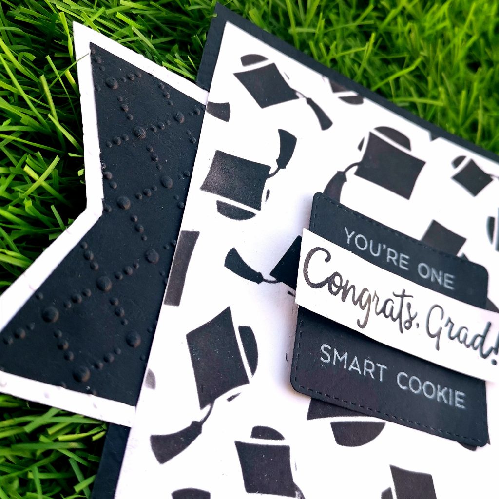
I trimmed 2 irregular polygons out of white cardstock paper and 2 blacks which were just 1/4 inch less than the white ones from all the sides. I stuck the black cardstock paper above the white cardstock. I then got them through my die cutting machine. I embossed it with an embarrassing folder from the sizzix. Then I stuck these 2 parts on the right and left sides of My basic card. As a final step. I trimmed a black cardstock paper into 5 1/4*5 1/4 and placed it behind the white cardstock.
So that’s how I ended up making a Masculine card. I am entering into a challenge from the maleroomcraftchallenge with this card. This week, their challenge was to make a Masculine card with the design below.

I hope I fulfilled their criteria and hope my card qualifies, but either way, I love this card and had a blast making it!
Also, do visit the maleroom craft challenge at https://themaleroomchallengeblog.blogspot.com/2020/06/challenge-138-sketch.html?m=1

For the guys
Alhamdulilah, finally I have reached out to my last assignment of level 1 at the altenew educator certification program. Fingers are crossed for the final project now. Like most of my fellow cardmakers, I always tend to make a feminine greeting card. It’s really rare that I make cards for the guys.
But today I have 2 reasons to make one. First of all, recently I attended a course,” for the guys” at the altenew academy. And I was looking for ideas to make a card with this theme. Secondly, I had a small fight with my hubby, and I think this is the best way to sort it out than sitting around a table talking for hours and finally reaching nowhere. Due to the current lockdown situation, I couldn’t go out shopping to get him some flowers. So I decided to inculcate all of this into my card.
As usual, I trimmed a Neenah classic crest solar white cardstock into 4 * 5 1 /4. I stamped a flower from Simon Says Stamp Exclusive 6×8 Stronger Together clear stamp set on the center of my card. As I wanted to give a try on the no borderline coloring, I stamped it with very pale distress ink from Rangers.
I colored the green leafy parts of it with the forest glades artistic marker from Altenew. For the red, I choose Ruby red artistic markers. The same markers were used throughout the making of the card. In order to get the darker shade of the same color, I colored over it again in certain areas of the flower. I gave an outline to the flower with the fine tip of my artistic markers.
I choose a sentiment from the versatile vases from Altenew and stamped it with Ruby Red crisp die ink. It was stamped towards the lower center of the card, just below the flower. To get a finished look, I trimmed a green cardstock paper into 4 1/4*5 1/2 sized cardstock and stuck it behind my white cardstock.
I gave it to him when he was back from the office. I was really delighted to see his reaction. Everything was worth the effort and time I took for making it. He said he loved it so much and would cherish it forever. Especially the sentiment, It made him realize that he was still on my thoughts even if we had a tough time. I don’t know if this could be considered as a masculine card, but I’m glad that it fulfilled my purpose.
I hope this method of making a simple Masculine card will turn out to be a inspiration for you too. Do give it a try to learn this course at https://altenew.com/products/for-the-guys. I hope to see you all soon with another project from AECP. Until then happy stamping and thanks for stopping by!
-shahi
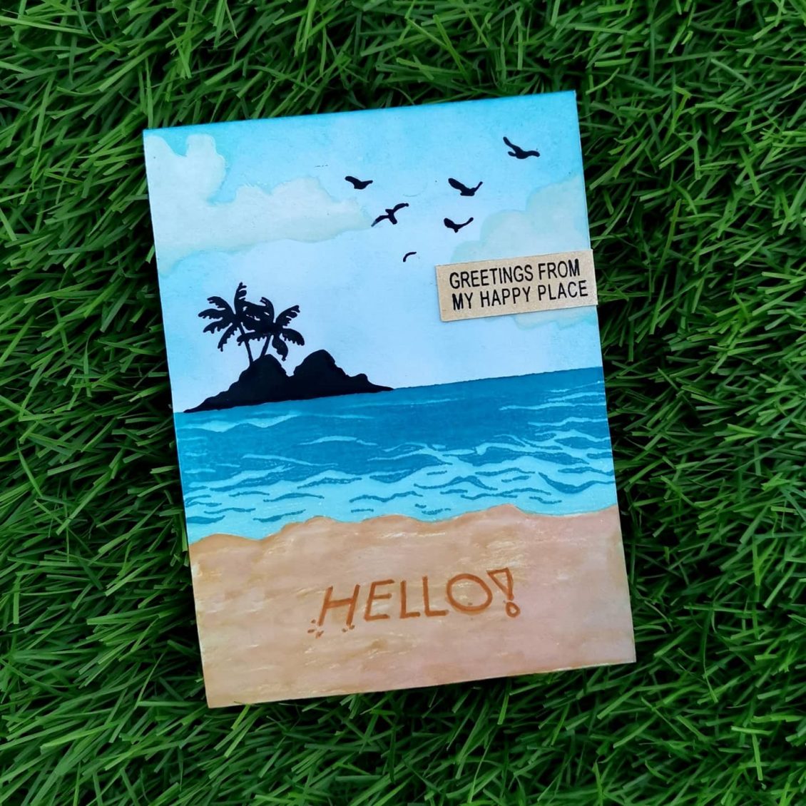
Landscape card
Entering into the 137th challenge at @themaleroomcraftchallenge
The challenge theme is landscapes.
As usual, it’s a 4 1/4 *5 1/2 Neenah classic crest Solar white cardstock. For stamping the image, I choose color layering waves and color layering sea and sky from heroarts. This is one of my favorite stamp set which hero arts have produced so far.
I have used my mini distress ink pads from Ranger for ink blending and my crisp die ink from Altenew.
To join the challenge:
https://themaleroomchallengeblog.blogspot.com/2020/05/challenge-137-landscapes.html?m=1

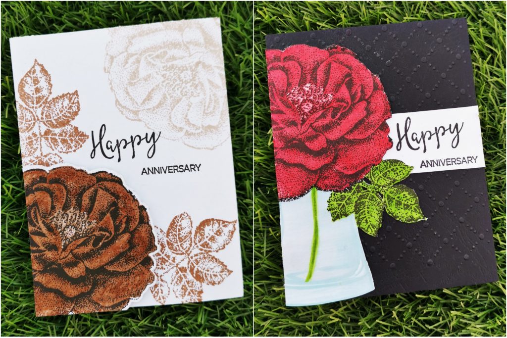
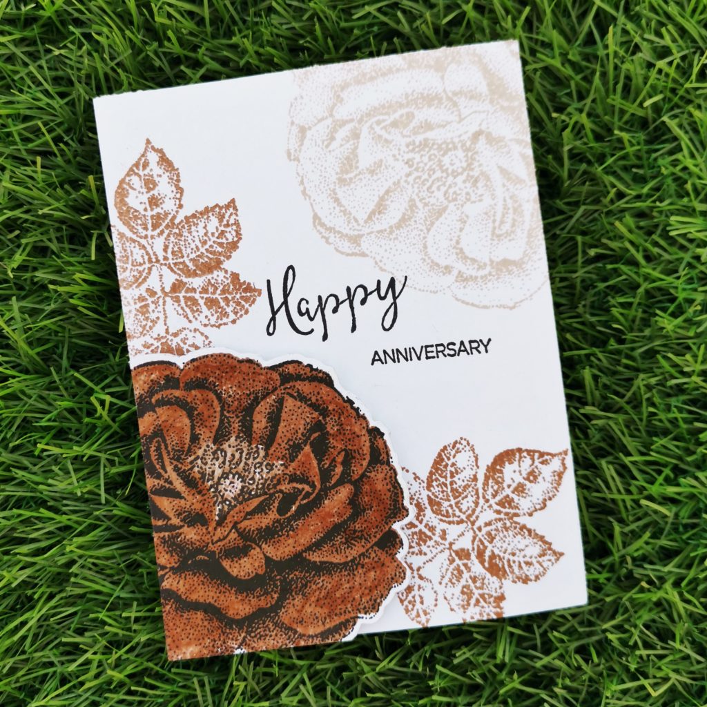
Irresistible Inking Techniques
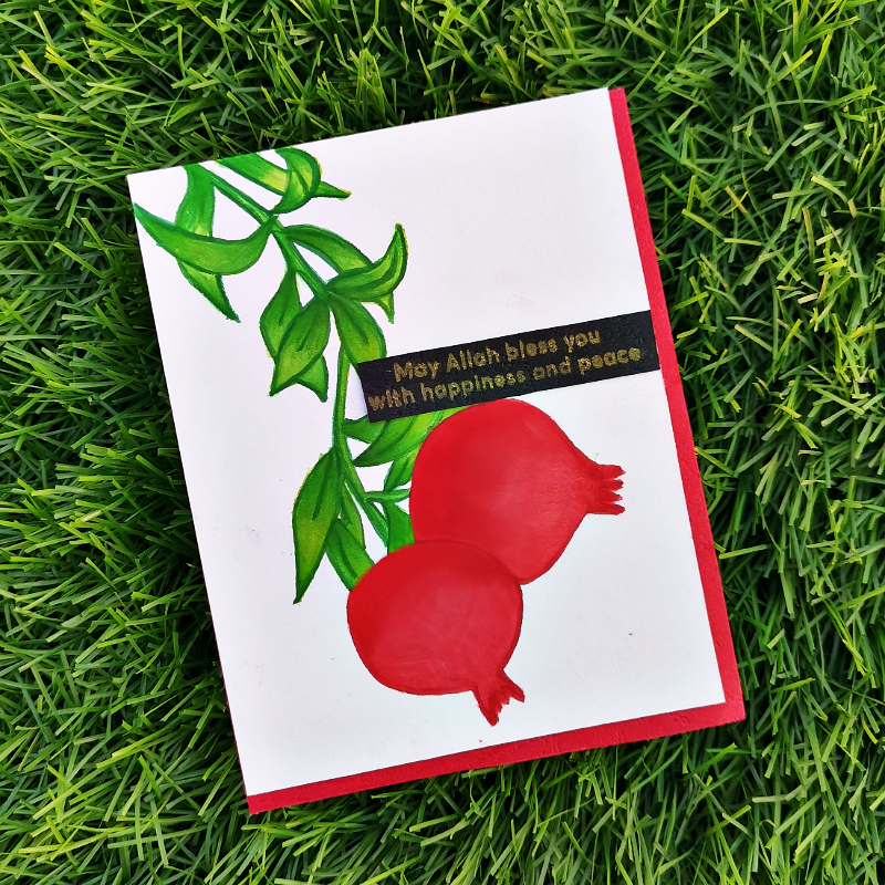
Hi, welcome back to a new blog. Hope you all are doing great.
Today’s blog is based on the Irresistible Inking Techniques taught by Sara Nauman at Altenew academy. This course helps us to stretch the purpose of our ink pads! It teaches us how to give new life to them by thinking outside the box. I never used my stamps for anything else other than stamping or ink Blending. So literally this course made me do things outside the box.
This is the first time I’m trying to color something with watercolor brushes. So eagerly waiting for your opinions and suggestions.
I took Neenah classic white cardstock and trimmed it into 4*5 1/4. I decided to use Happy pomegranates from Altenew for this project. I stamped the green leafy parts of the picture with just green altenew crisp die ink. And the red pomegranate parts with the heart beat crisp die ink from Altenew. Then I stamped these inks on my Altenew Watercolor Palette. Its light-colored surface ensures an accurate representation of our ink color and is smooth and sturdy. It’s perfect for our artistic needs, especially for the ones who play with colors.
I painted the pomegranates with these colors using a watercolor brush. I used the fine tip brush to paint the border and filled the inside part with a size medium watercolor brush. The tip retains its shape allowing for both broad strokes and fine detail work. I was really nervous about the coloring part, as this is my first painting with the watercolor brushes.
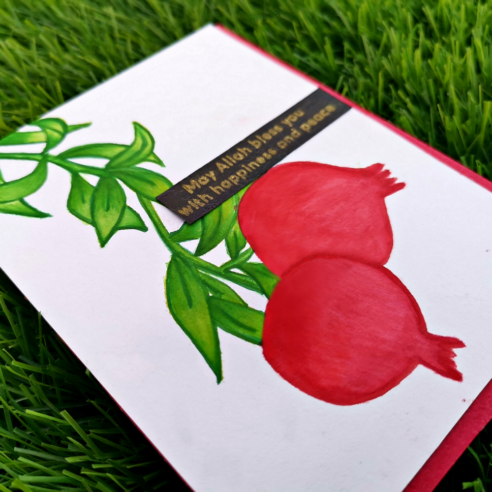
Ones the painting is dried, I trimmed a strip from the black cardstock and stamped out the sentiment from Mudra “Islamic festive” stamp set. I stamped it again with versa fine ink. And heat embossed it with Wow gold embossing powder. That trimmed sentiment strip was placed on the right middle corner of the card. I also trimmed a red cardstock paper into 4 1/4*5 1/2 and placed it behind the white one. This time I positioned it towards the lower right side of the card. So that the red color is focused on a single side of the card.
I hope this method will turn out to be an inspiration for you too. Do give it a try to learn this course at https://altenew.com/products/irresistible-inking-techniques
I hope to see you all soon with another project from AECP. Until then happy stamping and thanks for stopping by!
-shahi
Celebration: Stencil Techniques
Hi friends, I hope you all are doing good. Stay home. Stay safe.
Like many others, even I’m stuck out of my country. Wondering when I can go back. I’m definitely missing my craft room and my private crafty space. I just came done to meet my parents and got stuck here. But there is always good about getting stuck in your parents’ house, especially after marriage. I used to miss this place so badly.
Alhamdulilah somehow I could manage to get some of my basic craft items from my apartment. ( It was a real tough job. But I couldn’t stop myself from crafting.)
So coming to the point, today’s blog post is exclusively about how I ended up making a stencil of my own to make a beautiful card. Celebration: Stencil Techniques, is something which I learned from my Altenew educators certification program. Laurel Beard has explained things very well.
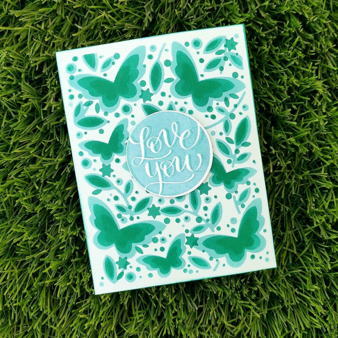
For this project, I decided to make a DIY stencil using Birch press butterfly garden layering dies.
This layering set consists of Layers A, B, and C. I die cut all the 3 layers on different cardstocks and used them as my stencils. I used thicker card stock paper while creating my own stencil so that it could be used multiple times.
After placing each die-cut layer on my cardstock, I did my first layer with Lagoon crisp die ink from Altenew and the second one with emerald. I didn’t want my third layer to stand out much from the other two shades. Instead, I wanted a soft color which is just a bit darker than my second shade. That’s how I ended up with my emerald crisp die ink again for my final layer.
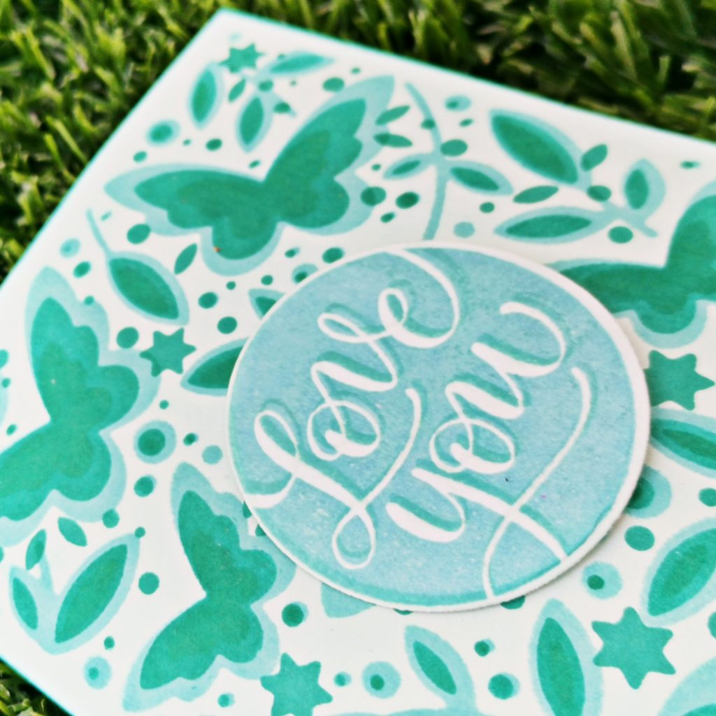
The layers by themselves looked really cool but it makes our card incomplete. So I added a sentiment “Love you” from Simon Says Stamps Love and valentines word mix set. I stamped it with altenew volcano lake crisp die ink and unicorn white pigment ink from hero arts. I just slightly changed the position when I stamped the second layer. Even though it was a small one, it brings a lot of difference to the look of the card. I was wondering if I ended up making a monochromic card. But I am fine. Because it is not something which I do often. I die cut the sentiment with its coordinating dies and stuck it with a piece of foam tape at the center of the card.
And here it goes…
The card is ready. Isn’t it so simple?
I hope this method will turn out to be an inspiration for you too. Do give it a try to learn this course at https://altenew.com/products/celebration-stencil-techniques?_pos=1&_sid=a8928335c&_ss=r
I hope to see you all soon with another project from AECP. Until then happy stamping and thanks for stopping by!
-shahi
Let it shine
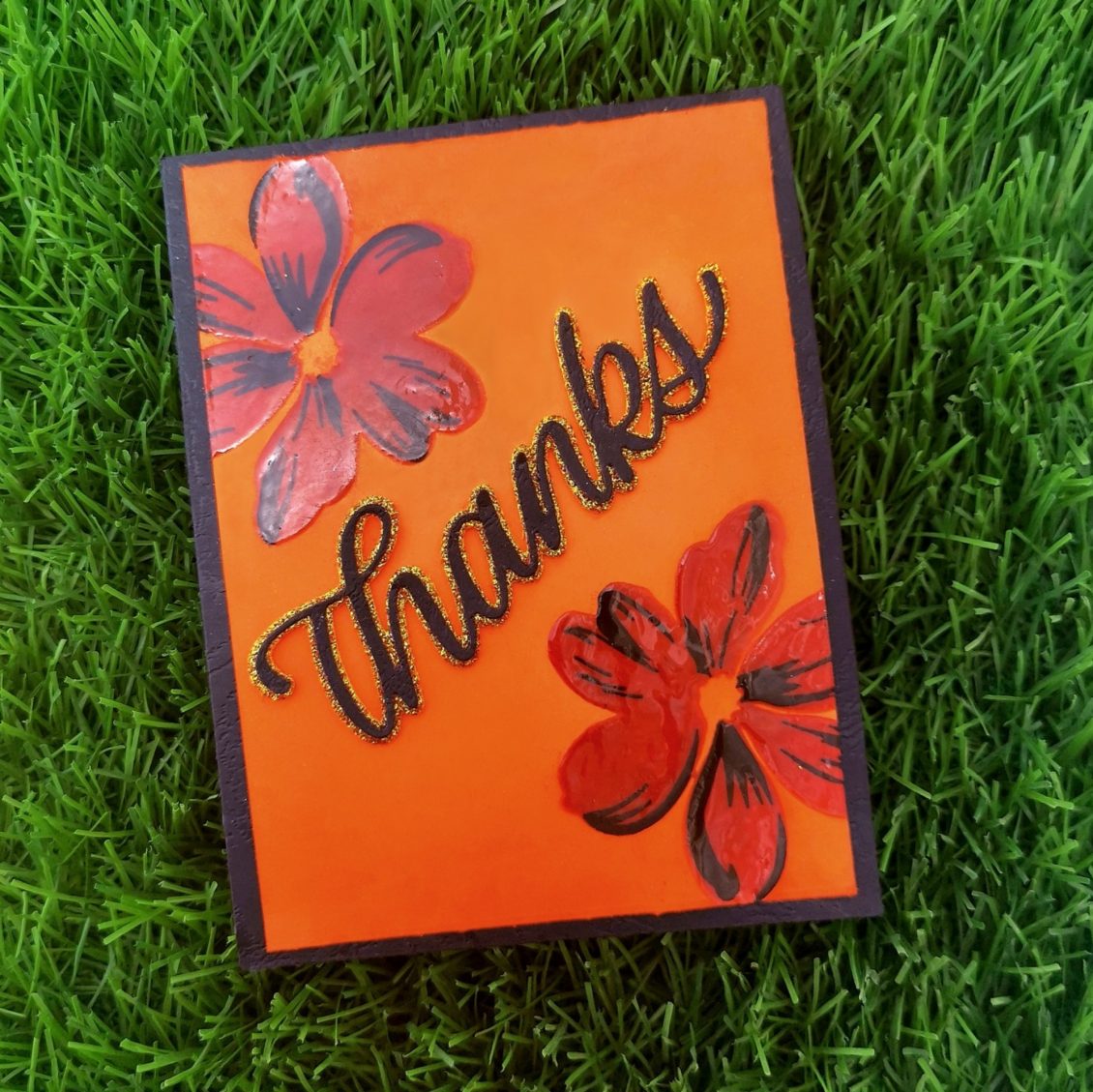
As I complete my projects one by one, of level 1, it’s getting real fun at the Altenew educator certification program. My today’s task is to make a card based on the lesson, Let it shine. This class literally helped me to determine some of the best ways to add shine to my projects and WOW others!
I trimmed a black card stock into 4 1/45 1/2. And placed an orange card stock on it. As it was about the size 3 3/4 *5, there was enough room for the black card stock paper to be seen. I choose the Fabulous Florets Stamp Set from Altenew for this project. So I placed it on my card stock and stamped the top flower with Caramel toffee Altenew crisp die ink and the bottom flower with the Autumn blaze Altenew crisp die ink. The second layer was done with the versafine Onyx black ink.
Then I prepared my card surface with some sort of anti-static powder tool. This fine layer of powder will prevent embossing powder from sticking to areas where you don’t want it to stick. Then I used Versa mark ink. It’s a clear sticky ink that can be used for embossing, or for watermark images. Then I applied some Hero Arts clear embossing powder on my card stock. Embossing powders can make any stamped image shiny and dimensional. And it’s easy to do. There are basic embossing powders, clear and white, that leave a hint of shine.
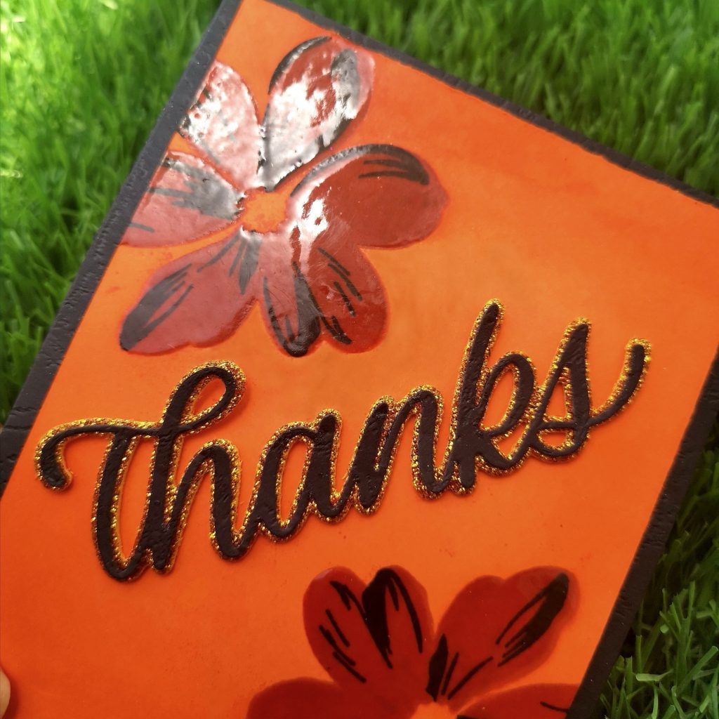
Here, I choose clear embossing powder as I wanted my flowers to shine in its original color which I have stamped. (Orange and black). Before heat setting the embossing powder, I used a dry brush to sweep away any stray pieces of embossing powder. These little specs will expand as they heat and turn into blobs. Quickly brushing away strays will give you great results every time. I allowed my heat gun to heat up to its hottest point before taking it to the paper. This will minimize the amount of time it takes for the powder to melt and will minimize warping. Once the embossing powder is melted, I moved my heat gun. We should not heat it in one place for too long. Once the grainy appearance goes away, and you see a bit of shine, you’re all set to move on.
I had a sudden change in plan while making my card. In fact, in happens most of the time. I never stick on to my planned project. But, isn’t it good? Because you end up making things better. Here I decided to softly blend the corners of the card with the same dieink with which I stamped my flowers at the start of my project.
For the sentiment, I decided to choose the Simon Says Stamp BIG THANKS Shadow Wafer Dies. I die cut the glitter card stock with the base wafer dies using my die cutting machine and the black card stock with the thin front wafer dies. It’s was positioned and stuck in the middle of the card.
Isn’t it so simple. I hope this method will turn out to be an inspiration for you too. Do give it a try to learn this course at https://altenew.com/products/let-it-shine I hope to see you all soon with another project from AECP. Until then, happy stamping and thanks for stopping by!
-shahi
 CASE your fellow AECP Crafter
  Clean & Simple Boutique Cards
  Easy Die Cutting Techniques
  Graduation card
  Let it shine
Recent Comments